You've got a landing page, a launch date, and roughly two hours before the rest of the team needs something they can post. The product works. The screenshots are ready. Then someone suggests a polished explainer with narration, custom scenes, and a review cycle that pushes launch day back.
That's the wrong starting point for most early-stage teams. Video product marketing works best when the format matches the job. For a launch teaser, the job is to stop the scroll, show the product's value quickly, and give interested people a clear next step. It isn't to explain every feature or replace a product demo.
Why 15-Second Silent Teasers Win for Video Product Marketing
Launch day is a distribution problem before it's a production problem. Your video needs to work in a feed, on a landing page, in an announcement post, and in an email without asking the viewer to commit to a long explanation.
Muted viewing makes that constraint obvious. A widely cited summary of Sharethrough research says 75% of people watch mobile videos on mute, which makes visual storytelling and on-screen text essential for feed-first content in this summary of the mute-viewing research. A narrated explainer can be useful later, but it's a poor default when the first contact happens with sound off.
The format also matches how people learn about products. In 2026, 91% of people said they prefer learning about a product through video, while 91% of businesses used video as a marketing tool, up from 61% in 2016, according to Wyzowl's 2026 video marketing statistics. Video product marketing is no longer an unusual launch tactic. The question is whether the asset respects the viewing context.

What the teaser should do
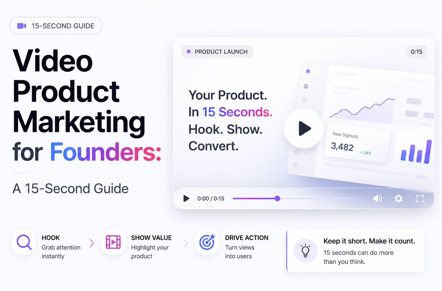
A 15-second silent teaser has a narrow job:
- Lead with the product promise: Put the useful outcome on screen before the viewer has a reason to leave.
- Show visual proof: Use the interface, a key workflow, or a product result. Don't narrate features the viewer can't see.
- Close with direction: Point people to the product URL, launch page, or signup action.
Short-form behavior supports the discipline. One 2026 benchmark reported that 51% of people consider 30 to 60 seconds the optimal video length, while 91% prefer videos under two minutes. The same reporting says 93% of marketers view video as producing positive ROI, with short-form video among the leading ROI-driving formats, as documented in the 2026 video marketing data overview.
That doesn't mean every product needs a 15-second video forever. It means the teaser should earn the next click. Treat it as pro content, not ad slop. A brand-quality motion-graphics piece creates a clean first impression. It doesn't pretend to be a performance ad with aggressive targeting, inflated claims, or a fake sense of urgency.
For practical standards on pacing, framing, and distribution, use these video marketing best practices. The main rule is simple: make the first asset easy to understand without sound, editing, or patience.
Prep Your Landing Page Before You Generate Anything
The landing page is the source material. If the page is vague, cluttered, or visually weak, the teaser will inherit those problems.
Start with the headline. A strong headline gives the video a usable opening line. It names the product category, the audience, or the valuable outcome. “A smarter workspace” is decoration. “Turn customer interviews into searchable insights” gives the teaser a direction.
Make the page do three jobs
First, tighten the headline and supporting copy. Keep the promise concrete. The first frame shouldn't introduce an abstract mission statement when the viewer needs to understand what the product does.
Second, inspect the hero screenshot. It should show the product doing the impressive thing, not a dashboard with tiny labels and empty states. Crop mentally from a feed viewer's perspective. If the key action can't be recognized quickly, replace the image before generating the video.
Third, expose the brand cues. Your visible colors, logo treatment, and one-line value proposition should appear near the top of the page. A URL-driven workflow can only use what the page makes available. Hidden brand guidance won't help the generated asset stay consistent.
Run this fifteen-minute check
- Headline: Can a stranger explain the product after reading it once?
- Hero visual: Does the screenshot show a meaningful product moment?
- Value proposition: Is the specific benefit visible without scrolling?
- Brand cues: Are the main colors and visual identity clear?
- Clutter: Can you remove navigation, claims, or secondary copy that distracts from the launch message?
- Next step: Does the page make the desired action obvious?
Practical rule: A short teaser can compress a sharp page. It can't rescue a confused one.
The page should also work when the video is absent. That matters because the teaser is a conversion asset, not a substitute for product messaging. Use this guide to landing page video to check placement, surrounding copy, and the role the video should play above the fold.
Don't build a separate story for the video unless the page has a real gap. The best launch teaser usually starts with the same promise visitors see when they arrive. That alignment reduces cognitive load and makes the click feel like a continuation rather than a reset.
Generate Your First 15-Second Teaser from a URL
The fastest workflow starts with the page you already have. Don't assemble a folder of raw footage, write a voice-over script, or open a timeline editor. For an early-stage launch, those steps create production work without improving the first impression.
Use the page as the brief
- Paste the product URL into ShipTeaser. The system analyzes the page copy, screenshots, and visible brand cues.
- Generate the free first video. The first video is available with no credit card.
- Review the render. Check the opening hook, visual consistency, product proof, and final call to action.
- Download the 1080p file. It's a ready-to-post 15-second silent motion-graphics teaser.
- Publish it where the launch already lives. Start with the landing page and announcement channels, then reuse the same asset in the launch sequence.
You can see the URL-driven workflow at ShipTeaser's URL-to-video page.

Review the first render like a founder
Don't search for cinematic perfection. Look for communication failures.
- Is the promise visible by second two? Short-form guides consistently identify the opening 2 to 3 seconds as the critical hook window, with recommendations placing the hook within roughly 1.5 to 3 seconds, as described in this short-form attention guide.
- Does the brand color carry through? The teaser should look like your product, not a generic template.
- Is the proof legible? A viewer should see what the product does, not just its logo and a slogan.
- Does the last frame give direction? Use one text-based next step. Don't finish on a decorative animation.
ShipTeaser's scope is intentionally narrow. It creates silent motion graphics from a product URL. It doesn't offer AI avatars, UGC actors, voice-over, audio narration, screen recording, stock footage, text-prompt-to-video, translation or subtitles, watermarking, or a video editor and timeline. “Silent” means there's no voice-over, although an optional background music bed can be included.
That limitation is useful when the job is a clean product teaser. You're not pretending the asset is a filmed testimonial or a full product walkthrough. You're creating a concise launch piece that communicates visually.
For ongoing output, the paid plans are $199 per month for one ready-to-post video per week, $299 for two, and $399 for four. Choose a cadence your team can use. A weekly asset that ships is more valuable than an ambitious content plan that stalls after launch.
The Skeleton of a Teaser That Hooks in Three Seconds
A good teaser has a fixed structure. That makes it easy to audit. Watch it once with the sound off and ask whether each beat has a distinct job.
The opening gets the most valuable screen time. Short-form guidance recommends placing the hook in the first 1.5 to 3 seconds, because a weak opener causes immediate drop-off, according to this short-form video guidance.

Use hook, proof, close
Hook, seconds 0 to 3. State the problem, outcome, or category. Put the important words on screen immediately. Don't spend the opening on a logo animation. The viewer hasn't decided that your brand deserves attention yet.
Proof, seconds 4 to 10. Show the product doing the thing. Use interface movement, a result, or a visual transformation. Motion graphics should guide the eye toward the evidence, not decorate an empty claim.
Close, seconds 11 to 15. End on a frame that can function as a static announcement card. Use one call to action, one URL or destination, and enough contrast for the message to survive a quick glance.
| Seconds | Beat | Job on screen | Common mistake |
|---|---|---|---|
| 0 to 3 | Hook | Name the promise or problem | Logo animation before the value |
| 4 to 10 | Proof | Show the product or result | Listing features without visual evidence |
| 11 to 15 | Close | Give one clear next step | Multiple CTAs competing for attention |
Text carries the message in a silent teaser. Captions and on-screen overlays are central because viewers may never turn audio on. Guidance on muted short-form viewing recommends designing the message so it lands through readable text and visual sequencing, as explained in this short-form creation guide.
The optional music bed should support rhythm, not explain the product. If removing the music makes the teaser incomprehensible, the structure is broken. Fix the text and visuals first.
A teaser earns attention with the hook, earns belief with proof, and earns the click with the final frame.
Audit the cut at normal feed speed. Then pause at the opening and closing frames. If either still looks like an unfinished transition, the video isn't ready.
A Launch-Week Distribution Plan for a Two-Video Team
A launch rarely fails because the team had only one usable file. It fails because nobody assigns the file a job on each channel.
Use a simple week. Keep the primary teaser unchanged. The point of a fixed 15-second format is repeatability, not endless re-editing.
Monday on the landing page
Place the teaser near the primary product message. Keep the headline and surrounding copy consistent with the video's opening. The viewer should understand the same promise whether they read first or watch first.
Caption pattern: “See how [product category] helps [audience] achieve [outcome].”
Check autoplay behavior and the first visible frame in the current page implementation. Don't assume a browser or device will behave the same way for every visitor.
Tuesday on X and LinkedIn
Post the teaser with a short caption that adds context instead of repeating every word on screen. The first frame must work as the in-feed thumbnail because many viewers will decide whether to pause before the video plays.
Caption pattern: “We built [product] for [specific problem]. Here's the workflow in fifteen seconds.”
Keep the post focused. Don't attach a feature list that turns a concise teaser into a wall of copy.
Wednesday on Product Hunt
Use the same core file for the launch listing. Pair it with a description that explains who the product is for and what the viewer should do next. The video should support the listing, not carry the entire launch narrative alone.
Caption pattern: “A new way for [audience] to [job]. Watch the core experience, then try it.”
Friday in email
Send the teaser to people who already opted into launch updates, customers, or a relevant waitlist. Link the image or video to the destination page, and write subject-line copy that sets an accurate expectation.
Caption pattern: “The product is live. See the core workflow, then try it.”
This cadence gives a two-video team a repeatable rhythm. One asset introduces the product. The second can answer a different objection or show another use case. Don't create channel-specific complexity before the first version has earned it.
The Three KPIs That Actually Matter for a Launch Teaser
A launch teaser needs a small dashboard. Track too much and you'll confuse activity with progress.
Hook retention
Measure the share of viewers who continue past the first three seconds. Native analytics may label this differently by channel, so check the current documentation for the exact definition and reporting window.
This number tells you whether the opening earns attention. If people leave immediately, changing the final call to action won't solve the main problem. Rewrite the first frame, simplify the promise, or show the product sooner.
Click-through rate
Track clicks from the post to the product destination. Platform reporting can show link clicks or related engagement metrics, but definitions vary, so compare like with like and check the current docs before drawing conclusions.
As a directional benchmark, one 2026 benchmark set reported a 1.72% CTR for 15 to 30 second creatives on Meta, 0.96% for 9 to 15 second videos on TikTok, and 1.14% for 6 to 15 second videos on YouTube Shorts, as shown in the 2026 creative benchmarks. Use those figures as context, not a promise. Audience, placement, creative, and destination all affect the result.
Qualified signups or waitlist adds
This is the decision metric. A teaser that attracts attention but produces no qualified action is entertainment, not useful launch content.
Attach the signup or waitlist result to the launch window using your existing analytics setup. Define “qualified” before launch. For one team, that may mean a relevant company email. For another, it may mean activation or a clear fit with the intended audience.
Friday review: Keep the teaser if attention, clicks, and qualified actions point in the same direction. Change the hook if retention is weak. Change the landing page if clicks arrive but signups don't.
Don't overreact to a small sample. Look for a pattern across the launch window, then make one meaningful change for the next post. Multiple simultaneous changes make the result impossible to interpret.
Founding-Team Mistakes That Kill a Good Teaser
They bury the hook behind the logo. Brand recognition doesn't matter if the viewer hasn't understood the product. Start with the outcome or the visible product moment. Put the logo where it supports recognition instead of consuming the opening.
They make the video dependent on sound. Voice-over can add nuance, but a launch teaser often meets people in a muted feed. Put the core message in readable on-screen text, and use motion to direct attention. Music is optional support, not the explanation.
They treat the landing page as an afterthought. A teaser built from weak copy and a poor hero image will look polished but communicate little. Fix the headline, screenshot, value proposition, and brand cues before generating the asset.
They post once and call the launch finished. One post creates one opportunity. Put the same ready-to-post teaser on the landing page, announcement channels, launch listing, and follow-up email. Give each placement a different caption and a clear job.
They skip the Friday review. Without retention, clicks, and qualified actions, you're relying on memory and opinion. Review the launch window while the details are fresh, then change one part of the next teaser.
Founders don't need a miniature production department for every launch. They need a reliable format, a sharp page, and the discipline to ship pro content instead of ad slop.
The first video is free, with no credit card. Visit ShipTeaser, paste a product URL, and get a 15-second launch teaser in about two minutes.