The first three seconds matter more than the polish of the full cut. Treat that as an editing rule, not a universal performance statistic: if viewers can't identify their problem immediately, a beautiful ending won't rescue the video. Founders often choose animation, a demo, or a talking-head recording before choosing the hook, then spend launch week producing the wrong asset.
The best video for product launch is usually a short problem-solution teaser, followed by a gallery that shows the actual software. Choose a screen demo when buyers need to inspect a workflow, and a founder message when your reason for building adds useful context. Skip the customer proof reel until real customers can approve the evidence.
Your production order shouldn't follow ambition. Start with assets you can publish, reuse, and correct without delaying the product. A live stream might be inexpensive to record, but preparing the demonstration, attracting an audience, and handling questions make it expensive in founder attention.
Launch-week rule: Choose the smallest format that answers the buyer's next question.
The formats below are ranked by usefulness against production effort, not by cinematic appeal. The teaser comes first because it establishes the message. The gallery follows closely in practical priority, even though a screen demo may be more important for technical buyers. Custom animation and live events need a stronger justification, and customer proof has a prerequisite that editing can't fix.
1. Problem-Solution Teaser (Under 30 Seconds)
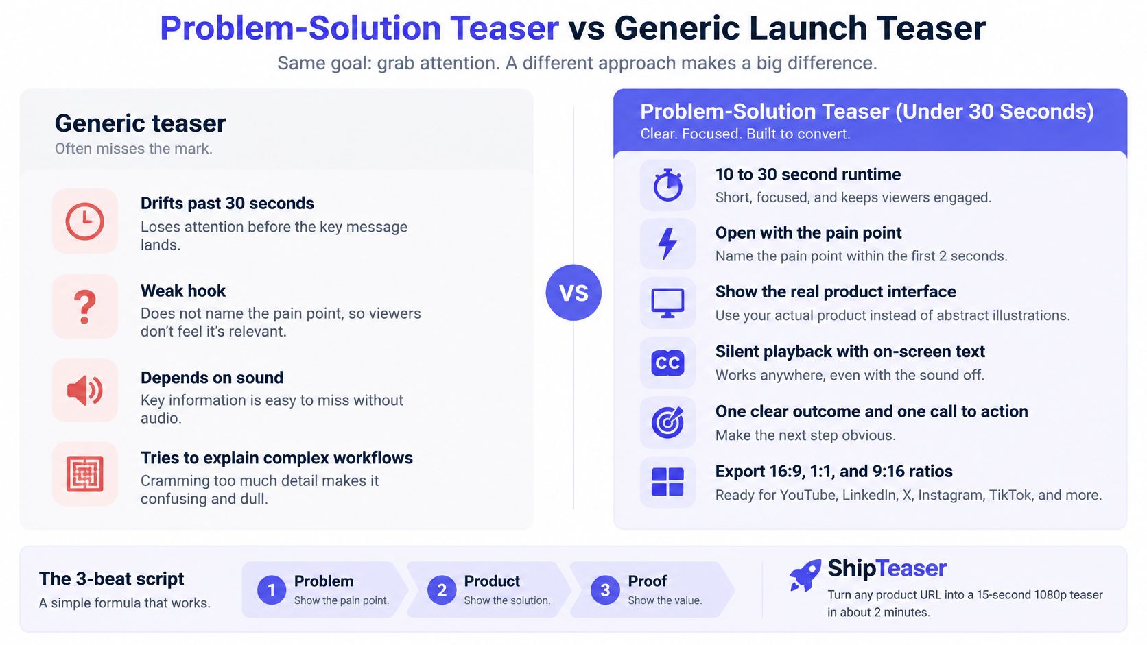
Rank this first. It answers the only question a launch-week visitor has: what does this fix? Thirty seconds is enough to name a specific problem, show the product touching it, and point at what changed. Measured against a solo founder's week, the teaser also wins on effort: one afternoon of writing and review, no casting, no crew, no scheduling.
Open with the pain before the logo. A handoff product can start on "Stop rebuilding context for every bug," cut to the interface resolving that sentence, then land on an observable result. A concrete output beats a productivity claim you cannot put on screen.
HubSpot's 2025 State of Marketing report identifies short-form video as the most-used content format, used by 29% of marketers. That supports keeping the asset short. Brevity on its own sells nothing.
Build the message before the motion
- Problem: Write a line your buyer already says out loud.
- Product: Show the interface doing the work.
- Proof: Use a visible output or a capability that ships today.
- Action: Point viewers to the trial or the launch page.
That four-part spine fits a template you can run without editing: ShipTeaser reads the product page you paste and returns a 30-second, 1080p silent MP4 in about two minutes, cut into five beats (hook, problem, solution, proof, call to action). The SaaS launch video workflow suits founders whose public page already carries accurate messaging and usable screenshots. Watch the render before you publish. Page copy and brand cues get misread often enough that review is the last step, every time.
Use the comparison below to check whether your draft explains the software or merely announces it.
Paid distribution is a separate project with its own budget and learning curve. Instagram advertising for SMEs with Scéaled covers placement and audience setup for when you reach that stage. Keep it off the launch-week list, or the ad build will eat the days you saved on the teaser.
2. Live Screen Demo Walkthrough
A developer evaluating an import feature doesn't need a cinematic promise. They need to see the input, the operation, the resulting data, and what happens when something fails. Choose a screen demo when product behavior is the main buying question.
Production effort is moderate. Recording is straightforward, but preparing clean example data and removing dead time takes care. A fragile first-use flow makes the work harder because every unexpected state interrupts the explanation.
Say you're launching an API monitoring product through Show HN. Record a single task: connect a sample endpoint, trigger a failure, and inspect the resulting alert. Put the successful outcome near the opening, then explain how the user reaches it.
Record a task, not a product tour
Rehearse the exact path before capture. Close unrelated tabs, hide bookmarks, disable notifications, and remove credentials from anything that might appear onscreen. Use a dedicated demonstration account rather than trying to conceal personal information afterward.
- Keep the cursor deliberate: Move toward the next action without circling the screen.
- Remove waiting: Loading indicators rarely explain value.
- Explain decisions: Describe why a setting matters, not merely where you clicked.
- Show boundaries: Distinguish available functionality from planned work.
The product demo video versus teaser comparison addresses the useful distinction: a teaser earns attention, while a demo supports inspection. Don't force the walkthrough to perform both jobs.
Use narration or captions where they clarify the workflow, created through your separate recording workflow. End with the same task viewers can try themselves, and link directly to the relevant documentation or starting screen.
3. Founder-to-Camera Launch Message
A founder message is worth making when your explanation is stronger than your production setup. The useful material isn't your excitement about launching. It's the specific frustration that led you to build, the decision you made differently, and who should try the result.
Production effort is low for a comfortable speaker and surprisingly high for someone who keeps restarting. If recording becomes an exercise in memorizing perfect delivery, switch to a screen demo or teaser.
Say you built a planning app because existing products made solo work feel like managing a large department. Open with that problem, name the product, and explain the simpler workflow. Don't spend the opening thanking supporters before a new viewer knows what you're announcing.
A straightforward presentation is enough.

Make the message understandable without sound
XR's 2025 captions analysis reports that 75% of people watch video with the sound turned down. For a spoken founder message, captions belong in the production plan rather than being an optional finishing touch.
Face a window, place the camera near eye level, and record somewhere quiet. Use a short outline instead of reading dense prose. Review captions for product names and technical terms, then check whether interface controls cover important text on a phone.
Your origin story earns space only when it helps the viewer understand the product.
Post the message to LinkedIn or send it to your waitlist with a direct next step. A personal explanation should still lead somewhere concrete.
4. Motion Graphics Explainer
Custom motion graphics carry the highest production burden among the prerecorded options. Reserve this format for products whose value is difficult to understand from the interface alone.
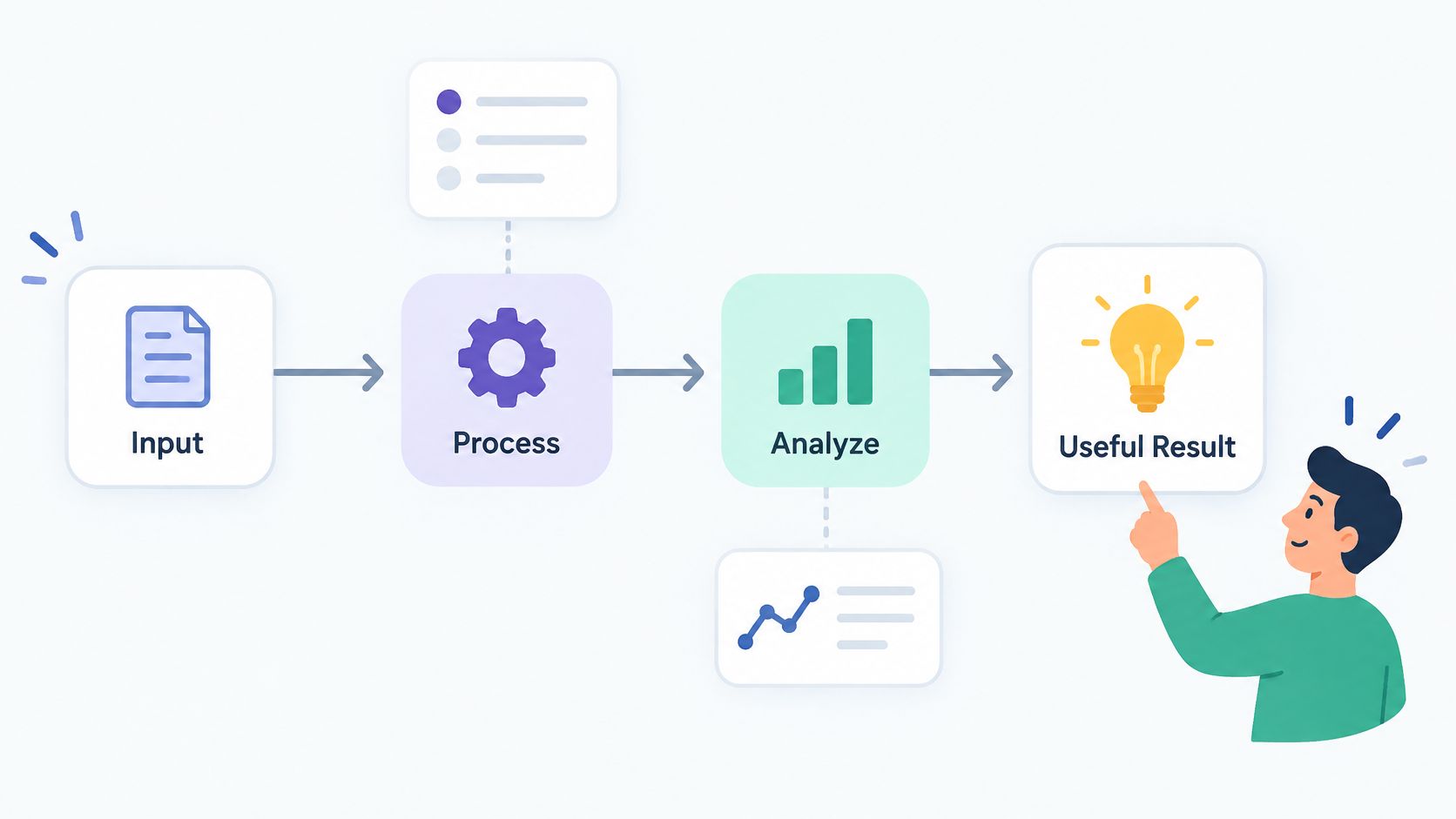
A data pipeline product is a good example. A dashboard screenshot might show a healthy status without explaining how events move between systems, where validation occurs, or why a failed job can recover safely. Animated diagrams can make those relationships visible.
The trade-off is revision cost. When the architecture, positioning, or interface changes, a custom explainer may need substantial rework. Don't commission an elaborate explanation while you're still changing the central promise.
A clear workflow diagram is a better starting point than a mood board.
Animate relationships, not adjectives
Write the explanation in plain language before drawing scenes. Each scene should answer a concrete question: what enters, what changes, where the output goes, or what the user controls.
- Use product language: Name actual components instead of inventing vague labels.
- Keep the metaphor stable: Don't switch between factories, roads, and floating clouds.
- Anchor abstraction: Include real interface fragments where viewers need orientation.
- Separate reality from ambition: Show shipped functionality as shipped functionality.
Wyzowl's 2025 industry survey reports that 99% of video marketers believed video increased users' understanding of their product or service. That's evidence of reported usefulness across video marketing, not proof that custom animation beats a simpler demonstration.
Place a detailed explainer on the homepage or documentation page where interested visitors can evaluate it. For launch-day feeds, extract the central idea rather than publishing the entire architectural explanation.
5. Product Hunt Launch Gallery Set
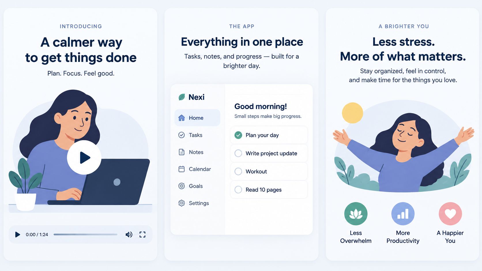
Think of the Product Hunt gallery as a sequence of answers, not a collection of attractive exports. The opening asset explains what the software does. The following assets show the workflow, the result, and the reason someone should try it.
Production effort is low to moderate if you reuse an existing teaser and capture focused screenshots. Effort rises when every gallery panel gets a different visual style or repeats the same slogan.
For a productivity app, make the sequence concrete: the promise, the working interface, and the completed outcome. The viewer shouldn't need to assemble the story from disconnected feature names.
Keep the gallery visually consistent without making every panel identical.
Reuse the concept, not the same crop everywhere
Meta's placement guidance recommends 9:16 for Stories, Status, and Reels, while recommending 16:9 for in-stream video. Those are distribution requirements for those placements, not Product Hunt specifications, but they explain why related launch assets need different compositions.
Keep important interface details readable when adapting the gallery for social posts. Don't shrink an entire desktop screenshot until the text becomes decorative texture.
- Hero asset: Make the product understandable without sound.
- Workflow image: Show the action users will take.
- Outcome image: Show what successful use produces.
- Preview check: Ask someone unfamiliar with the software to explain the gallery back to you.
Follow the Product Hunt launch video workflow when preparing the video asset. Product Hunt gallery videos use YouTube links, so upload the MP4 publicly and paste the full video URL into the gallery.
Preview the complete set before launch morning. Reuse the hero concept in email and social posts, but inspect each destination separately.
6. Customer Proof Reel
Skip this format until real customers exist. A montage of anonymous praise, founder-written endorsements, or invented results is worse than having no testimonial video.
Production effort is moderate once approved evidence is available. Before that, gathering permission and verifying claims is the work. Editing can't compensate for missing substance.
A useful scenario is a SaaS founder combining approved customer comments with the relevant product workflow. Show the result, introduce the customer accurately, then let the quote explain why the change mattered. Keep each statement close to its original meaning.
Permission comes before production
Ask customers to approve their name, role, company, quote, and any result you intend to publish. Confirm whether the approval covers social posts, your launch page, and future reuse. Don't assume permission to publish a written comment also includes permission to use someone's image or recording.
- Verify the metric: Confirm the baseline, measurement period, and scope.
- Preserve qualifications: Don't remove context that changes the claim.
- Label relationships: Identify beta users or design partners accurately.
- Avoid implied guarantees: A customer's result isn't every buyer's likely outcome.
A real usage example is stronger than a testimonial you have to manufacture.
If you have active users but no approved quotes, show a documented workflow using your own demonstration account. Describe that as product evidence, not customer endorsement.
Once suitable stories exist, guidance on how to turn customer stories into video testimonials can help structure the interview and resulting asset. Keep the customer's actual words central rather than polishing every statement into marketing language.
Use the reel after viewers understand the problem and solution. Proof is persuasive when the audience knows what the evidence is supposed to establish.
7. Changelog or Feature Drop Video
Start with the change, not an announcement that an announcement exists. This format is a low-effort choice for existing users when the release changes a familiar task.
Say your app now imports issues from a repository instead of requiring manual entry. Show the old friction briefly, demonstrate the import, and reveal the populated workspace. A returning user should understand what's different without reading the release notes first.
Production effort stays low when you keep the scope narrow. A montage of unrelated changes usually requires more explanation and gives the viewer less reason to act.
Show the difference users will notice
- Name the feature immediately: Use the same name users will see in the interface.
- Make the contrast visible: Show the previous step and the replacement.
- State availability: Explain relevant access or rollout limits accurately.
- Send users to the feature: Don't default to the homepage when a direct route exists.
The feature announcement video guide is a useful starting point for keeping the announcement focused on user value. Keep minor fixes in the changelog unless showing them helps someone complete a task.
For a repeatable publishing rhythm, reuse the visual system rather than inventing a fresh treatment for every release. A familiar structure makes review easier and helps returning users recognize the update.
Send the announcement to current users before broad promotion when their feedback could expose confusion. Watch for questions about access, setup, and changed behavior. Those questions reveal what the next draft needs to explain.
Don't use this format to make a maintenance release look like a new product launch. If the improvement doesn't need motion to be understood, a clear screenshot and release note may be enough.
8. Live Launch Stream
A live stream has the highest coordination burden, even when recording costs little. You need a stable demonstration, an audience invitation, working links, and a plan for questions you can't predict.
Choose this format when discussion adds value. A developer product with installation questions or architectural trade-offs can benefit from a live walkthrough. A simple app with an obvious first-use flow probably doesn't need an event.
Say you're introducing an API endpoint. Demonstrate a request, inspect the response, explain an error condition, and take implementation questions. That gives attendees something more useful than a narrated landing page.
Prepare for failure before going live
Rehearse the exact demonstration using the same account, browser, and network you'll use during the stream. Keep a fallback recording and screenshots available. If the live environment fails, explain what happened and continue with prepared material rather than repeatedly refreshing.
- Invite relevant people: Tell interested builders what they'll learn.
- Publish access details: Include the time zone and joining instructions.
- Keep links ready: Pin the product, documentation, and next action.
- Respect uncertainty: Record unanswered questions instead of inventing answers.
Fallback standard: A failed demo shouldn't end the explanation.
Afterward, edit a self-contained excerpt that answers a useful question. Use a separate recording and editing workflow for that work. Don't repost an unexplained fragment that requires viewers to have attended the stream.
Publish the replay where evaluators can find it, such as the relevant documentation page. If you don't have a credible invitation list or a question worth discussing live, make a prerecorded walkthrough instead.
How the eight launch video formats compare on length, effort, and best use
| Item | Typical length | Production effort | Best for | Best channel |
|---|---|---|---|---|
| Problem-Solution Teaser (Under 30 Seconds) | 10–30 seconds | Low; quick to script and edit | Communicating one clear value proposition | Social feeds, Product Hunt, launch posts |
| Live Screen Demo Walkthrough | 2–5 minutes | Medium; requires a clean setup and editing | Showing real product workflows and building technical trust | Product docs, help center, Show HN |
| Founder-to-Camera Launch Message | 30–90 seconds | Low; phone and simple setup | Building trust through a founder's story | Founder's social profiles, waitlist email |
| Motion Graphics Explainer | 45–90 seconds | High; custom animation can take weeks | Explaining abstract or complex products | Product homepage |
| Product Hunt Launch Gallery Set | Hero clip under 30 seconds, plus supporting assets | Medium; several assets need to be prepared | Presenting what the product is, how it works, and why it matters | Product Hunt gallery |
| Customer Proof Reel | 20–60 seconds | Medium; requires customer permission and approvals | Providing social proof to skeptical buyers | Landing pages, ads, sales emails |
| Changelog or Feature Drop Video | 15–45 seconds | Low; simple, repeatable format | Re-engaging existing users with a product update | In-app notifications, user channels, X |
| Live Launch Stream | 20–60 minutes | High; requires rehearsal and live preparation | Demonstrating the product and answering questions in real time | YouTube Live, X |
Pick Two Formats and Ship Them This Week
Launch week gives you one real constraint: production time. Rank the eight formats by how much work each needs before it can credibly represent the product, then pick the two that fit between final copy lock and launch morning. For most solo founders, that means a short problem-solution teaser plus a screen demo cut from the same product walkthrough. Both can draw on the same product page and interface capture, so the second asset does not double your production load.
The format to skip is the customer proof reel. It ranks highest on permission risk, not production effort, and it stays out until named customers have approved the words and numbers you plan to publish. Custom animation and live events also fail the launch-week test unless they answer a question the simpler assets cannot. A live stream without rehearsal creates more failure points than it removes.
Keep the production order practical
- Lock the promise first: Name the user, the problem, the visible result, and the next action.
- Capture evidence once: Record clean interface views and verify every claim before editing.
- Cut for destination: Check composition, text size, and readability where the video will run.
- Publish and measure: Connect the video to one product action, not to playback alone.
Review every generated draft before publishing. Generated videos can contain factual errors or misread the brand, so check product names, screenshots, availability claims, and the call to action against the actual product. Download and retain the approved file rather than treating a hosted preview as permanent.
Keep the post-launch schedule narrow. Each video needs a new feature, workflow, or customer question. If the only change is a new title card, skip the upload.
Measure the next useful action
Use tagged destination links and choose one primary outcome before posting. Qualified visits, sign-ups, and activation answer different questions. A viewer who watches but never understands who the product serves is not a successful launch result.
Keep the landing page and audience comparable when testing alternative messages. Review results after a predeclared period rather than changing the creative whenever a view count moves. Small samples give directional evidence, not proof of causation.
For the accompanying copy, browse LinkedIn launch announcement templates, then replace generic language with your actual problem and result. The post and video should make the same promise.
FAQ
What's the best first video for a software product launch?
A problem-solution teaser is the right first video when you have one week and no finished demo. It needs a clear problem, a product view, and a next step, nothing more. If you already have a working demo, switch to a live screen walkthrough and keep the teaser as the short version.
Should a product launch video include narration?
Add narration only when it replaces a confusing on-screen explanation. Silent feeds autoplay without sound, so a launch video that needs a voice to make sense will fail where you post it. If the script cannot survive as on-screen text, cut the script until it can.
Can a prelaunch startup make a customer proof reel?
Skip the customer proof reel until real customers exist. A prelaunch proof reel turns into a testimonial-shaped ad with borrowed credibility, and viewers notice. Spend that effort on a changelog or feature drop where the product can carry the proof.
When should you stop using a launch video format?
Stop when the format keeps forcing you to explain the same thing twice in the post copy. A format that needs a paragraph of setup is doing too little work. Give each format two launch cycles, then keep it only if it produces a useful question, sign-up, or demo request.
ShipTeaser creates a 30-second 1080p MP4 from a product page URL. It uses silent motion graphics and five beat-cut scenes, and it ends with your own call to action. Review every generated video before publishing, because the output can misread the brand or contain factual errors. The first video is free, with no account and no card: ShipTeaser.