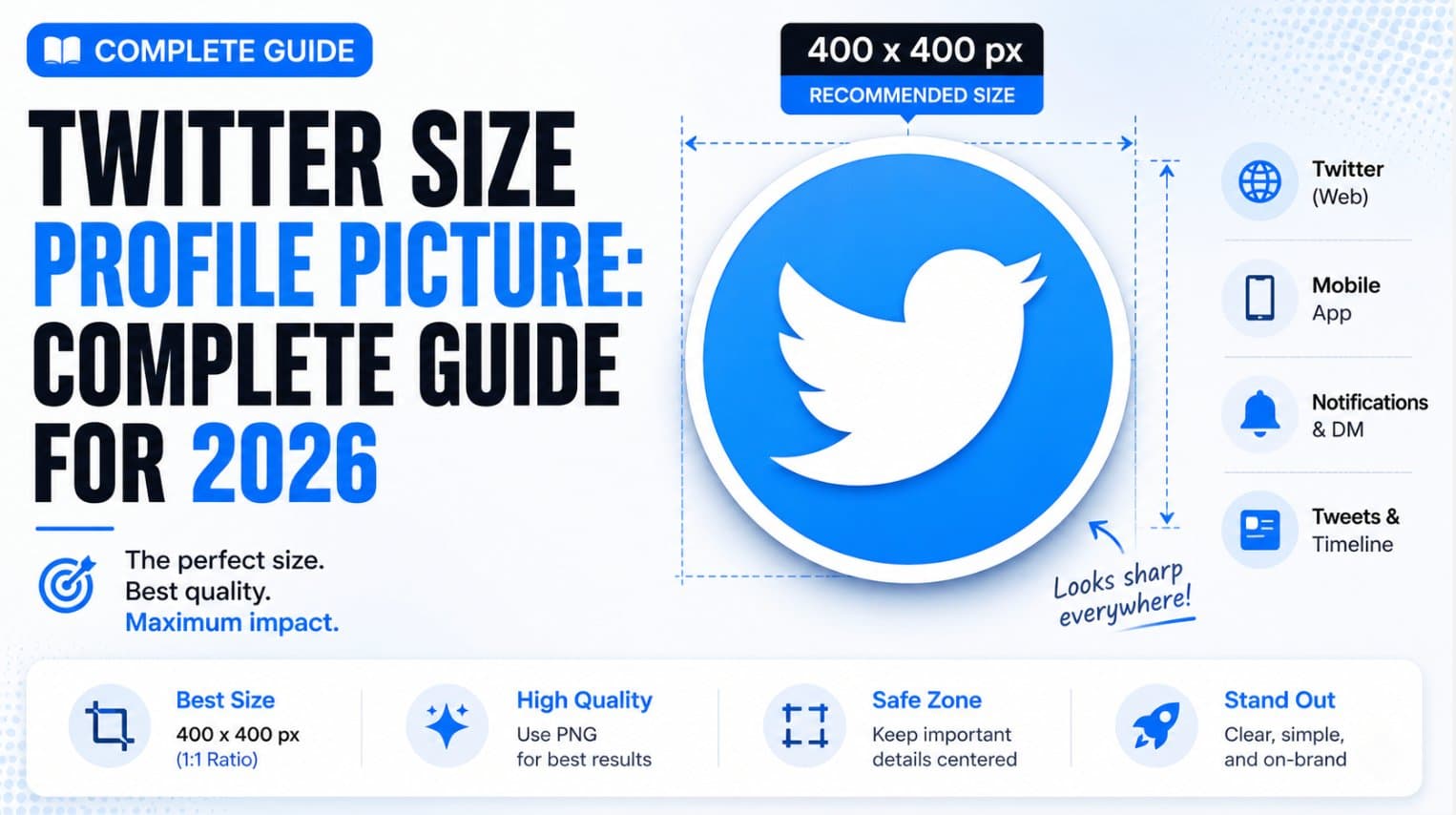
The recommended Twitter profile picture size is 400 × 400 pixels in a 1:1 square format, with a 2 MB maximum file size, and X displays it as a circle across the platform. The best avatar isn't the one that merely meets that upload requirement, but the one that stays recognizable after X reduces it to a tiny feed and notification icon.
That distinction is the part most size guides miss. I've tested different exports for launch accounts and product brands, and file dimensions alone haven't produced a meaningful difference in profile visits. Crop, contrast, and recognition at small sizes have mattered far more, so the practical job isn't to design a beautiful 400-pixel square. It's to design a clear mark that survives downscaling, compression, and a circular mask.
The Upload Spec That Has Not Changed in Years
The 400 × 400 upload recommendation is not the hard part. X specifies a 400 × 400 pixel profile image in a 1:1 square aspect ratio, with a 2 MB maximum file size, according to the official X profile-photo upload guidance.
Use PNG for logos and graphic artwork, especially when clean edges matter. JPEG suits photographic portraits and can produce a smaller file. Keep the source square before uploading, even though X applies a circular mask to the displayed image.
Treat the upload number as a fixed constraint
The specification has stayed unusually stable. Guidance published in 2021 used the same 400 × 400 recommendation, and 2026 guidance still reports the same dimensions, square ratio, circular display, and file-size ceiling in the long-running social image-size guidance. That stability helps brand teams maintain one dependable master asset instead of rebuilding it for every interface adjustment.
Compliance alone does not make an avatar work. A 400 × 400 file can fail when the face occupies too little of the frame, a logo relies on fine lettering, or important artwork sits near the corners. After downscaling, those details disappear first. The upload specification sets the ceiling, while the actual test is whether the mark remains recognizable at roughly 24 to 48 pixels in feeds and notifications.
Practical rule: Build at 400 × 400, then judge the design at the smallest size where people will encounter it.
Export below the 2 MB limit rather than expecting X to repair an oversized file. Start with a clean, high-resolution source, use the correct color space, and inspect the circular preview before saving. The stable specification simplifies production. It does not replace testing the finished avatar at tiny display sizes.
How X Displays Your Avatar Across the Product
A 400 × 400 upload is rarely viewed at anything close to its working size. X reduces the avatar to roughly 48 × 48 pixels in the timeline, about 40 × 40 pixels in search, approximately 24 × 24 pixels in notifications, and around 134 × 134 pixels on the full profile page, according to this X profile-size breakdown.

The smaller placements usually matter more than the profile page. A visitor may see facial expression, logo structure, or supporting color on the profile. In the timeline, the avatar is a compact cue beside a post. Search leaves less room, while notifications can reduce a detailed illustration to a handful of indistinct pixels.
The practical pixel budget
Design the avatar around recognition, not detail. Each surface gives the image a limited pixel budget:
- Timeline and replies, about 48 × 48 pixels: A face, mascot, or logo should be recognizable without supporting text.
- Search, about 40 × 40 pixels: Fine lettering and narrow strokes become unreliable. Shape and contrast matter more.
- Notifications, about 24 × 24 pixels: Use this as the stress test. If the subject disappears, simplify the composition.
- Profile page, about 134 × 134 pixels: Secondary details may show here, but identification should not depend on them.
Some references report larger profile contexts, including around 200 × 200 pixels, while other product-size references place the full profile view at about 134 × 134 pixels. Rendering can vary by surface, device, and interface state. The practical choice stays consistent: optimize for the smaller placements first.
A large wordmark can look polished on the profile page and become unreadable beside a reply. A complex product screenshot may communicate clearly when opened, then vanish in the feed. Recognition comes from the silhouette, face, dominant color, or simplified icon. Details that require zooming do not survive the smallest display contexts.
Designing for the Circular Crop and Safe Area
X presents profile pictures inside a circular mask, even when the uploaded file is a perfect square. The corners of the source canvas therefore become invisible, and any face, logo, border, or text placed too close to those corners can be clipped, as explained in this circular profile-picture sizing reference.

At 400 × 400, the circle has a 400-pixel diameter. The square's corner regions sit outside that circle, so they shouldn't carry essential information. The inner 75% safe-zone rule shown in the design guide is a practical working boundary, not a guarantee that every edge inside it will look equally clear at tiny sizes.
A reliable crop workflow
Start with a square artboard and place the subject in the center. Then add a circular overlay or mask to your design file so you can see what X will retain. For a face, keep the head and the most identifying features comfortably inside the circle. For a logo, use the symbol rather than forcing a long wordmark into a shape that can't support it.
Use this sequence before export:
- Center the subject: Align the face, mascot, or icon around the canvas center instead of trusting the crop tool to make a thoughtful composition.
- Protect the perimeter: Keep thin borders, small labels, and decorative corner elements away from the visible edge.
- Preview the mask: Inspect the design as a circle at both profile-page scale and a tiny feed scale.
- Check the crop on the actual account: X's editor can reposition the image, but it can't repair a subject that was composed too close to the edge.
The same principle applies to launch graphics that need to carry a product message. A centered focal point and generous breathing room are easier to preserve than an edge-dependent layout. For broader branded motion work, this guide to creating on-brand video without a designer follows the same production logic: establish the visual system first, then simplify it for the actual viewing context.
The circular crop is predictable. Surprises usually come from designing as if the square corners will remain visible.
Choosing Between PNG and JPEG for Your Avatar
Format choice should follow the artwork. PNG is often the stronger choice for logos, typography, and sharp graphic elements because it preserves hard edges, while JPEG suits photographic portraits with continuous tones, as explained in this PNG and JPEG profile-picture guidance.
| Avatar content | Preferred format | Why it fits |
|---|---|---|
| Logo or icon | PNG | Keeps sharp edges and flat color transitions cleaner |
| Typography-heavy mark | PNG | Reduces the risk of letters becoming muddy |
| Photographic headshot | High-quality JPEG | Handles gradients and natural texture efficiently |
| Mixed photo and graphic treatment | Test both | Choose the version that keeps the face or mark clearer |
For a graphic avatar, export PNG at 400 × 400 pixels in sRGB with minimal compression. The larger upload canvas gives X enough source detail to process, but the format still matters at the 24 to 48 pixel sizes common in feeds and notifications. PNG keeps logo edges and small shapes cleaner, although it cannot make an overly detailed design readable at that scale.
Photographic avatars usually work well as high-quality JPEGs. Start with the original image, not a screenshot or a file that has already been compressed. After export, inspect skin tones, hair edges, and the background at both the full canvas and the tiny display size. A compliant JPEG can still look soft when its source has been resized repeatedly.
Keep the final file below X's 2 MB ceiling. If a PNG is too heavy, remove hidden layers and export only the visible artwork. Do not shrink the dimensions first. Preserve the working canvas, then reduce file weight through a clean export. The practical test is simple: compare PNG and JPEG at feed size, and keep the version whose subject or mark remains clearer.
Making Your Avatar Readable at Tiny Sizes
The avatar should communicate one idea quickly. At 24 to 48 pixels, a detailed scene, long slogan, or thin outline doesn't have enough visual room to survive. The strongest designs usually have a single focal point, clear separation from the background, and a shape that remains identifiable when the viewer barely notices it.

Design for recognition, not inspection
Contrast does more work than resolution at small sizes. Put a dark subject on a light background, or a light subject on a dark background, and avoid adjacent colors with similar brightness. A distinctive color block can survive reduction better than a nuanced gradient.
Keep the composition deliberately sparse:
- Use one focal point: A face, symbol, or mascot should dominate rather than compete with secondary objects.
- Remove tiny text: If the account name can't be read at feed size, it adds clutter instead of clarity.
- Thicken fragile shapes: Hairline strokes, narrow counters, and delicate borders can disappear during downscaling.
- Preserve negative space: A little breathing room helps the subject remain separate from the circular edge.
- Test against both light and dark interfaces: A background that looks distinct in one mode can lose separation in another.
The product-teaser example makes the same point in a different format. Switching a product teaser from a square asset to a wider 16:9 composition made the product interface easier to understand in the feed. The improvement came from giving the UI more space, simplifying the frame, and making the primary feature readable without opening the image, not from resolution alone.
The small-size test
Export the avatar, place it beside a mock reply, and reduce it until it resembles the smallest practical display. Ask someone who hasn't seen the design what they recognize first. If the answer is “a blue shape,” the visual identity may be working. If the answer is “I can't tell,” remove detail before increasing resolution.
Don't use the profile page as your only proof. A design that looks excellent when enlarged can fail where recognition matters most, beside a fast-moving conversation.
Animated Profile Pictures and Premium Options
Animated avatars can attract attention, but motion is easy to overestimate. X may support animated profile photos under account-specific conditions, including Premium eligibility and the stated 400 × 400 pixels upload format. Availability can change, so treat animation as an optional feature rather than a dependable baseline.
The true test happens at 24–48 pixels in feeds and notifications. At that size, viewers may register a flicker without understanding what changed. Extra frames can also introduce compression artifacts or make the avatar feel unstable. A clear static mark usually communicates faster.
Animation fits when the profile page is a destination, the movement reinforces the brand, or the subject remains recognizable throughout the loop. It performs poorly for logos that depend on fine lettering and portraits that become distracting when repeated.
Motion should add recognition, not compensate for an unclear static design.
Compare the opening frame with a strong static version before committing. If the static image fails beside a reply or notification, animation will not repair weak contrast, cramped composition, or an unclear subject. Test the loop at the smallest practical display size, where the first frame may carry most of the recognition burden.
For launch teams producing additional motion assets, keep technical planning separate from the avatar decision. A profile icon has very limited viewing area, while a launch asset can support a larger frame and clearer sequencing. The launch video specifications guide can help set those requirements without forcing the avatar to carry the entire campaign.
Uploading Your Profile Picture on X
Prepare the asset before opening X. Use a square file at 400 × 400 pixels, choose a supported image format, and keep it below the 2 MB upload limit. The upload specification matters, but it does not predict readability in feeds, replies, or notifications, where the avatar may render at only 24–48 pixels.
The upload sequence
On desktop, open your profile, choose the profile-edit control, select the profile image, upload the file, adjust the crop, and save. On mobile, open your profile, tap the edit control, select the avatar, choose an image from your device, position it within the circular crop, and confirm.
Interface labels may change as X revises its product. The workflow stays familiar. Use the crop editor to position the artwork, not to rescue a cramped source file. If a face, logo, or letterform sits near the edge, revise the original and add breathing room before uploading.
Check the result at three stages:
- Circle preview: Make sure the mask does not cut off a key feature.
- Small rendering: Inspect the avatar in a reply, feed item, or notification. A design that looks sharp on the profile page can lose its identity at 24–48 pixels.
- Color and sharpness: Confirm clean edges, readable contrast, and no unexpected softness.
If X rejects the file, check its size, format, and dimensions in that order. Avoid repeated trial uploads without correcting the source. For the broader publishing workflow, see the guide to launching on X.
Fixing Common Profile Picture Problems
Most avatar failures fall into a small set of patterns. Diagnose the visible symptom before changing the file.
| Symptom | Likely cause | Specific fix |
|---|---|---|
| Blurry everywhere | Source is too small or has been repeatedly resized | Return to the original artwork and export at 400 × 400 |
| Sharp on profile, muddy in feed | Too much detail for small rendering | Remove text, simplify the background, and strengthen contrast |
| Face or logo clipped | Important content sits near the circular boundary | Recenter it and add padding around the subject |
| Upload rejected | File exceeds the limit or uses an incompatible export | Confirm the file is under 2 MB and save as PNG or JPEG |
| Colors look different | Export uses a non-sRGB color profile | Convert the final asset to sRGB before upload |
| Thin lines disappear | Strokes don't survive downscaling | Increase stroke weight and test the smallest preview |
A sharp profile-page result doesn't prove the design works. If the timeline version looks muddy, the problem usually isn't a lack of pixels. The composition has more information than the smaller surface can carry.
Unexpected cropping has a similar solution. Don't keep nudging the image inside X until the subject barely fits. Reopen the source, enlarge the safe margin, and use the circular overlay while composing.
Color shifts are less dramatic but still distracting for branded accounts. Export in sRGB, especially when the avatar uses a tightly controlled palette, then compare the uploaded version with the original on the same screen.
Quick Reference Table for X Profile Picture Specs
A 400 × 400 pixels upload is only the starting point. In feeds and notifications, your avatar may appear around 24 × 24 to 48 × 48 pixels, so recognition and contrast matter more than detail. Use X's profile-photo requirements for the upload baseline and this independent X profile-size reference for practical display contexts.
| Specification | Value |
|---|---|
| Recommended upload dimensions | 400 × 400 pixels |
| Minimum upload size | 200 × 200 pixels |
| Aspect ratio | 1:1 square |
| Maximum standard profile-photo file size | 2 MB |
| Practical file formats | PNG or JPEG |
| Display shape | Circular |
| Timeline and replies | About 48 × 48 pixels |
| Search results | About 40 × 40 pixels |
| Notifications | About 24 × 24 pixels |
| Full profile page | About 134 × 134 pixels, with some profile contexts showing about 200 × 200 pixels |
| Production priority | Recognition, contrast, centered composition, and safe margins |
Treat the minimum upload size as a compatibility threshold, not a design target. Build on the recommended canvas, keep the subject inside the circular safe area, and test the artwork at the smallest display size. If a face, logo, or distinctive shape disappears there, simplify the source rather than adding more detail.
Frequently Asked Questions About X Avatars
Does changing the picture improve engagement or follower growth?
Not by dimensions alone, based on my experience. I've tested different exports, but I haven't seen a meaningful difference in profile visits that could be attributed specifically to file dimensions. Crop, contrast, and recognizability have made the clearer difference.
Follower growth is even harder to isolate because profile-picture changes often happen alongside updates to positioning, bio, content, and posting frequency. A clearer avatar can improve consistency and recognition across replies, which may support profile visits and follower conversion indirectly, but it isn't a standalone growth lever.
How often should you update an avatar?
Update it when the identity changes, the current image no longer represents the account, or a campaign needs a temporary visual treatment. Frequent cosmetic changes can weaken recognition, especially for accounts that rely on repeated replies and ongoing conversations.
For a launch, create the avatar before the campaign begins and keep it stable through the main publishing window. Change the surrounding content more often than the core recognition asset.
Can one image work across every social platform?
It can, but a single export isn't always the best production choice. Different platforms apply different masks, display sizes, and surrounding layouts. Keep the core subject consistent, then create platform-specific crops when a circular avatar, square tile, or wider identity treatment needs different spacing.
Why did X reject a file that looked correct?
Check the technical basics first. Confirm the file is below 2 MB, uses a practical supported format such as PNG or JPEG, and has the intended square dimensions. If those checks pass, export a fresh copy from the original rather than reusing a file that has accumulated multiple edits or metadata issues.
Should a brand use a logo or a person?
Use the mark that people already associate with the account. A founder-led account often benefits from a recognizable face, while a product account may need a simplified symbol. Don't force a full wordmark into a tiny circle if the lettering can't be read. A distinct icon or cropped portrait usually communicates more effectively.
The best Twitter profile picture is therefore not the largest-looking one. It's the one that remains unmistakable after the circular crop and aggressive reduction, especially in the small places where people encounter it first.
ShipTeaser turns an existing product landing page into a ready-to-download, approximately 15-second promotional video by analyzing its copy, screenshots, and visible brand cues. Visit ShipTeaser to create concise launch assets without manual editing and keep your product announcement workflow moving.