Your teaser autoplays muted in a crowded feed. Strangers decide whether to keep watching almost immediately, yet most founders polish the middle of the video and neglect the first frame. The result is a polished asset that explains too late.
These teaser campaign examples solve that problem with reusable scene orders, opening hooks, and posting cadences. Each format gives you a structure you can copy instead of a showreel you can only admire. ShipTeaser can build the first version from your product URL, which gives solo builders a practical starting point for how executives launch products.
The strongest teaser format for an early-stage software launch is short, silent motion graphics with a clear hook, a specific problem, a visible solution, credible proof, and one direct CTA. Use 15 seconds, show one idea, and publish the same concept in 16:9, 1:1, and 9:16. ShipTeaser turns a landing-page URL into that five-scene sequence, with an optional music bed but no voice-over or narration.
1. The Hook-Problem-Solution Teaser
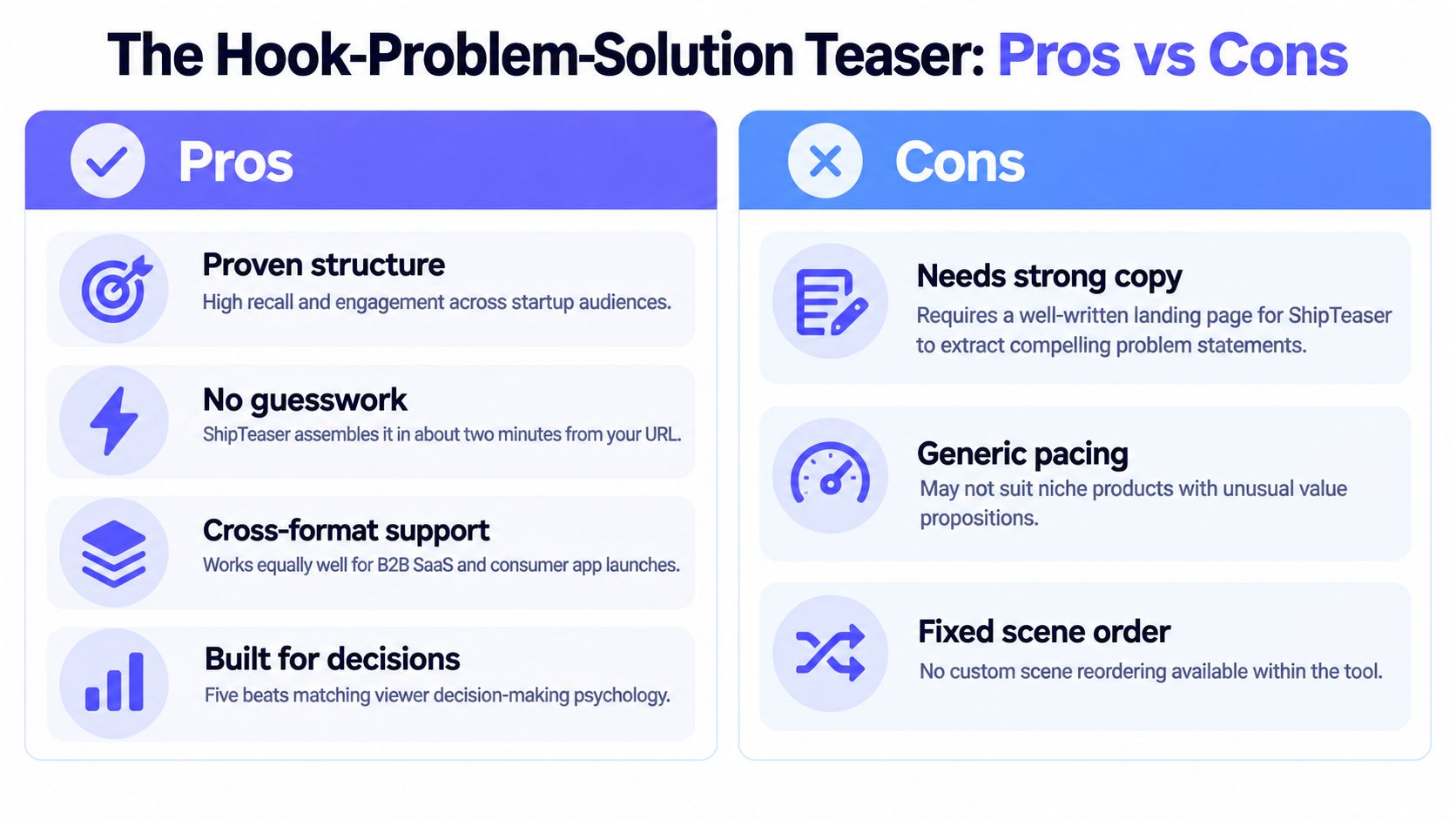
This is the best default format for a new software launch. It gives viewers a reason to stop, names the pain they already recognize, shows the product solving it, adds proof, and tells them what to do next.
A strong scene order looks like this:
- Scene one, hook: Open with a striking statement or visual about the user's frustration.
- Scene two, problem: Show the manual task, delay, confusion, or recurring cost.
- Scene three, solution: Reveal the product interface and the main action it performs.
- Scene four, proof: Display a genuine testimonial, customer logo, review, or product result.
- Scene five, CTA: Send viewers to the signup page, waitlist, or product demo.
A project-management SaaS teaser could open with a cluttered task list, move to missed deadlines, reveal a clean dashboard, display a real customer quote, and close with a signup link. A no-code automation product could begin with a frustrating manual workflow, show one-click setup, display recognizable integration icons, and finish with a free-trial CTA.
ShipTeaser generates this sequence from landing-page copy and visible product cues. The clearest source page produces the clearest first draft, so lead with the problem your audience understands without explanation.
Practical rule: Don't use a clever hook if viewers can't identify the problem within the next scene.
Use the three-second hook framework to sharpen the opening. Then test the first free ShipTeaser video before choosing a plan. For a steady weekly cadence, the $99 per month plan produces 1 video per week. The first video is free, and no credit card is required.
2. The Before-and-After Transformation Teaser
Show the messy state first. Then show the clean state your product creates. This format works because the viewer doesn't need narration to understand the change.
The first three seconds should expose the before state. Use a cluttered spreadsheet, a fragmented dashboard, a long manual checklist, or a visual that signals wasted effort. The middle should show the product changing that condition. The final scenes should reinforce the result and direct viewers to a relevant page.
An analytics product might open on a spreadsheet filled with disconnected tabs, then transition to one screen of clear insights. An email marketing platform could show manual list management before revealing automated segmentation. A productivity tool could move from scattered notes to a structured workspace.
The visual contrast must be honest. Don't show a dramatic transformation that your product can't support. Use customer screenshots, genuine interface states, and language that matches the landing page.
Build the contrast around one workflow
Don't combine three unrelated benefits in one transformation teaser. Choose one workflow and make the change unmistakable.
- Before: Identify the exact task that frustrates the intended user.
- Transition: Show the product performing the key action.
- After: Present the improved workflow, not a vague promise.
- CTA: Link to the page where that user can start the same workflow.
A solo builder should test this format against the hook-problem-solution structure in the first two ShipTeaser videos. Publish each version in 16:9, 1:1, and 9:16. Google Ads lists 15 seconds as a recommended length for all three orientations and pairs them with 1920 by 1080 horizontal, 1080 by 1920 vertical, and 1080 by 1080 square output in its video specifications. Google's video ad specifications support the practical choice to create platform-ready compositions instead of stretching a single horizontal file.

3. The Feature Showcase Teaser
Feature teasers work after the audience understands the product category and core problem. They don't replace the first problem-solution video. They give interested viewers a reason to explore further.
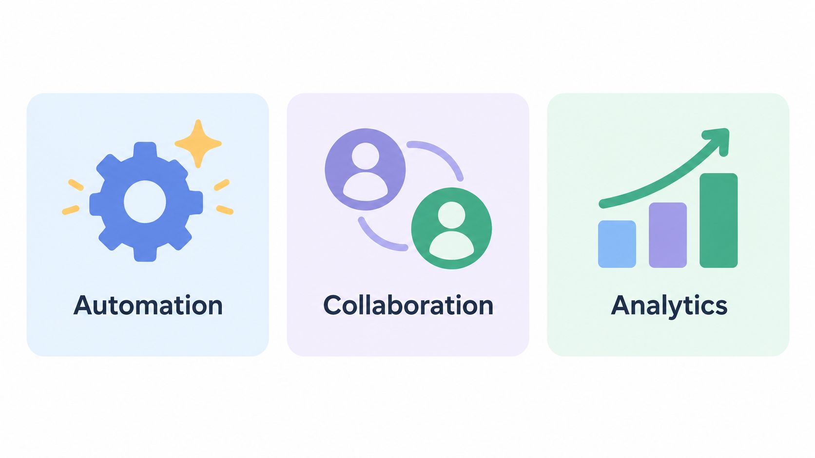
Use three or four features at most. Each feature needs a distinct visual, a short label, and a clear connection to the product's value. A productivity app might show task automation, team collaboration, and reporting. A design product could reveal vector drawing, templates, and export options.
The opening hook should name the outcome rather than announce a feature list. “Ship client work from one workspace” is stronger than “Three powerful features.” The first frame needs a user benefit, then the product can earn attention with the interface.
ShipTeaser extracts feature bullets and screenshots from the landing page, then assembles them into motion graphics. Make the source page easy to parse. Put the most important features in clear sections, use consistent names, and avoid burying essential details in dense copy.
Keep every feature visually separate
Fast pacing doesn't excuse confusion. Give each feature a distinct screen state or visual treatment. If two scenes look alike, viewers won't know what they saw.
- Feature one: Lead with the capability tied most closely to the main problem.
- Feature two: Show the workflow that makes the product different.
- Feature three: Add the feature that supports retention or expansion.
- Final scene: Use a CTA that sends viewers to the full feature page.
Use a feature teaser as a secondary asset after publishing your core narrative. The feature announcement video guide can help you turn a release into a compact sequence without implying that the teaser explains the entire product.
ShipTeaser plans support repeat testing. The $99 per month plan includes 1 video per week, the $149 plan includes 2 per week, and the $199 plan includes 4 per week. Use those outputs to vary feature combinations while keeping the audience, destination, and basic promise consistent.
4. The Social Proof and Testimonial Teaser
Social proof belongs after you have real proof to show. Don't invent traction, inflate adoption, or use decorative logos that don't represent customers. A trust-focused teaser succeeds only when every claim is verifiable.
Open with the question your audience is already asking: “Who uses this?” Then move through customer logos, genuine review snippets, product validation, or a specific result that appears on your landing page. Close with a direct CTA for viewers who now want to evaluate the product.
A SaaS platform could show customer logos, a verified review, and a concise testimonial. An indie app could show a legitimate award, a press mention, and short customer comments. The sequence should feel like evidence, not a collage of badges.
Trust doesn't come from showing more logos. It comes from showing proof that matches the buyer you're trying to reach.
This format pairs well with the hook-problem-solution teaser. The first asset establishes why the problem matters. The second answers whether people trust the solution. The $149 per month plan provides 2 videos per week, which fits that two-asset rhythm.
Use real testimonial material and preserve its meaning. If you want to display customer video testimonials, choose excerpts that identify a concrete user problem or outcome. Avoid vague praise that could describe any software product.
Refresh proof without changing the promise
Rotate new customer evidence when you have it, but keep the core positioning stable. A founder should recognize the product promise across every version. The visual identity should also remain consistent, so viewers don't mistake a proof update for a different product.
This teaser needs an accessible visual hierarchy. Use readable text, sufficient contrast, and captions for any spoken material supplied outside the ShipTeaser workflow. ShipTeaser creates silent teasers, meaning no voice-over or narration. An optional music bed can remain, but the message must work when the placement is muted.
5. The Founder Story and Mission-Driven Teaser
A founder-story teaser sells the reason behind the product. It works best when the mission is specific and the audience already cares about the problem.
The scene order should move from personal insight to wider mission, then to the product and its invitation. A climate software founder might open with the difficulty of tracking emissions, show the larger supply-chain problem, introduce the product as a carbon-accounting solution, and invite companies to participate. An accessibility product might begin with the founder's lived experience, show the barrier it creates, present the product, and close with an invitation to support independence.
The first three seconds should contain a personal tension or clear observation. “I couldn't find a way to…” gives the viewer a concrete reason to keep watching. “We believe technology should help everyone” is too broad unless the next scene makes the belief specific.
Put the mission on the landing page
ShipTeaser reads the source URL. If your About section and mission statement don't explain why the product exists, the generated script won't have enough material for a strong founder narrative. Add the personal context, the affected audience, and the change you want to create.
Use this format as a second or third teaser after a functional benefit video. Early viewers need to understand what the product does before they care much about the founder's motivation. Mission adds meaning, but it shouldn't hide the offer.
The 9:16 version is a strong choice for founder-led social posts because the vertical frame gives the story room for large text and clear scene changes. Publish the mission teaser in founder communities, Product Hunt launch posts, and channels where early adopters already discuss the problem.
Keep the CTA concrete. Ask viewers to join a waitlist, try the product, follow the launch, or share the mission. Don't close with a vague statement about changing the world. Founders earn attention when the next action is obvious.
6. The Use Case Scenario Teaser
A use case teaser puts one real user in one recognizable situation. It beats abstract benefit language because the viewer can compare the scenario with their own work.
Open with a deadline, recurring task, or painful workflow. A developer tool might show a developer facing a release deadline, automate testing, and reach a completed shipment. A marketing platform could show one solo marketer managing several campaigns, centralize the workflow, and end at a clear campaign overview.
The scene order should stay concrete:
- Scene one: Identify the person and pressure.
- Scene two: Show the manual or fragmented process.
- Scene three: Reveal the product inside that workflow.
- Scene four: Show the outcome or credible product proof.
- Scene five: Link to the page built for that use case.
Use one teaser for each major audience or workflow. A developer, marketer, and designer may need different hooks even when they use the same product. Send each audience to a relevant landing page rather than forcing every viewer through a generic homepage.
Base the scenario on actual user language
Don't invent a customer story and present it as evidence. Use support conversations, interview notes, testimonials, or clearly labeled product scenarios. The closer the wording is to a real workflow, the more likely the right viewer will recognize themselves.
The SaaS launch video use case is a useful model for connecting the scene order to a specific software audience. Generate separate versions with the $149 per month plan for 2 videos per week or the $199 plan for 4 videos per week when you need to rotate several use cases.
Use 9:16 for vertical posts on TikTok and Reels. Keep the first visual readable on a phone. The CTA should use a tracked URL and name the promised workflow, such as “Automate testing before release” or “Manage every campaign in one place.”
7. The Product Launch Countdown Teaser
Countdown teasers create a deadline. They work for a waitlist, beta opening, launch day, or a feature release with a real date. They fail when the date changes repeatedly or the urgency has no substance.
The first three seconds should state what is coming and when. “Launching Monday” is clear. “Something big is coming” isn't. Follow the opening with previews of unreleased features, genuine waitlist evidence, and a time-sensitive CTA.
An indie app might show “Three days to launch,” preview the core workflow, and invite viewers to request beta access. A SaaS product could show a launch date, reveal four interface moments, present genuine waitlist information, and close with an invitation to join.
Google distinguishes between bumper ads up to 6 seconds and standard non-skippable in-stream ads from 7 to 15 seconds in its video advertising length guidance. A 15-second countdown therefore gives you enough room for a hook, preview, proof, and CTA while staying within that standard non-skippable range.
Change the CTA when the date passes
Build the countdown before launch, then retire it immediately after launch. A stale “coming soon” message creates doubt. Replace it with an evergreen hook-problem-solution teaser once the product is available.
Use ShipTeaser's first free video to test the launch message. Paid plans support repeat generation when the date or CTA changes. The product launch video examples can help you shape the sequence, while this SaaS and e-commerce launch guide provides broader launch context. The teaser itself should remain focused on software founders and the specific release.
Don't fabricate waitlist size or availability. If you have genuine limited beta access, say so. If you don't, use a direct signup invitation instead of manufactured scarcity.
8. The Integration and Ecosystem Teaser
Integration teasers sell workflow fit. They show that your product belongs inside the tools your audience already uses.
Open with fragmentation. Show separate systems, repeated copying, or scattered data. Introduce your product as the connecting layer, display the actual integrations, and finish with the unified workflow. An automation platform could show Slack, Google Sheets, and HubSpot before revealing the connected flow. An analytics aggregator could combine several data sources into one dashboard.
Recognizable logos help viewers orient themselves quickly, but only show integrations you actively support. The landing page should list the partners clearly so ShipTeaser can extract the right visual and textual cues.
Lead with the workflow, not the logo wall
A row of logos isn't a story. Show what moves between the systems and what the user gains. “Send new leads from form to CRM” gives the viewer a workflow. “Connect your favorite tools” gives them a slogan.
Use the integration teaser as a secondary asset after explaining the product's core value. Publish it every other week with the $99 per month plan's 1 video per week when you want a consistent supporting cadence. If you have a verified integration total, include that specific number in the CTA. If you don't, name the most important supported connection instead.
Google notes that Discover feed and YouTube Home feed video ads default to muted autoplay, while YouTube in-stream, Watch Next, and Shorts placements default to sound-on autoplay after the relevant interaction. Its documentation also states that Demand Gen video ads can run without sound. Design the integration sequence so motion and on-screen text explain the workflow without narration, while an optional music bed supports the visual rhythm.
8-Point Teaser Campaign Comparison
| Teaser Format | Implementation complexity 🔄 | Resource requirements ⚡ | Expected outcomes 📊 | Ideal use cases 💡 | Key advantages ⭐ |
|---|---|---|---|---|---|
| The Hook-Problem-Solution Teaser | Medium 🔄, auto-assembled but fixed scene order | Low–Medium ⚡, landing-page copy, motion graphics | High 📊, strong recall & conversion lift | Early-stage founders; B2B SaaS & consumer apps | Proven decision-driven arc; fast production ⭐ |
| The Before-and-After Transformation Teaser | Low–Medium 🔄, split-screen or sequential edits | Medium ⚡, clear before/after visuals or screenshots | High 📊, instant benefit clarity; very shareable | Productivity tools, automation, design utilities | No narration needed; immediately obvious value ⭐ |
| The Feature Showcase Teaser | Medium–High 🔄, rapid cuts, tight pacing | Low–Medium ⚡, feature screenshots, overlays | Medium–High 📊, conveys breadth; drives curiosity | Multi-feature platforms; feature-differentiated products | Shows product scope quickly; high visual variety ⭐ |
| The Social Proof and Testimonial Teaser | Low 🔄, straightforward extraction & animation | Medium ⚡, testimonials, metrics, logos present on page | High 📊, fast trust-building; boosts conversions (when present) | Post–product‑market‑fit acquisition & retention campaigns | Reuses existing assets to build credibility quickly ⭐ |
| The Founder Story & Mission-Driven Teaser | Medium 🔄, narrative pacing & emotional framing | Medium ⚡, founder copy, supportive imagery | Medium 📊, deep engagement & loyalty; slower ROI | Mission-driven startups; community-focused launches | Differentiates brand; builds long-term advocacy ⭐ |
| The Use Case Scenario Teaser | Medium 🔄, per-persona scene construction | Medium ⚡, persona visuals, contextual UI in situ | High 📊, relevance-driven engagement & qualification | Vertical solutions; targeted personas across segments | Lets viewers see themselves; highly targetable ⭐ |
| The Product Launch Countdown Teaser | Low 🔄, simple countdown/urgency assets; frequent refresh | Low ⚡, launch copy, sneak previews, timers | High (short-term) 📊, drives waitlist/first-day signups | Pre-launch hype; event-driven product launches | Creates urgency and high short-term CTR ⭐ |
| The Integration & Ecosystem Teaser | Medium–High 🔄, workflow visualization can be complex | Medium ⚡, integration logos, flow diagrams, partner assets | Medium–High 📊, demonstrates fit; reduces adoption friction | Middleware, automation platforms, connector tools | Answers "works with X"; positions product as additive ⭐ |
Pick One Teaser Format and Ship It This Week
Choose the format that matches your strongest proof today. If the product is new and you have limited customer evidence, use the hook-problem-solution structure. If the transformation is visible, use before-and-after. If your product has several clear capabilities, use a feature showcase after the core problem is established.
Don't choose based on which format looks most impressive in a portfolio. Choose based on the evidence your landing page can support. A teaser can't fix an unclear product promise. It can expose that weakness quickly.
Start with one landing page and one audience. Write the first scene before you think about transitions. The first three seconds should name the problem, show a striking contrast, or state a real launch event. Then keep the remaining scenes disciplined:
- Hook: Stop the scroll with a specific visual or statement.
- Problem: Show the user's current friction.
- Solution: Reveal the product performing one relevant action.
- Proof: Add genuine evidence, not decorative claims.
- CTA: Send viewers to one focused destination.
ShipTeaser generates this five-scene sequence from a product URL. It produces a 15-second, 1080p silent motion-graphics teaser in about 2 minutes, with outputs in 16:9, 1:1, and 9:16. Silent means no voice-over or narration. An optional music bed may be present, so the visual message should still work when a placement is muted.
Treat the first video as a test, not a final verdict. Publish each ratio in the placement that fits it, use tagged destination URLs, and compare qualified visits, signup activity, and activation rather than views alone. Google recommends HD video in 1920 by 1080 for horizontal, 1080 by 1920 for vertical, and 1080 by 1080 for square formats in its current asset guidance, which supports creating separate compositions for each orientation rather than merely resizing one file.
A useful benchmark comes from Caterpillar's “Lift More” campaign for the CAT 306CR excavator. Its cross-channel video advertising generated nearly 36 million impressions and 100,000 clicks, while the video ads achieved almost 3 times the click-through rate of a companion new-product campaign using traditional creative, according to the CAT 306CR campaign case study. The relevant lesson for a software founder isn't to expect the same outcome. It's to keep a control group. Compare the teaser with a static asset while holding audience, placement, budget, and CTA constant.
Measure the funnel in stages. Exposure tells you whether the asset is being served. Product-page visits show whether the message created interest. Signup and activation show whether the promise matched the product. Amazon's Tree Hut campaign illustrates this separation. The 12-week media mix across display, online video, and Amazon Live delivered 220 million impressions, 8.5 times the forecast. By day 90, it produced 1.7 times more unique detail-page views than comparable full-funnel campaigns without the same mix. Amazon Live recorded a 1.5 times higher CTR, an 11.5 times higher detail-page-view rate, and a 37 times higher purchase rate than its benchmarks, while Tree Hut reached 1,000 units sold 41% faster than comparable launches, as documented in Amazon's Tree Hut campaign case study. Use the measurement principle, not the consumer-product context, for your software launch.
Accessibility belongs in the creative plan. Don't rely on the unsupported claim that most videos are watched without sound. Test sound-on and sound-off contexts, keep text readable, use sufficient contrast, and don't convey essential information through motion alone. Industry reporting says 90% of video teams are taking steps toward accessibility, and one survey summary reports that more than half of adults and three-quarters of Millennials and Gen Z use captions even when they aren't hearing-impaired, according to the short-form video accessibility summary. ShipTeaser's silent format makes visual clarity central, but it doesn't add dubbing, translation, subtitles, or narration.
Apple's first iPhone teaser remains a useful model for restraint. The commercial aired in the United States during the Academy Awards in February 2007, used more than 30 clips of characters saying “hello,” revealed an unfamiliar keypad-free phone, and ended with “Coming in June.” The first iPhone launched in June 2007 with a starting price of $499, creating roughly a four-month interval between teaser and availability, as described in the iPhone launch history. The lesson is simple: recognizable setup, distinctive reveal, and a concrete release cue can carry a teaser without explaining every feature.
Movie marketing offers the same structural lesson. The first known movie trailer screened in November 1913 in New York theaters for a Broadway musical, and the format was applied to a Charlie Chaplin film the following year. A later Terminator 2 campaign began more than six months before release, with a reported production cost between $400,000 and $800,000, and the film opened with approximately $53 million during the July 4 weekend. Academic research cited in the Los Angeles Times history of movie trailers examined 413 trailers advertising 143 movies, finding that campaigns used between 1 and 8 trailers, averaging 3 per movie, and that consistent information across trailers was associated with stronger opening-box-office performance. A startup doesn't need a film budget. It does need repeated assets that reinforce one promise.
Generate your first video at shipteaser.com. ShipTeaser makes the first video free with no credit card, so testing a format costs you only the decision. Post it in 16:9, 1:1, and 9:16, measure which version gets watched past the first three seconds, and build the next teaser from that winner.
FAQ
What teaser format works best for an early-stage software launch?
The hook-problem-solution teaser is the strongest default. It introduces a recognizable pain, shows the product solving it, adds genuine proof, and ends with a direct CTA in one compact sequence.
How long should a software teaser be?
A 15-second teaser is a practical format for concise product promotion. Google lists 15 seconds as a recommended length for horizontal, vertical, and square video ads in its Google Ads specifications.
Should a software teaser include narration?
No. Build the core message for silent viewing with clear motion graphics and readable on-screen text. ShipTeaser creates silent teasers without voice-over or narration, although an optional music bed may be included.
Which aspect ratios should founders publish?
Publish 16:9, 1:1, and 9:16. The formats cover common horizontal, square, and vertical placements, and each composition should keep its text and interface details readable in the intended frame.
What does ShipTeaser create from a product URL?
ShipTeaser analyzes the landing page and creates a 15-second, 1080p motion-graphics teaser with five scenes: hook, problem, solution, proof, and CTA. The first video is free with no credit card, and ongoing plans provide 1, 2, or 4 videos per week.
Use ShipTeaser to turn your product URL into a 15-second teaser in 16:9, 1:1, and 9:16 formats. Start with the free first video, test the hook-problem-solution structure this week, and publish the version that earns qualified visits and signups.