A 15-second marketing script template requires exactly five scenes, hook, problem, solution, proof, and CTA, with one visual idea and one text claim per scene to survive a muted social feed. The structure works because it forces every second to carry a clear job instead of compressing a landing page into unreadable copy.
The popular advice is to “make the hook stronger.” That's incomplete. A strong hook can't rescue a teaser with three benefits, competing CTAs, or visuals that contradict the text. For an early-stage software launch, the marketing script template should act as a strict production control system, mapping the landing-page claim to a timed scene, visual cue, accessibility layer, and measurable next step.
The Five-Scene Structure for Short Teasers
Good teaser scripts are built more like shot lists than copy docs. For an early-stage software launch, that matters. The script has to control production. It should tell the editor what appears on screen, what claim the viewer can process in that moment, and what URL-to-video system can reliably generate without guesswork.
Use five scenes. Give each one a single job.
- Hook, 0 to 2 seconds: Show the interrupt. Use a visible problem, a before-and-after state, or a sharp outcome. Skip the company intro.
- Problem, 2 to 5 seconds: State the friction in plain language. One pain point only.
- Solution and proof, 5 to 10 seconds: Show the product doing the work. Pair it with one observable proof point, such as an interface state, workflow step, or concrete output.
- Differentiated benefit, 10 to 13 seconds: Show what changes for the user. The script earns attention here. It turns product action into a reason to care.
- Brand and CTA, 13 to 15 seconds: Make the brand visible. Then give one direct next step.
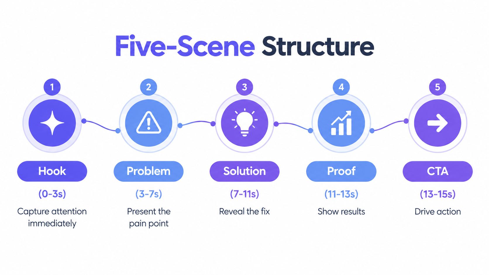
Those timings are practical, not decorative. In a muted feed, a viewer can register one image fast, read one short claim, and decide whether to keep watching. Cram two ideas into the same beat and both get weaker. That is why this structure works well for automated production too. Each scene maps cleanly to one landing-page claim, one visual instruction, and one exportable clip segment.
Practical rule: Every scene gets one visual idea and one text claim. If a scene needs two explanations, split the idea or remove one.
A weak opening says, “Meet our new platform for modern teams.” It asks the viewer to care before showing anything concrete. A stronger opening starts with the missed launch, the messy handoff, or the blank calendar, then shows the finished teaser or generated asset in the next beat. If you want a tighter first frame, this three-second hook guide helps pressure-test what the viewer understands before they decide to scroll.
Designing for the Muted Autoplay Feed
Muted autoplay is less a creative constraint than a production rule. If the first seconds do not carry meaning without sound, the script is weak for paid social, launch cutdowns, and automated URL-to-video workflows. Treat the script as a control system. Each scene should define what appears on screen, what text the viewer reads, and what remains clear if audio never plays.
Captions are the primary information channel in a muted feed. Plan caption blocks while writing, not after export. Keep each block to one idea, use readable contrast, and leave it on screen long enough to process before the next scene replaces it. This is not polish. It determines whether the viewer understands the product promise or just sees motion.
A useful silent-first script has four layers:
- Visual action: What changes on screen?
- On-screen claim: What must the viewer understand?
- Optional music bed: What sets pace without carrying meaning?
- Fallback meaning: What remains clear if motion, sound, or context is missed?
That four-layer setup matters even more when launch videos are generated from a product page. The script has to survive compression into short scenes, different aspect ratios, and varying placements. If you are setting constraints before writing, this launch video specifications guide helps define the format and visual requirements that shape scene copy.
Captions and subtitles are different jobs. Subtitles reproduce spoken dialogue. Captions also communicate meaningful non-speech information, such as a visible interface change or a relevant sound cue. If you're evaluating tools for caption workflows, this guide to best auto caption software offers useful terminology and selection criteria.
The common failure is message drift. Voice-over says one thing. On-screen text says another. Product animation demonstrates a third. In a 15-second asset, that confusion kills comprehension fast. Use the same claim across layers. If the text says “Launch videos from your product URL,” the visual should show the URL turning into a finished teaser, not a decorative dashboard that adds no proof.
Branding still matters, but value has to arrive first. Show the logo early if you want, or use product color and interface cues to establish identity. Just do not spend the opening frames on branding alone when the feed is already trying to scroll past you.
A Ready-to-Use Software Launch Template
A useful template should leave fewer decisions for production, not create more. Start with the landing page and extract one audience, one pain point, one product mechanism, one benefit, one proof signal, and one CTA. If the page doesn't support a claim, the script shouldn't either.
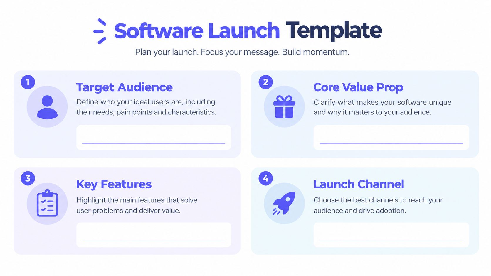
Use this fill-in structure:
Scene one and the hook
Visual: [Show the moment before the problem is solved]
Text: “[Audience], still [specific frustrating task]?”
Timing: 0 to 2 seconds
Avoid throat-clearing such as “We're excited to announce.” A software founder might write, “Still spending launch week turning product updates into social content?” That line identifies the audience and the friction immediately.
Scene two and the problem
Visual: [Show the bottleneck or failed workflow]
Text: “[Problem] makes [launch consequence] harder.”
Timing: 2 to 5 seconds
Keep the consequence concrete. “Manual video production slows every announcement” is clearer than “Marketing is challenging.” Don't introduce a second pain point just because the landing page includes one.
Scene three and the mechanism
Visual: [Show the product input, workflow, or interface state]
Text: “[Product] helps [audience] [perform action] by [mechanism].”
Timing: 5 to 10 seconds
The mechanism gives the claim credibility. “Paste a product URL and generate a short teaser” tells the viewer what happens. “Grow your launch faster” doesn't.
Scene four and the benefit
Visual: [Show the finished output or changed user state]
Text: “[Benefit] without [relevant friction].”
Timing: 10 to 13 seconds
Use one benefit. Don't stack speed, reach, awareness, and conversion in the same frame. For practical examples of creating TikTok product demos, focus on how the product action becomes a visual sequence rather than copying a generic social script.
Scene five and the CTA
Visual: [Show brand, product, and destination]
Text: “[Imperative CTA]”
Timing: 13 to 15 seconds
Choose one action. “Visit the product page” and “Start a free video” are different destinations. Multiple CTAs force the viewer to decide when the video should be making the decision easy.
Reject the draft if it contains unsupported proof, a late product reveal, or a CTA that asks the viewer to do two things. The product video script framework is a useful reference when you need to turn page messaging into scene-level production instructions.
Automating Production with ShipTeaser
The script is only useful if a founder can produce the asset without rebuilding a timeline for every launch. Manual editing creates a hidden tax: collecting screenshots, matching brand colors, resizing layouts, checking text, and exporting separate files for each placement.
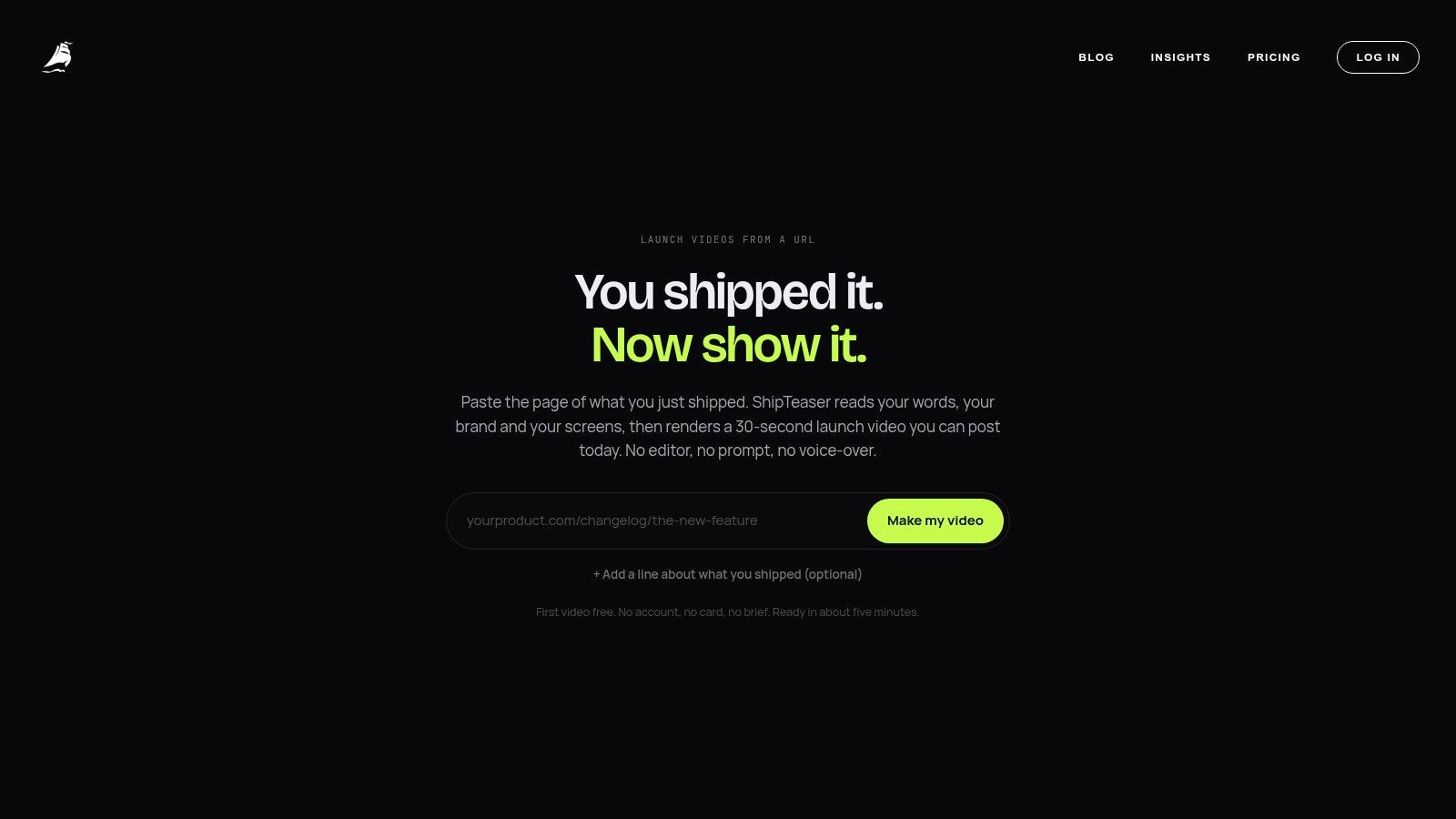
“ShipTeaser lets a founder paste a product URL and receive a 15-second, 1080p, silent motion-graphics teaser in about 2 minutes, ready to post.” The system uses the landing page as the source for copy, screenshots, and visible brand cues. The output follows five scenes, hook, problem, solution, proof, and CTA, and comes in 16:9, 1:1, and 9:16 ratios.
ShipTeaser doesn't provide AI avatars, voice-over, narration, screen recording, stock footage, a video editor timeline, dubbing, subtitles, translation, or clip trimming. “Silent” means no voice-over. An optional music bed can support pacing, but the message must remain understandable with sound off.
Production test: If the landing page can't support a precise claim, fix the page before generating the teaser. A URL-to-video workflow is only as reliable as its source material.
Different placements need different shapes. Vertical 9:16 suits full-screen short-video placements, while square 1:1 and horizontal 16:9 remain useful for feed, desktop, and in-stream contexts. Generating each ratio from the same scene plan is cleaner than cropping one horizontal export and discovering that the CTA or product interface has moved outside the safe area.
For founders who want a dedicated product launch video maker, ShipTeaser offers one free first video with no credit card. Ongoing plans are $99 per month for one video per week, $149 for two per week, and $199 for four per week. Treat the output as a repeatable launch asset, not as a replacement for a full product demo or a detailed onboarding video.
Measuring Script Performance Beyond Views
Views are the loosest metric in the stack. For a launch teaser, the script should act like a production control system. It sets the test, the audience promise, and the action that proves the video did its job. If none of that is defined before rendering, the result is just motion with a vanity report attached.
Run two variants with the same product, audience, format, and CTA. Change one variable only. In practice, that usually means the first scene. Test a problem-led hook against an outcome-led hook, then give each version its own UTM-tagged destination so clicks, sign-ups, and activation events stay separated.
Track the journey in stages
Measure the teaser as a sequence, not as a single number.
Start with the first two seconds. A 2-second hold rate shows whether the opening earned attention in a feed where people decide fast and often with sound off. Completed-view rate helps diagnose whether the scene order and on-screen wording stay clear to the end. Click-through rate shows whether the message created enough intent to visit. Landing-page action tells you whether the traffic was actually qualified.
That last step matters most. A script can produce strong retention and still fail if it attracts curiosity instead of fit.
Put the brand in the first two seconds, not the last. A logo appearing only in the final instant may arrive after the viewer has already decided whether to keep watching. Repetition helps too. Brand cues should appear early and again when the product mechanism or payoff is shown. Nielsen's analysis of memory in advertising is often cited on this point, but the production rule is simpler than the research summary. If people miss the first branded moment, they need another one before the CTA.
Interpret disagreement between metrics
Metric disagreement is where the useful diagnosis starts.
High retention with low clicks usually means the teaser is watchable but the benefit does not pull hard enough into the next step. The viewer understands the video, but not why they should act now. Tighten the promise or make the CTA more specific.
High early views with weak activation usually points to hook quality in the wrong direction. The opening gets attention from people outside the product's actual buyer set. Narrower hooks often reduce top-of-funnel volume and improve downstream behavior. For founders shipping software launches at speed, that trade-off is usually worth it. A smaller, cleaner audience gives better signal for the next script iteration.
Frequently Asked Questions
How long should a marketing script be for a launch teaser?
For a launch teaser, 15 seconds is enough if the script works like a production control system instead of a writing prompt. Use five timed scenes: hook from 0 to 2 seconds, problem from 2 to 5 seconds, solution and proof from 5 to 10 seconds, differentiated benefit from 10 to 13 seconds, and brand plus CTA from 13 to 15 seconds. Longer formats can work for entertainment-led content. A product teaser has a different job. It needs one clear message, tight pacing, and no wasted scene.
Should a silent teaser include music?
A silent teaser can include an optional music bed, but music mustn't carry the product explanation. The hook, problem, mechanism, proof, benefit, and CTA should remain understandable through motion and on-screen text when the viewer has sound turned off.
That standard matters even more when the video is generated from a product URL. If the script cannot survive without audio, the system has too much ambiguity and the final cut will drift.
What should the CTA say?
Use one short imperative CTA tied to the destination. “Try the product,” “Visit the launch page,” and “Join the waitlist” imply different actions, so choose the one that matches the landing page and the campaign goal.
How often should founders create new teaser variants?
Create variants when you have a clear hypothesis, not because a new format is available. Change one variable at a time, keep UTM destinations distinct, and judge retention together with downstream product activity. A weekly cadence is sustainable when the landing page remains the canonical source and each new release promotes a specific update, launch, or customer problem.
ShipTeaser turns a product URL into a 15-second, 1080p motion-graphics teaser with hook, problem, solution, proof, and CTA scenes in 16:9, 1:1, and 9:16 formats. Paste your launch page, generate the first video free with no credit card, and visit ShipTeaser to create a repeatable teaser workflow for your next software launch.