Your product is ready, the landing page is live, and launch day is already on the calendar. Then you notice the missing asset: there's no video to carry the announcement beyond a block of page copy and a static screenshot.
A product teaser video solves a narrower problem than a demo. It earns attention, identifies the product, shows one useful outcome, and sends the viewer to the next step. For an early-stage software founder, a focused 15-second teaser works best as the front of a funnel, not as the entire sales argument.
The 15-Second Problem Every Founder Hits Before Launch
Launch week creates a specific kind of pressure. The product works. The landing page explains the product. The announcement copy is drafted. Then the founder opens a blank video project and discovers that “make a quick video” means writing a script, finding visuals, designing scenes, choosing formats, editing, exporting, and checking every version on a phone.
The landing page often isn't the bottleneck anymore. The bottleneck is turning that page into a visual asset people can understand while scrolling. A page can wait for a reader to inspect the headline, scan the feature list, and study the screenshots. A feed video gets only a brief chance to earn attention.
I've shipped enough launch videos to take a firm position: a teaser isn't a creative open brief. It's a constrained engineering problem. You have 15 seconds, one primary audience, one job, and one next action. Those constraints remove the temptation to cram every feature into a miniature product tour.
A founder launching a workflow product, for example, shouldn't try to explain integrations, pricing, permissions, reporting, and onboarding in one clip. The teaser can show the old painful workflow, the product's simpler path, and a clear invitation to see the full product. That's enough for awareness. The landing page and follow-up content handle the rest.
Practical rule: If the viewer can't tell what changed, who it helps, or what to do next, the teaser is decoration.
The production gap is common enough that it deserves its own diagnosis. This breakdown of why launch videos fail is useful because it focuses attention on structure before visual polish. Your job isn't to make a cinematic object. Your job is to ship a compact entry point into the product story.
What a Product Teaser Video Actually Is
A product teaser video is a short motion-graphics clip that introduces a software product and moves a viewer toward a next step. It's built for quick consumption, usually with the assumption that the viewer may see it without activated sound.
That definition matters because founders often ask a teaser to do the work of three different assets. A teaser earns a stop and creates recognition. A demo explains how the product works. An explainer gives more context and handles objections. A teaser shouldn't become a screen recording, an avatar-led pitch, or a compressed sales presentation.
ShipTeaser's output makes the format concrete. You paste a product URL and receive a 15-second, 1080p, silent motion-graphics teaser in about 2 minutes, ready to download and post. “Silent” means there's no voice-over or narration. An optional music bed can add atmosphere, but the core message must work without spoken explanation.
The structure has five scenes:
- Hook: Create a reason to keep watching.
- Problem: Name the painful situation.
- Solution: Show what the product changes.
- Proof: Add one credible signal from the product or landing page.
- CTA: Tell the viewer what to do next.
The output comes in 16:9, 1:1, and 9:16 ratios. Those aren't cosmetic choices. They let one product story travel across desktop feeds, square placements, and mobile-first surfaces without forcing the founder to re-edit every version.
The format also excludes several things deliberately. ShipTeaser isn't an AI avatar system, a voice-over generator, a video editor, a timeline, a screen recorder, a stock-footage library, or a prompt-based text-to-video system. It doesn't provide dubbing, subtitles, translation, clip trimming, or a full manual post-production workflow. The URL supplies the source material, including visible copy, screenshots, and brand cues, while the output stays fixed and reviewable.
For a deeper distinction between formats, see this guide to product demo videos versus teasers. The useful test is simple: a teaser should make the next click feel worthwhile, not eliminate every question before the viewer reaches the page.
The Five-Scene Structure That Fits 15 Seconds
A launch teaser has fifteen seconds to do one job. Decide whether that job is awareness, understanding, or conversion before writing a frame. Awareness earns attention, understanding shows the product's change, and conversion sends a qualified viewer to the next step. Trying to do all three produces a crowded ad that does none well.
ShipTeaser's URL-to-output workflow supports this discipline. The source page supplies the product story, interface, and brand cues. The teaser turns that material into a short sequence with a clear job, rather than forcing every feature into the edit.
Hook from zero to three seconds
The hook stops the thumb. Open with the product, the painful outcome, or a statement that lets the target founder recognize the problem immediately.
For a launch analytics product, “Meet a better way to understand your launch” sounds like generic marketing. A crowded dashboard paired with “Your launch data is scattered” creates specific tension. The viewer understands the problem before seeing the solution.
Keep logos and abstract transitions out of the opening. If the first frame does not create recognition or curiosity, the viewer will not reach the product.
Problem from three to six seconds
Give the hook context with one short line and one visible condition. Show a founder copying data between tools, losing track of feedback, or delaying a release because the workflow is unclear.
The scene should trigger recognition. “That's exactly the part I hate” is the response you want. Vague frustration makes the product feel interchangeable, so show the repeated action, missing information, or stalled decision that creates the pressure.
Solution from six to ten seconds
Make this the visual center. Show the product completing one job, not a catalogue of capabilities.
A software teaser can show a URL entering a workflow and a branded teaser appearing as the output. That sequence communicates input, transformation, and result in seconds. It also makes the URL-to-output workflow concrete without explaining the whole product.
Short-form performance supports this focused approach. Concise instructional clips can hold attention effectively, while longer promotional material needs a stronger reason to continue. Use the fifteen seconds to demonstrate one meaningful change. A micro-demonstration gives the viewer evidence instead of another feature statement.
Proof from ten to thirteen seconds
Use one credible signal: a product screen, a visible result, a customer-approved statement, or a concrete claim already supported by the landing page. One proof point is enough. Several claims make the frame harder to read and reduce trust.
For a scheduling product, show a calendar filling with confirmed sessions. For a developer product, show a clean output screen. The proof must make the promised change visible. Keep unsupported numbers and broad claims out of this scene.
CTA from thirteen to fifteen seconds
End with one verb and one destination. “Try it at the site” gives the viewer a clear next step. “Learn more, join the waitlist, follow us, and book a demo” creates a decision problem at the moment attention is shortest.
Industry surveys consistently show short-form video as a widely adopted format, while a fifteen-second asset sits below the commonly selected longer short-form ranges. That difference is its advantage. A fifteen-second teaser cannot carry a full product argument, so assign it one job and send the viewer to a page that can finish the explanation.
Script, Visuals, and the Sound-Off Test
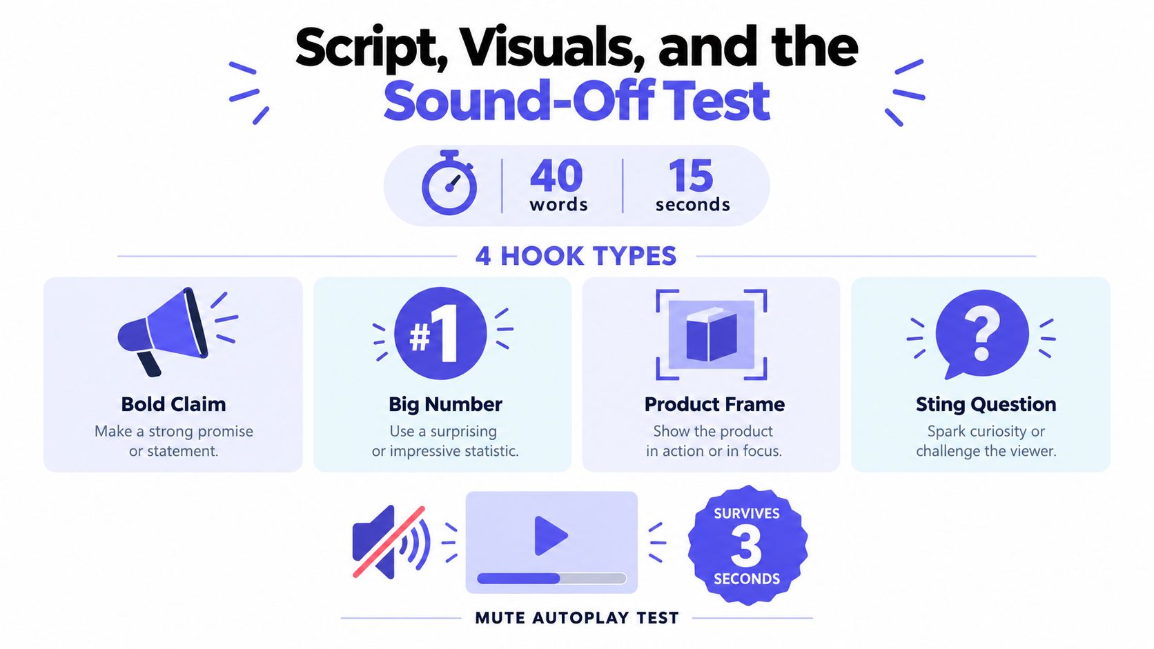
Write the script after choosing the one job. A 15-second teaser can support roughly 35 to 45 spoken words at a brisk but intelligible pace, but the words shouldn't carry the entire message. The visuals must show the change.
Start with a hook that survives muted autoplay:
- Bold claim: “Launch videos shouldn't take launch week.”
- Big number: Use a number only when the landing page supports it.
- Product in frame one: Put the interface or result on screen immediately.
- Sting question: “Still turning every release into a custom video project?”
Pick one type. Combining a question, a claim, and a statistic in the first scene produces noise. The viewer needs a clear entry point, not a writing sample.
Build visuals around one idea
Give each scene one visual idea and one short text layer. Don't stack a headline, subheading, feature list, and disclaimer into the same frame. If the viewer has to read a paragraph, the scene has already failed.
For vertical crops, keep the important text and product UI inside a central safe zone. Use large, high-contrast typography. Avoid placing key information near the edges where platform controls or reframing can cover it. Generate responsive compositions rather than just cutting the sides off a horizontal master.
Founders who want to study the production side can use this practical resource on scripting and shooting product videos. The useful principle is to plan the visual evidence before polishing the words. A line such as “turn your page into launch content” becomes stronger when the viewer sees a page-derived visual become a finished asset.
Ship the sound-off test
Mute the file. Watch it on a phone. Stop after the opening scene and ask three questions:
- Can I identify the product category?
- Can I name the problem?
- Do I know what action comes next?
If the answer is no, revise the visual sequence. Don't solve a comprehension problem by adding more narration. The optional music bed can create pace and mood, but the hook, problem, solution, proof, and CTA must remain understandable without voice-over.
Use the same discipline when reviewing captions or on-screen text. Product names, acronyms, and interface labels must be accurate. Text must remain readable at mobile size. A sound-off viewer isn't a special case. Feed playback often begins muted, and many viewers choose not to activate sound.
Plan at least two variants before launch. Keep the solution and CTA stable, then change the hook or problem framing. One version might lead with the founder's pain. Another might lead with the product result. You're not creating duplicates. You're testing which entry point earns attention from the same audience.
For more guidance on writing the message before production, use this product video script framework.
Why 15 Seconds Is Not Always the Right Answer
A founder launches a product with a sharp 15-second teaser. It earns attention, but viewers still ask what the product does, how it works, and whether it fits their workflow. That outcome is not a failed video. It means the teaser was assigned the wrong job.
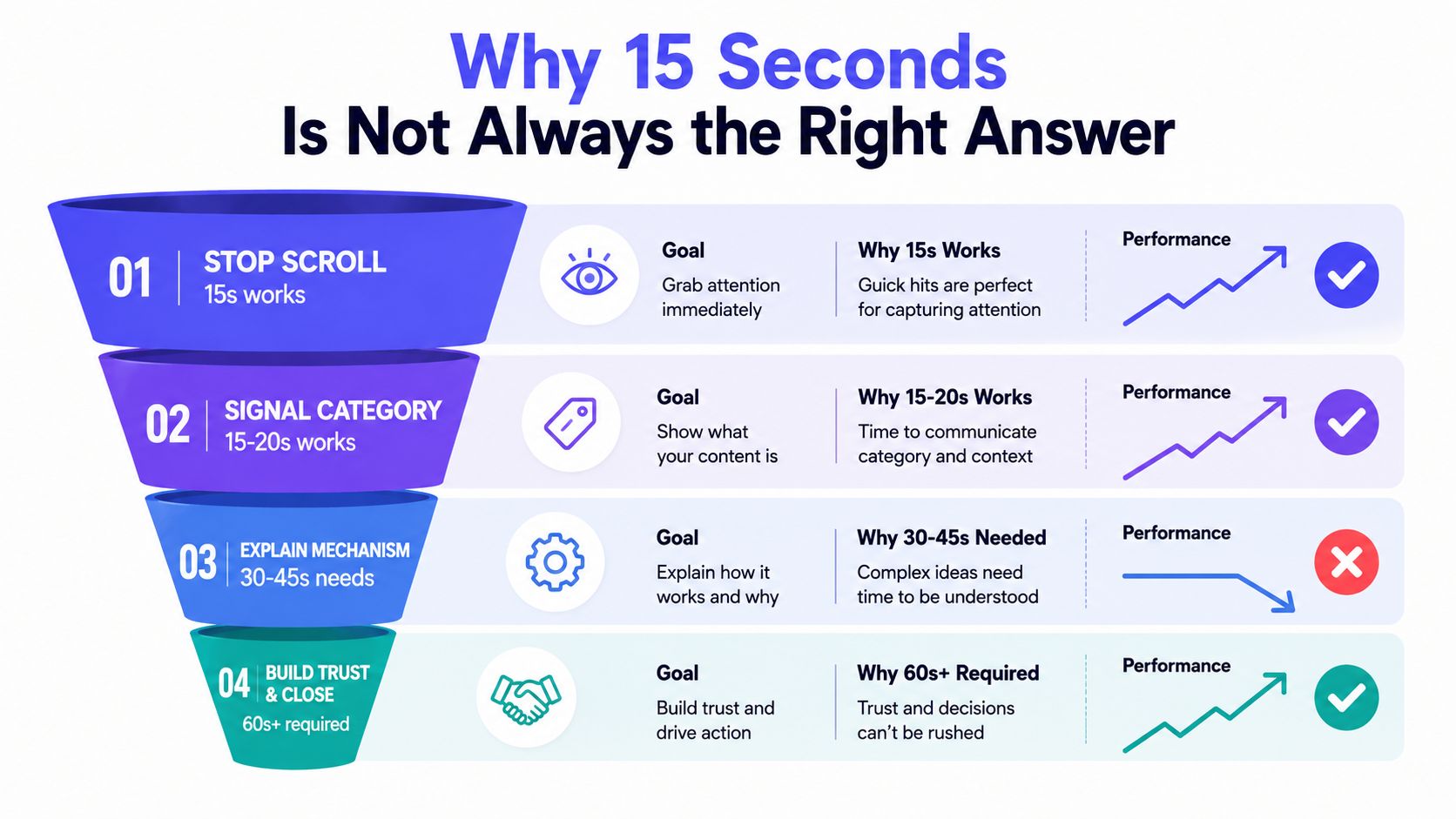
A fixed 15-second format works best for awareness. It can expose a problem, signal a product category, or earn the next click. It rarely explains a mechanism, proves reliability, or closes a considered purchase on its own.
Short-form video ranks strongly for ROI, while viewers often prefer longer clips when learning about a product. The practical distinction is simple: match duration to the viewer's question. ShipTeaser's URL-to-output workflow supports that decision by turning one product page into assets built for different funnel stages, rather than forcing every message into one file.
Use 15 seconds to earn the next step
Choose the short format when the viewer needs a reason to care, not a complete lesson.
- Launch awareness: Show the problem and signal the category.
- Announcement distribution: Give the launch one visual asset that works in a feed.
- Warm audience reactivation: Remind existing followers what changed and where to look.
- Feature awareness: Introduce one capability before sending viewers to the full page.
The teaser is the front of the funnel. Its job is to hand the viewer to an asset that answers the next question.
Use a sequence when understanding matters
For a complex product, build the funnel in stages:
- Stop the scroll: Use the 15-second teaser to establish relevance.
- Explain the mechanism: Follow with a 30 to 60 second feature demo.
- Build trust and convert: Send interested viewers to a longer walkthrough, product page, or signup flow.
A developer platform may show the result first, then the setup, while the landing page handles documentation, pricing, and objections. A workflow product can lead with the before-and-after, then show the complete path in an in-app recording.
Give each asset one job. Awareness earns attention, understanding removes confusion, and conversion addresses proof and risk. A teaser that creates the right next question is doing its job.
The Three Ratios and Where Each One Earns Its Keep
Treat 16:9, 1:1, and 9:16 as distribution compositions, not automatic crops. One source story can support all three, but each ratio needs its own text placement, product framing, and visual emphasis. Choose the format according to the teaser's job: earn awareness, clarify the product, or drive the next click.
9:16 for mobile-first attention
Use vertical for full-screen mobile feeds and other short-form placements. For vertical placements, use 9:16 video at 1080×1920 pixels alongside square and wide variants, following the video asset specifications. Adding vertical assets to a video campaign has been shown to increase short-form view-through rate by more than 40% compared with wide-only ad groups.
The practical takeaway is simple: vertical composition uses the phone screen properly. Keep the product UI large, place key text inside the central safe zone, and remove wide interface details that become unreadable in a portrait frame. Build this version for attention first. Do not force it to explain every feature.
1:1 for compact feed real estate
Square earns its place in dense, balanced feeds. Horizontal video can look undersized in a narrow column, while vertical may take more space than the surrounding content supports.
Use square for a product card, a short announcement, or a feed post where the video sits beside other compact content. Center the main interface and avoid long horizontal dashboards. The square cut should communicate one visible result, not preserve every edge of the desktop composition.
16:9 for desktop and the master composition
Horizontal remains the sensible choice for desktop placements, launch pages, and widescreen viewing. Choose it when the product interface needs horizontal room or when the teaser sits beside written launch information.
ShipTeaser turns a landing-page-derived story into all three ratios. That gives founders a predictable output set without asking an editor to reframe each version manually. Use one shared scene graph with responsive positioning, then tune each composition for its placement. The wide file is the master only when the distribution plan starts on desktop. A funnel-led workflow chooses the ratio by job, not by habit.
Shipping a Teaser Across Launch Day and the Week After
Set the distribution plan before rendering. Choose one job for the teaser, then publish its strongest cut where your existing audience already pays attention. Awareness needs reach. Understanding needs a clear product moment. Conversion needs one direct next step. A 15-second file cannot do all three well.
Release a second format later that day, then use the third the next morning. ShipTeaser turns a product URL into these planned outputs, so the workflow starts with the launch page and ends with channel-ready cuts rather than a single file forced into every placement.
The week after launch should reuse the idea without reposting the exact video. Convert one scene into a static post, publish the problem as a short text update, or show the product result with a link to the launch page. A scheduling tool for Instagram Stories can organize supporting reminders around the primary announcement.
At the end of the first week, publish a second teaser with a different hook. Keep the solution recognizable so the campaign builds memory, then change the entry point so the test measures a new message. Use the post-launch week plan to extend the launch conversation instead of repeating launch day.
Video belongs in the wider paid and organic content system. Industry reports show U.S. internet advertising revenue exceeded $250 billion in 2024, with digital video accounting for roughly one dollar in every four spent online and growing near 19% year over year. Those totals describe the market, not the result of one teaser. They support a repeatable workflow for testing launch messages across channels.
ShipTeaser's plans map to different publishing rhythms: $99 per month for one video per week, $149 for two per week, and $199 for four per week. Choose a pace your launch calendar can fill with distinct messages. Output without message variety creates repetition, not a stronger funnel.
Pre-Render Checklist and FAQ
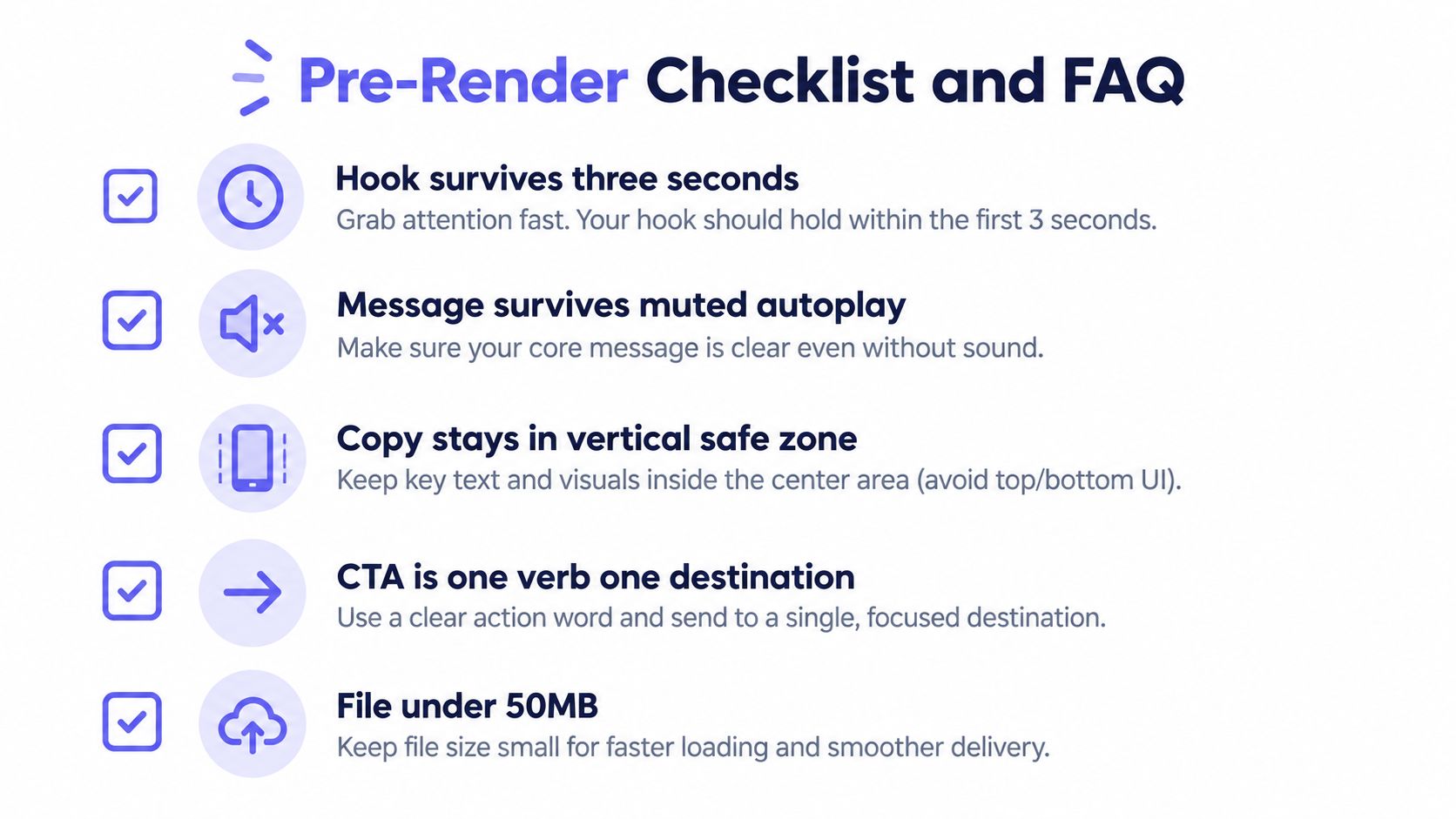
Run this check before you render:
- Hook: Does the opening survive the first three seconds?
- Sound-off: Can a muted viewer understand the product and next step?
- Safe zone: Does the copy remain readable in the vertical composition?
- CTA: Is there one verb and one destination?
- Brand fidelity: Do the colors, screenshots, and language come from the landing page?
- Variant: Is at least one alternate hook ready?
Does a product teaser video need sound?
A product teaser video doesn't need voice-over or narration. The visual sequence should explain the hook, problem, solution, proof, and CTA without activated sound, while an optional music bed can add atmosphere.
Is ShipTeaser's first video free?
ShipTeaser's first video is free, and no credit card is required. A founder can paste a product URL and evaluate the resulting 15-second teaser before choosing a recurring plan.
Is 15 seconds enough to explain a complex software product?
Fifteen seconds is enough to create awareness and direct a viewer to the next step. It usually isn't enough to explain a complex mechanism, answer objections, and close a considered purchase, so pair the teaser with a longer demo or walkthrough.
Paste your product URL into ShipTeaser to generate a 15-second, 1080p silent motion-graphics teaser with hook, problem, solution, proof, and CTA scenes. Start with the free first video, test two different hooks, and ship the version that makes the next step obvious.