Most SaaS landing page advice starts with colors, spacing, and polished screenshots. That's backwards. A beautiful page with a vague promise still loses the visitor, while a plain page with sharp message-market fit can earn the next click.
SaaS landing page best practices start with one clear buyer outcome, one obvious action, fast performance, and proof placed where doubt appears. Dynamic product visuals can strengthen that message, especially when a short teaser works on both the landing page and muted social feeds.
Where SaaS Conversion Rates Actually Stand
A polished SaaS landing page can still convert poorly. Unbounce's benchmark reports a 3.8% median conversion rate for SaaS landing pages, compared with 6.6% across all industries, putting SaaS pages 42% below that broader benchmark (Unbounce's SaaS conversion benchmark).
Use that gap to audit the message before the design. A qualified founder should identify the target audience, urgent problem, promised outcome, and next action without decoding the page. If the visitor needs a guided tour to understand the offer, the copy is failing.
Variation within SaaS reinforces the point. Within the same benchmark, hardware pages converted at 4.1%, while data and infrastructure pages converted at 3.3%. Category alone does not determine performance. Message-market fit and visitor intent matter as much as presentation, especially when the page also needs to support short product videos for social distribution.
Build for one outcome
A landing page should sell one high-intent outcome, not explain the entire company. Choose the primary action, such as starting a trial, requesting access, or booking a product conversation. Shape the page and its visual assets around that decision.
Use this test:
- Audience: Name the specific person arriving on the page.
- Problem: State the costly or frustrating task they need to solve.
- Outcome: Describe what they can do after adopting the product.
- Action: Give them one logical next step.
Dynamic, automated teasers should reinforce the same promise. A video that looks impressive but targets a different use case creates more confusion, not demand. Generate variations for the audience and channel, then keep the landing-page version aligned with the headline and CTA.
Review the page with these actionable landing page CRO strategies, then apply a consistent conversion rate improvement workflow to test message, visuals, and action.
Practical rule: Fix the promise before you fix the pixels.
A page aimed at everyone produces soft copy, scattered CTAs, and visuals with no clear job. A narrower page gives the right visitor a reason to continue and gives every teaser a message worth distributing.
Writing Outcome-Driven Headlines and CTAs
Your headline should filter for buyers, not greet everyone. Feature-led copy attracts visitors who want to inspect functionality. Outcome-led copy attracts people who want a specific result.
Use this formula:
Help [specific audience] achieve [specific outcome] without [familiar pain].
“Launch product teasers from your landing page without editing video” gives a solo builder a clear audience, result, and removed task. It also creates a message that automated video variations can repeat across social channels. Keep the teaser promise identical to the page promise. A polished video aimed at another use case will weaken message-market fit.
A SaaS page audit recommends headlines built around buyer outcomes, relevant testimonials near the CTA, one conversion action, and top-of-funnel forms limited to one or two fields (Stackmatix's SaaS landing page examples). Apply that advice to the first screen before polishing layout details.
Make the CTA the obvious next move
Choose one primary action and repeat its wording across the page. “Start free trial,” “Book a demo,” “Subscribe,” and “Download the guide” are separate decisions, not flexible options. Presenting them together makes the visitor choose your funnel for you.
A conversion analytics guide recommends one or two main actions, placing a CTA in the hero or sticky header, and avoiding competing choices (Mouseflow's SaaS CTA guidance). For an early-stage product, select the simplest action your sales process can support.
Match the button to the commitment:
- Low friction: “Try the product”
- Product-led signup: “Start free”
- Access request: “Request access”
- Founder-led sales: “Book a product call”
State conditions beside the button. If a trial needs a card, say so. If it does not, make that visible. ShipTeaser's three-second hook guidance reinforces the same rule: the opening message must earn attention before visitors inspect details.
Use the subheading to resolve the headline's ambiguity. Name the audience, required input, or first workflow step. Keep the opening screen easy to understand, then generate teaser variations that preserve its promise for each social channel.
Page Speed as a Primary Conversion Lever
A slow landing page can erase a strong message before visitors see it. Fix speed before adding polish, animation, or more copy.
Portent's site speed analysis reported conversion rates around 40% for pages loading in 1 second, about 34% at 2 seconds, and about 29% at 3 seconds, with the lowest level in its study at 6 seconds. Its headline finding was that a 1-second site converted roughly 3 times better than a 5-second site.
These figures are not a forecast for your SaaS product. They set a clear priority. Every image, animation, tracking script, and embedded component must earn its loading cost.
Cut weight before adding polish
Start with mobile. Test the first meaningful content, hero visual, CTA, and form. A page that looks excellent after loading still fails if visitors wait through blank space.
Use this order:
- Remove visuals that repeat the copy.
- Compress hero images and serve only the dimensions the layout needs.
- Delay nonessential scripts until primary content appears.
- Replace heavy embeds with lightweight previews where possible.
- Check the page on a real mobile connection, not only a fast desktop network.
Then pair that test with guidance on using landing page video without sacrificing load time. A teaser should sharpen message-market fit and give your social channels reusable content, not slow the page before the visitor reaches the CTA.
An observational study summarized by SEO Summer associated a 0.1-second mobile performance improvement with higher retail and travel conversion rates across 37 brand sites and more than 30 million mobile sessions monitored over 30 days in late 2019. Those categories are not SaaS, so do not use the findings as a SaaS forecast. Use them as evidence that small delays can affect commercial journeys.
For the technical checklist, review the Web Mage speed guide. Keep a visual only when it improves comprehension enough to justify its cost.
A 2026 roundup reports that pages loading under 1.5 seconds converted 2.4 times better than pages taking 4 seconds. Treat that claim as directional. Treat fast loading as required.
Replacing Static Screenshots with Automated Teasers
Static screenshots show an interface. They rarely show the outcome, the workflow, or the reason a visitor should care. If your product value depends on sequence, replace the still image with a short, focused teaser.
A workflow, dashboard change, automation, or before-and-after state becomes easier to understand in motion. Keep the visual subordinate to the promise. The teaser should reinforce the headline and CTA, not create a second message.
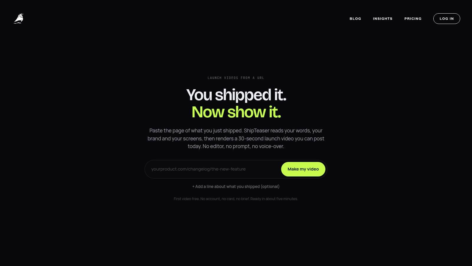
ShipTeaser accepts a product URL and produces a 15-second, 1080p, silent motion-graphics teaser in about 2 minutes. Its five-scene workflow covers hook, problem, solution, proof, and CTA. “Silent” means there is no voice-over or narration. An optional music bed remains available.
Choose the format based on the visitor's question. A technical evaluator may need a readable interface image. A cold visitor arriving from a founder-led social post may need a rapid explanation before exploring the page.
- Static screenshot: Use it when interface detail provides the proof.
- Looping motion: Use it when a product state changes quickly.
- Scripted teaser: Use it when visitors need a compact story before deciding whether to continue.
- Interactive demonstration: Use it when value depends on trying a workflow.
Short product-led motion and interactive demonstrations work well for complex offers because they explain sequence faster than text alone. Unbounce's SaaS landing page guidance also covers this role for video. Format is not the strategy. Match the asset to funnel stage, traffic source, and product complexity.
Place the teaser beside one clear headline and one CTA. Keep the product story above decorative brand content. Then reuse the asset in launch posts, founder updates, and product announcement channels. A landing-page asset should support acquisition after the visitor leaves the page.
This approach suits a solo builder who needs repeatable content instead of a video production project. ShipTeaser outputs 16:9, 1:1, and 9:16, allowing one source page to support the landing page and several social placements. The first video is free and requires no credit card. Plans are $99 per month for 1 video per week, $149 for 2 per week, and $199 for 4 per week.
The teaser still needs a working product and credible proof behind it. Use it as a compact explanation layer after the page has a focused message. For the format decision, read this guide to product demo video versus teaser.
Here's a short example of how a product-led teaser can support the page:
Strategic Placement of Trust Signals and Proof
Trust signals convert only when they answer the objection blocking the next click. A logo strip far below the CTA cannot resolve uncertainty at the moment of action.
Place proof beside the primary CTA. Use a testimonial that names the workflow change directly, not vague praise. It should show why a similar founder chose the product, what improved, or which concern disappeared. Place a testimonial that names the workflow change directly beside the primary CTA, not in a distant logo strip.
Match proof to the objection
Choose evidence for the question the visitor is asking:
- Unclear product value: Show a short workflow or automated product teaser.
- Fear of wasted setup time: Explain the first input and the first useful output.
- Concern about fit: Use a testimonial from a similar company or role.
- Concern about reliability: State the support, access, or data-handling details you can verify.
- Concern about commitment: Make pricing, trial terms, and cancellation conditions easy to find.
The placement matters. Visitors may understand the product before they trust the promise. Put relevant proof beside the action, then use the same specific message in launch posts, founder updates, and social video derived from the page. Proof should reinforce message-market fit wherever the prospect encounters it.
Never invent proof to fill an empty section. Use transparent evidence instead: a real interface, a clear workflow explanation, a founder demonstration, or a public changelog. Label every item accurately. If customers have not supplied quotes, show what the product does and what the visitor can expect after the first input.
Keep proof specific
“Easy to use” says almost nothing. “I pasted our launch page and had a teaser ready for review” tells the reader what happened. Specific proof helps a prospect judge whether the same outcome applies to their workflow.
Place one strong proof element near the hero CTA. Add deeper evidence lower on the page for visitors who need more detail. Keep every example tied to the headline. If the page promises faster launch communication, the proof should show that improvement, not praise an unrelated feature. A clear testimonial can support both the landing-page conversion and the social content that brings the next visitor in.
Frequently Asked Questions
How long should a SaaS landing page video be?
Use the shortest video that communicates the product clearly. Guidance for SaaS landing pages places hero videos within a broad 10 to 90 seconds range (Userpilot's SaaS landing page guidance). Set the length from the message, not a default. If the teaser cannot state the problem, product response, and next action in 15 seconds, fix the script before making the video longer.
How many form fields should a trial form use?
Use the fewest fields needed to start the product experience. For a top-of-funnel trial, keep the form to one to two fields, as noted in the earlier SaaS landing page audit (Stackmatix's SaaS landing page examples). Ask for qualification details after the visitor receives value, unless your sales process requires them before access.
Where should the primary CTA appear?
Put the primary CTA in the hero or a sticky header. Repeat the same action after the main product explanation and proof. Keep secondary resources visually quieter, so research options do not compete with the intended conversion.
What should founders test first?
Test the message before button color. Start with the outcome headline, supporting explanation, CTA wording, hero visual, and form friction. Change one meaningful variable at a time. Judge the result by the conversion action that matters to the business.
Should every SaaS page use video?
No. Use video when motion explains product behavior or a workflow faster than a screenshot. Use a static visual when interface detail provides the proof. Remove any asset that slows the page without improving comprehension.
Paste your product URL into ShipTeaser to generate a silent teaser for web and social publishing. Use one focused landing page message as both a conversion asset and a reusable social content source. Start with the free first video, then visit ShipTeaser.