Your Facebook cover looks perfect on a desktop preview, then the mobile version cuts off the headline, product screenshot, or logo. That happens because Facebook doesn't display the same cover area on every device.
Introduction That Answers the Sizing Question Directly
A launch cover can look polished on desktop and fail on a phone. The headline sits near the edge, the product shot fills the opposite side, and mobile cropping removes both. Resizing the same file again will not repair that layout.
Start with the commonly recommended 851 × 315 pixel upload canvas. Facebook displays the cover at about 820 × 312 pixels on desktop and 640 × 360 pixels on smartphones. Treat those figures as different viewing frames, not one fixed rectangle. Keep the headline, logo, product shot, and CTA inside a centered safe zone so they survive the narrower mobile crop. ContentStudio's Facebook cover photo guide documents these display dimensions and the recommended upload size.
Set a wide canvas, lock the image proportions, and crop to roughly a 2.7:1 aspect ratio. Keep the main message and product visual near the center. Use the outer edges for background color, texture, or decorative bleed. Do not stretch the image to fill empty space. Distortion makes product interfaces and logos look careless.
A reliable workflow separates canvas size from content survival. Set the geometry first. Reposition every high-value element into the center safe zone. Export only after checking the composition in desktop and phone previews, then compress the file for faster loading.
This approach works for a launch announcement, a waitlist page, or a founder profile. It protects readable headlines and recognizable product shots without forcing another design pass.
Exact Facebook Cover Dimensions and Safe Zones Explained
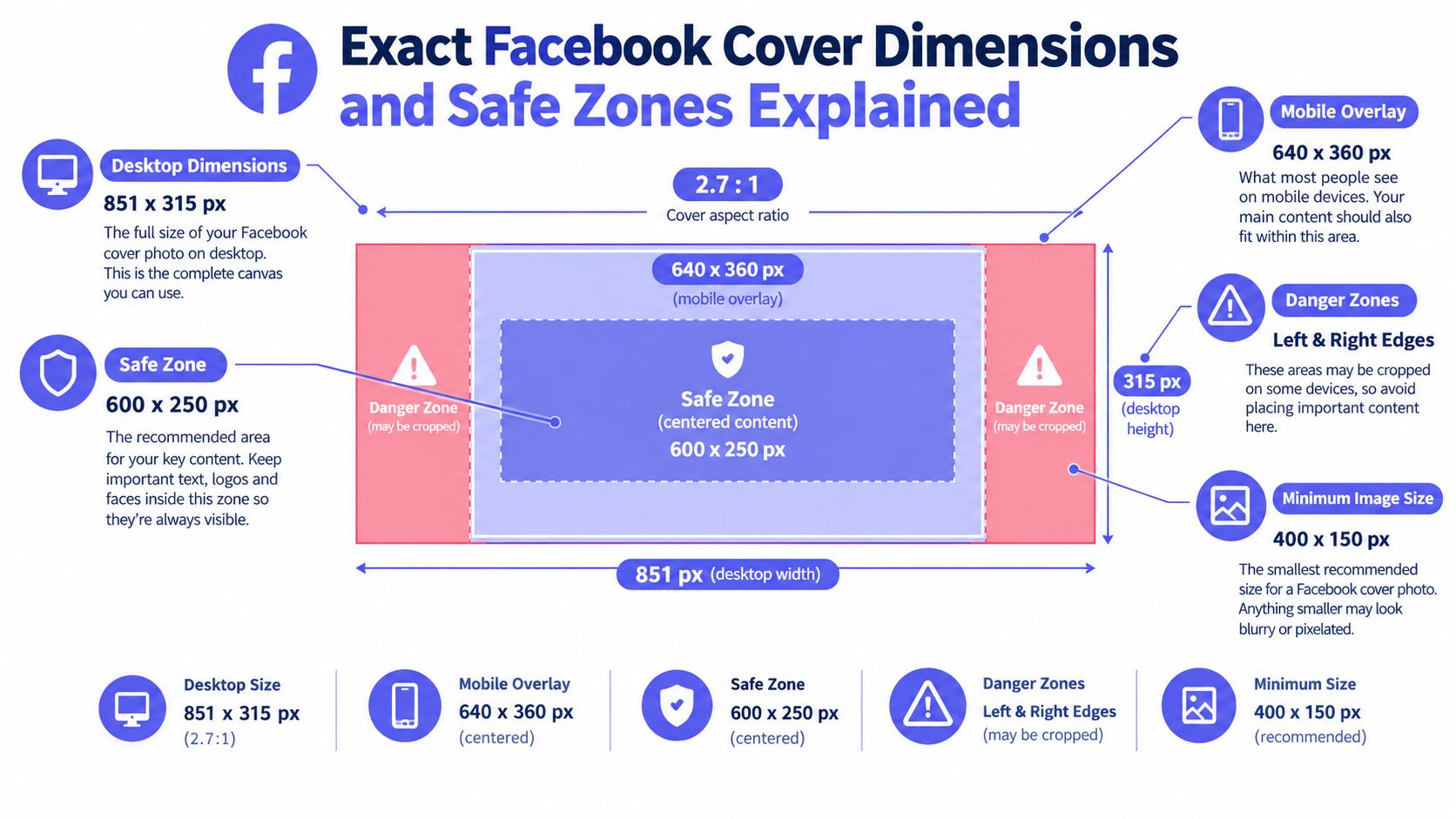
A Facebook cover can meet the upload requirement and still fail on a phone. The commonly recommended canvas is 851 × 315 pixels. Facebook shows it at about 820 × 312 pixels on desktop and 640 × 360 pixels on smartphones. Design for both viewing frames, not one fixed rectangle. Keep the headline, logo, product shot, and CTA inside a centered safe zone.
The cover ratio is roughly 2.7:1. A square product screenshot needs a deliberate crop, a wider composition, or a smaller central placement. Stretching it will warp interface panels, faces, and logos. Use the outer edges for background color, texture, and decorative bleed. Keep meaning away from those edges.
Use 400 × 150 pixels only as a minimum reference, never as your design target. A small source can turn soft when enlarged, especially around thin interface text, fine logos, and crisp product edges. Start with a larger source whenever possible, then check readability at phone size.
Build around the center
Keep the main message within approximately the middle 70 percent horizontally. Use this placement rule:
- Put the headline near the center.
- Keep the logo beside the headline or central product visual.
- Move decorative shapes and background imagery toward the edges.
- Leave the lower-left area quiet because the profile picture can cover it.
Treat the left and right edges as bleed. Never place a required word, product detail, or CTA there. For layout references, templates for social posts offer centered compositions to study without copying a specific design.
Check the cover on desktop and phone previews before export. A headline that survives the mobile crop and a product shot that remains recognizable matter more than filling every pixel. Teams preparing the same launch across channels can also review video format choices for Instagram before adapting the announcement to a feed visual or vertical video.
How to Resize Your Picture Without Stretching or Blurring
The safest workflow preserves the original image ratio first, then crops the canvas around the subject. Don't drag the sides until the image fills the banner. That creates stretched faces, warped interface panels, and rounded logos that look slightly wrong even when the problem is hard to identify.
Browser workflow
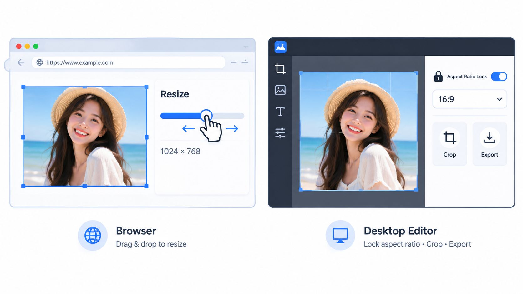
Use any reputable browser-based image resizer with a custom canvas and crop controls. Follow this sequence:
- Open a custom design at 1640 × 624 pixels for a higher-resolution working file, or use 851 × 315 pixels when you need the standard upload canvas.
- Import the source picture.
- Turn on the lock or aspect-ratio control.
- Scale the image until the product or subject has the right visual weight.
- Crop the composition to the wide cover ratio instead of squeezing the source.
- Add a guide for the centered 640 × 360 pixel mobile-safe area.
- Move all meaningful text and product details inside that guide.
- Export a JPG for photographic or mixed artwork.
The high-resolution route gives you more room to position a screenshot cleanly before compression. It isn't a license to add tiny text. Mobile still decides whether the message works.
For founders working with generated artwork, this guide to resize AI-generated graphics is a useful reference for preserving edges and proportions during enlargement.
Desktop editor workflow
A desktop photo editor gives you more control over cropping and sharpness:
- Create a new document at 1640 × 624 pixels.
- Place the source as a separate layer.
- Scale from a corner with the proportions locked.
- Use a mask or crop tool to remove excess sides.
- Add temporary guides for the mobile-safe region.
- Keep the headline and product image centered.
- Flatten a copy only after checking the layout.
- Export as JPG and inspect the compressed result at phone size.
Don't sharpen a blurry source until it looks crisp on your monitor. Excess sharpening creates halos around letters and interface edges, which Facebook compression can make worse. Fix the source scale and composition first.
Preview both frames before publishing. A desktop check catches awkward horizontal balance. A phone check catches the failure that matters most, missing words and disappearing product details.
Export Settings That Keep Covers Sharp and Fast Loading
A cover can look perfect in your editor and fail after upload. Facebook recompresses the file, while mobile cropping removes outer content. Set the export around the center safe zone, then inspect the result at phone size.
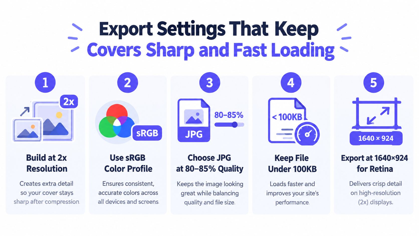
Build on a 1640 × 624 pixel canvas so the headline, logo, and product image retain detail during reduction. Test the centered 640 × 360 pixel mobile-safe area before exporting. Anything outside that region is supporting artwork, not mission-critical content. Keep the final JPG under 100 KB when the design remains readable, because a lighter file loads faster and leaves less compression work for the platform.
Choose the format by the artwork
Use JPG for photographs, gradients, and product scenes. Use PNG for crisp flat graphics or transparency during the working process, then check whether the exported file is too heavy.
A launch cover with a headline needs readable letters more than decorative texture. Compress the background first. Reduce noise and simplify shadows. Keep the center message clean.
Export rule: If the headline disappears in a narrow phone preview, changing the file format will not fix the layout.
Set the color profile to sRGB when your editor offers it. Export a JPG at the quality level your workflow requires, then inspect the actual file instead of trusting the quality slider. Thin text, small logos, and one-pixel borders reveal compression damage first.
Check the cover on both desktop and phone before publishing. The phone preview decides whether the headline and product shot survive the crop. The launch video specifications guide can help when adapting the same product message to video. Match the message, not the canvas. A cover communicates immediately, while a teaser unfolds over time.
Placement Tips to Keep Focal Points Safe on Every Device
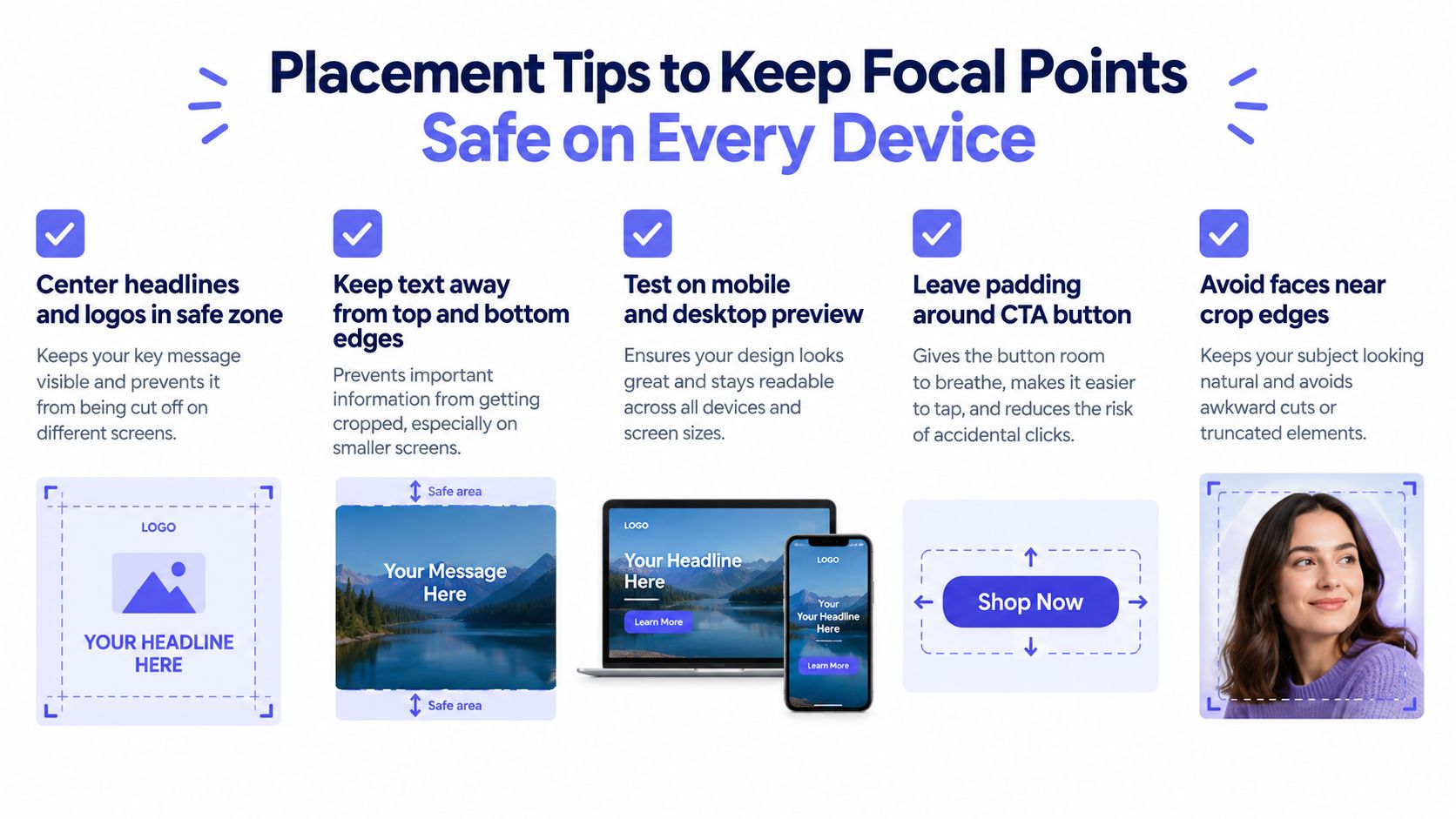
Resizing can't rescue a layout that asks the device to show content outside its reliable center. Design the cover as if the phone will remove the outer sides, because that is the failure mode founders notice after publishing.
Put the product name, one clear promise, and the strongest product visual in the center. Keep supporting shapes, abstract gradients, and background screenshots near the edges. The lower-left corner deserves extra caution because the profile picture can cover content there.
Use a survival checklist
For a text-heavy cover:
- Center the headline: Keep the main promise inside the central safe area.
- Limit the message: Remove secondary copy that becomes unreadable on a phone.
- Protect the CTA: Leave padding around buttons or action phrases.
- Enlarge the logo: A tiny mark loses identity after crop and compression.
For an image-led cover:
- Center the subject: Place the product screenshot or interface preview where both frames overlap.
- Move faces inward: Faces near the edges are vulnerable to mobile cropping.
- Simplify the background: Busy edge detail creates noise after compression.
- Repeat critical context centrally: If a launch date or product category matters, include it near the central visual instead of hiding it in a corner.
Design decision: Move, remove, or duplicate any element that matters. Don't leave important information at the crop boundary and hope the preview behaves.
Founders building a repeatable publishing habit can use this practical guide to create social media content without treating every cover as a fresh design problem. A reusable central layout is more valuable than a clever edge treatment.
For product-led visual systems, on-brand video without a designer offers a related way to keep launch messaging consistent across assets.
Common Resizing Mistakes and Quick Fixes
Most bad Facebook covers fail for one of four reasons. Each has a visible symptom and a fast correction.
The image looks stretched. The editor changed width and height independently. Turn on aspect locking, then crop excess content instead of forcing the full source into the banner.
The image looks blurry. The source was too small and got enlarged. Start with a larger original, simplify fine details, or use a clean background behind the product visual. Sharpening won't recreate missing detail.
The headline looks soft. Compression damaged thin letters or the export was already too small. Increase the working resolution, use heavier type, remove unnecessary copy, and check the compressed JPG at phone size.
The product shot disappears. The subject sits outside the center-safe area. Move the screenshot inward and use the sides for nonessential background only.
A final check should happen before Facebook handles the file. Open the export on a desktop preview and a smartphone preview. Confirm the headline, logo, product image, and CTA remain understandable without zooming.
Founders who need more launch assets can review best practices for video marketing, but don't let extra formats distract from the cover's core job. One clear message beats a crowded banner.
FAQ
What should I do if the original picture is too small?
A small source picture should not be enlarged blindly. Use a clean background, crop less aggressively, simplify the composition, or replace the source with a higher-resolution product image before building the cover.
Should a text-heavy Facebook cover use JPG or PNG?
A text-heavy cover should use the format that preserves readable edges after compression. JPG is practical for mixed artwork and photos, while PNG can suit crisp graphic elements, but the final file still needs a mobile readability check and a file-weight check.
How can I update a campaign cover without redesigning everything?
Build a reusable wide template with a fixed centered safe zone. Keep the logo, headline position, product visual area, and background treatment consistent, then swap only the campaign-specific message or screenshot.
What matters more, perfect dimensions or safe placement?
Safe placement matters more after the canvas is correct. The recommended dimensions prevent a distorted frame, but only a centered composition protects the message from desktop and mobile crop differences.
ShipTeaser turns a product URL into a ready-to-post 15-second, 1080p, silent motion-graphics teaser in about 2 minutes, with hook, problem, solution, proof, and CTA scenes in 16:9, 1:1, and 9:16 formats. Your first video is free with no credit card, then plans are $99 per month for 1 video per week, $149 for 2 per week, or $199 for 4 per week. Visit ShipTeaser and turn your next launch page into a focused product teaser.