You have a product page that's nearly finished and a list of a few hundred people who asked to hear from you. You've typed "we're live" four times, deleted it four times, and started scrolling other companies' launches looking for a shape to copy. The shape is the problem, not the words.
A product launch email template is a fixed order of parts, subject line through call to action, that keeps the announcement under 150 words and points at exactly one action. The template works because a reader decides in the first two lines whether the message is about them, so the problem comes before the product and the proof comes before the ask. Send it as the middle message of a three- to four-email sequence with stop conditions, and judge the result on clicks and signups rather than opens.
The Product Launch Email Template, Part by Part
Seven parts, one fixed order, one action. A launch email fails when it reads like the builder's diary: a greeting, a paragraph about how long the build took, a feature list, three links, a thank you. Readers scan that shape, find nothing addressed to them, and leave.
The template fixes the order before you write a word: subject line, preview text, opening problem line, announcement, one proof point, one call to action, and an optional P.S. Each part carries one job and one length limit, and the whole email lands under 150 words. Here it is, filled in for a fictional invoicing product called Tidyboard.
| Part | What to write | Example | Length limit |
|---|---|---|---|
| Subject line | The outcome, with a time or number if you have one | Tidyboard now sends invoices in 20 seconds | Under 45 characters |
| Preview text | The second benefit, not a repeat of the subject | Built for solo founders who skip the spreadsheet | Under 90 characters |
| Opening line | The problem the reader already has | Chasing invoices eats the hours you meant for building | One sentence |
| Announcement | What launched and who it is for | Tidyboard is live for solo founders who bill clients by hand | One or two sentences |
| Proof | One number, quote or screenshot | Beta users sent their first invoice in under a day | One line |
| Call to action | One action, stated once | Try Tidyboard free | One button or link |
| P.S. (optional) | A real deadline or offer | Launch pricing ends Friday | One line |
The order isn't arbitrary. The problem line earns the announcement its reading. Proof answers the objection the announcement just raised: does this thing work? The call to action lands only after the reader has a reason to click. Swap any two parts and each one asks for trust the part before it hasn't built yet.
The format has a long pedigree. Britannica's account of the first mass marketing email dates it to May 3, 1978, when Gary Thuerk of Digital Equipment Corporation promoted demonstrations of DEC's DECSYSTEM-2020 and related machines to roughly 400 ARPANET users. Around 40 recipients attended, and Thuerk attributed more than $12 million in sales to the campaign. Announcement, specific invitation, countable commercial action, in one short message.
The same episode carries the warning. Recipients complained because they had never asked to hear from him, which is the half of the story founders skip. The identical email that converts on a waitlist burns your sending reputation on a purchased list. If you're deciding where each element earns its place across a launch week, launch conversion optimization strategies is worth reading before you draft.
Fill-in rule: if you can't write a part in one sentence, the product isn't clear enough to launch yet. Fix the page, not the email.
The template runs once per send. The announcement, the reminder and the last-call message each get their own pass through the same seven parts, and the sequence stops for a reader the moment they sign up. If the launch is a beta rather than a general release, the wording shifts more than you'd expect; our guide to the beta launch announcement covers phrasing that keeps expectations honest without underselling the thing.
Write a Subject Line and Preview People Open
Your subject line has one job: make the specific outcome clear to the right person, so they open, click and drop out of the sequence. Three formulas cover almost every software launch, and each one fits under 45 characters.
- Outcome with a time or number: "Tidyboard now sends invoices in 20 seconds." The number does the persuading, and the product name does the targeting.
- Launch date plus a real reason to act: "Tidyboard launches Tuesday, and launch pricing ends Friday." Only send this if the deadline is genuine, because a fake one teaches your list to ignore the next.
- Plain announcement for a known audience: "Tidyboard is live for waitlist members." Weakest of the three on a cold list, strongest on the one that's been waiting.
Set the sender name to a person plus the product, such as "Maya at Tidyboard," rather than a bare company name, and keep it identical across every send in the sequence. Preview text should carry the second benefit instead of restating the subject line. Forty to ninety characters is the usable window before Gmail and Outlook previews cut it off.
Personalization needs a test on your own list before it earns a place in the template. MarketingSherpa's case study on the personalization tests records a seven-test series that split audiences randomly and changed nothing but the subject line, where subject-line personalization produced a 5.13% higher average open rate and a 17.36% higher average click-through rate, plus a randomized field study where first-name personalization lifted opens by 11.8% in one treatment and a separate experiment that found a 3.2% decrease. Direction of effect depends on the audience, which is exactly why the test comes first.
The procedure is four steps and takes under an hour:
- Split the list randomly in half.
- Change only the subject line. Same body, same send time, same segment.
- Send both versions in the same window, so inbox conditions match.
- Compare unique clicks per delivered email. Opens get distorted by image blocking and privacy features, so they cannot tell you which line worked or whether a subscriber should stop receiving the sequence.
If you also run an onboarding sequence alongside a launch, browse welcome subject lines that convert covers the adjacent first-impression problem.
If your line needs the product name explained to make sense, it is too vague to send. Rewrite it around the outcome and try again.
Plan Launch Emails by Audience and Send Date
One announcement to the whole list is the most common launch mistake, and it's the expensive one. Your waitlist, your paying customers and your quiet subscribers have three different relationships with the product, so they get three different messages on three different schedules. Four emails cover a normal software launch.
| Audience | Send timing | Stop when | |
|---|---|---|---|
| Teaser preview | Waitlist and followers | 5 to 7 days before launch | Recipient clicks the teaser or signs up |
| Launch announcement | Full list | Launch day, morning in each time zone | Recipient already signed up or started a trial |
| Existing user note | Current customers | Launch day | Customer replies or unsubscribes |
| Follow-up for non-clickers | Opened but did not click | 3 days after launch | Recipient clicks, signs up or unsubscribes |
Laid out against launch day, the schedule looks like this.
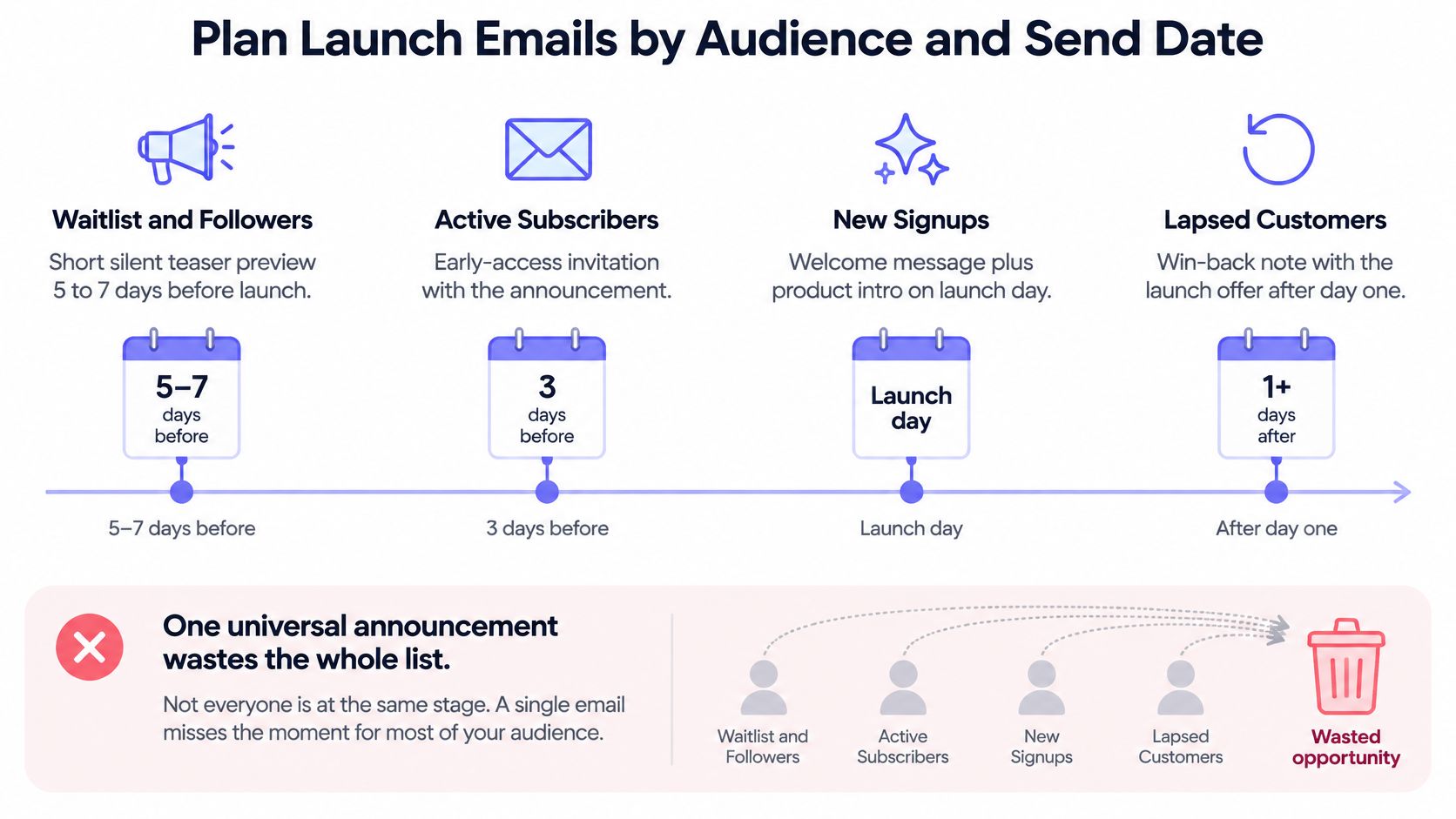
The teaser preview sells nothing. Its only job is to show that something exists and to pull the ready people into an early-access list. No pricing, no feature list, one link.
The launch announcement carries the whole ask. Send it in the morning in each recipient's time zone, because a launch email that lands at nine at night reads as tomorrow's news. One action, one link, the template from the first section unchanged.
The existing user note answers a different question. Your current customers already pay you; what they want to know is what changed for them specifically. Skip the origin story and lead with the difference they'll notice this week.
The follow-up for openers who didn't click gets one new argument. Three days after launch, send a different proof point rather than the same screenshot with "just bumping this" on top. New evidence earns a second look. A reminder doesn't.
Why the stop rules matter more than the copy
Anyone who signed up, started a trial or unsubscribed leaves the sequence immediately. Reminders to people who already converted don't produce conversions, they produce unsubscribes, and the subscriber you lose is the one you'll want for the next launch. A suppression list costs nothing to build and protects the asset.
Three to four emails is the right size for a launch, and never more than one per day even when the segments are different. Cleaning the list is the unglamorous prerequisite; GDPR-safe list cleaning with Mailbeam is a sensible step a week before send, so dead addresses don't drag your delivery down on the day it counts.
Where the launch happens matters too. Where to launch your product covers the channels that pair with this sequence rather than competing with it.
Pre-send timing check: the launch email can't go out until the product page is live and the call-to-action link resolves in a private browsing window. Confirm both on the morning of the send.
Build, Test, and Send the Email
The build is mechanical. Get it wrong and the best copy you have arrives in a broken layout.
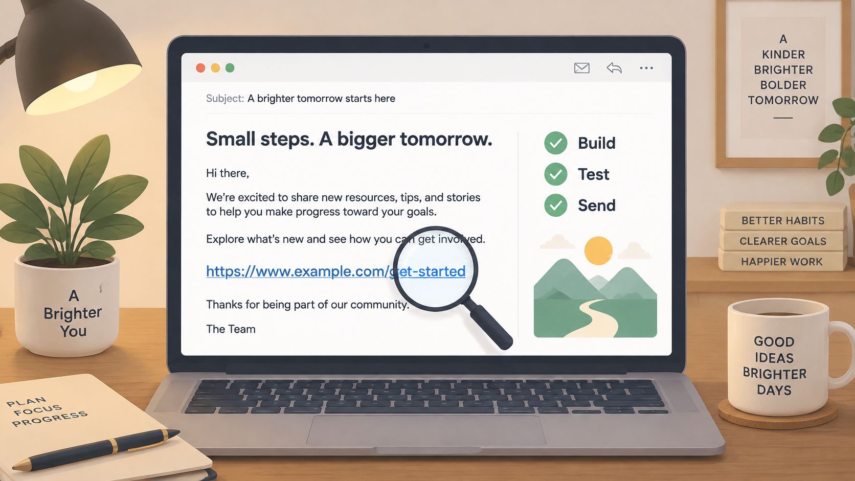
Six rules to build against
- Single column, semantic headings, left-aligned body text. Reading happens on a phone, often at an angle, and anything that requires horizontal eye movement gets abandoned.
- Body copy at 16px with 14px as the floor, line spacing around 1.4 to 1.5. Purdue's email best practices deck sets the 14px minimum, prefers 16px for body copy, and calls for a contrast ratio of at least 4.5:1 for normal text.
- Descriptive alt text and a background colour on every image. Plenty of inboxes block images by default, so the message should still read as a complete email with the pictures off, not a row of empty boxes.
- The video goes in as a linked thumbnail inside a container, with the promise repeated in live HTML text underneath. The teaser is silent motion graphics built from your own brand, with no faces and no voice-over, so the email copy has to state what the video shows.
- Skip the export-settings debate. The teaser arrives as a single 1080p MP4 with nothing to configure, so the only decision is where the thumbnail links. Phones still reward vertical framing elsewhere in the launch: Google's guidance on video ad asset ratios reports that adding a vertical asset to a Shorts campaign increased conversions by more than 35% in its global 2024 internal data.
- The call to action is an HTML button or a text link. Never bury the only action inside an image, and never repeat it three times in different colours.
A 30-second teaser built on this structure looks like the embed below: five beat-cut scenes covering hook, problem, solution, proof and call to action, each carrying a single message.
The pre-send test and the send decision
Run the test in this order: desktop width, mobile width, dark mode, images disabled, keyboard focus through every link, and the final destination URL with its tracking parameters intact. Two common launch failures are a truncated tracking string and a button that exists only inside an image.
Send when four things are true. The subject line has been split-tested against one alternative. The product page is live and answers the reader's first question without a scroll. The segments and stop conditions are set. And the video has been watched end to end, because generated videos can contain factual errors or misread the brand. Every line of copy in the teaser comes from the page you pasted, word for word or clearly derived from it, so the review is a check on the extraction, not a hunt for invented claims.
When all four hold, paste your product URL into ShipTeaser and you get a silent 30-second teaser as a 1080p MP4, ready to sit in the email as a linked thumbnail. If the same video is going into a Product Hunt gallery, upload the MP4 to YouTube, set it to public, and paste the full URL into the gallery. To pressure-test the page before you generate, the free ShipTeaser MCP audit returns the launch angles your page can carry, the lines that carry them and what is missing, with no account needed.
Read Launch Email Results Without Fooling Yourself
Benchmarks tell you what normal looks like. They don't tell you whether your launch worked, and they're easy to misread. Read the numbers in diagnostic order, not trophy order.
| Metric | What it tells you | Reference value |
|---|---|---|
| Delivery rate | Whether the email reached inboxes | 99.2% across all email (DMA UK, 2025) |
| Open rate | Subject line and sender name | 43.5% average; 55.0% for B2C (DMA UK, 2025) |
| Unique click rate | Whether the message and call to action worked | 2.5% average (DMA UK, 2025) |
| Click-to-open rate | Engagement among readers who opened | 6.2% average (DMA UK, 2025) |
Those figures come from the DMA UK email benchmarking summary published by Emarsys, which reports 99.2% delivery, a 43.5% average open rate, a 2.5% unique click rate and a 6.2% click-to-open rate for 2025 campaigns across all email. The same summary shows 55.0% open for B2C, 49.2% for retail and 34.8% for travel, which is the entire argument for comparing against your own sector and audience or not comparing at all.
Open rate is the weakest of the four signals. Mailbox privacy features and blocked images break the tracking pixel, so a reported open rate is closer to an estimate than a count. Judge the launch on downstream action instead: signups, teaser generations or downloads per 100 recipients, and paid conversions where the launch sells directly.
The two patterns worth naming
High opens with almost no clicks means the subject line did its job and the body didn't. Either the offer wasn't legible, the button sat below a wall of features, or the destination page asked for a credit card the reader wasn't ready to give.
Healthy clicks with weak opens is a subject-line and sender-name problem, and it's the cheaper of the two to fix, because the body already converts the people who reach it. Change one variable, resend to a fresh slice, and leave the copy alone.
Then set your own baseline from the first send and compare every later launch against that. A travel-industry average tells you nothing about a founder-led SaaS list. Your own last launch tells you almost everything, and product launch metrics lists the ones worth putting on a dashboard.
FAQ
Can I send a launch email to people who never asked for it?
No. Send only to people who opted in, and segment by audience before the send rather than after. Unrequested launch mail generates complaints, complaints damage your sender reputation, and reputation damage outlasts any lift the extra recipients could have produced.
What if I have no audience yet?
Start with a waitlist page and send the teaser preview to the people who join it before launch day. That list is small, opted in, and far more useful than a large cold one. To check whether the page can carry a launch video, ShipTeaser's free audit needs no account: paste the URL and it returns the five launch angles the page can carry, the lines that carry them, and what is missing. Fix what it flags, then generate.
Can I reuse this template for a feature update?
Yes. Keep the order of parts, swap the announcement and proof for the new feature, and keep the same stop conditions. Name the feature in the subject line so existing users recognize what changed, and cut the origin story entirely, because they already know who you are.
What if a subject-line test shows no winner?
Keep the control for the rest of the send and log the result as a tie. A tie means the subject line was not the bottleneck, so the next test belongs on the call to action or the destination page, judged on clicks and signups rather than opens. Once the launch send is done, the post-launch week plan is where those follow-up tests belong.
Your launch email needs one visual that survives a blocked-image inbox and a silent feed. ShipTeaser reads the product page you paste and returns a 30-second 1080p MP4 built for silent feeds, structured as hook, problem, solution, proof and call to action, with every line of copy taken from your own page. Paste your URL at ShipTeaser, review the video before publishing because a generated video can misread the brand, and send the launch with a preview asset instead of a screenshot of a dashboard.