Most founders assume a product demo video needs a polished voiceover. That assumption fails the moment the video autoplay starts muted in a crowded social feed. A better product demo video script treats silence as the default and makes the product understandable through on-screen text, motion, and one visible outcome.
A strong 15-second product demo video script contains one primary promise, one proof moment, and one next step. Extract those elements from the landing page, then structure the video around a problem, solution, proof, and call to action. The viewer should understand the use case without hearing a single word.
The Muted Reality of Launch Videos
Voiceover-first scripts are built for a viewer who has already chosen to pay attention. Launch videos rarely get that advantage. A founder may spend days polishing narration, but the finished clip often appears between unrelated posts with autoplay muted. The viewer hasn't pressed play, and the product has roughly a few seconds to earn another moment of attention.
That changes the writing job. The script isn't a transcript for a narrator. It's a visual communication plan that tells the viewer what problem exists, what the product does, what result to notice, and what action to take. If the message only works when someone hears the explanation, the script isn't finished.
Practical rule: Write the silent version first. Treat optional music as pacing support, never as the carrier of meaning.
A useful product demo video script compresses the landing page into five scenes:
- Hook: Show the desired outcome or the most recognizable problem.
- Problem: Make the friction specific enough for the right founder or builder to recognize.
- Solution: Show one product interaction, not a dashboard tour.
- Proof: Display a concrete interface state, result, workflow completion, or published product fact.
- CTA: Tell the viewer exactly what to do next.
This structure aligns with the broader shift toward short-form video. HubSpot's summary of Wyzowl's 2025 research reports that 89% of businesses use video marketing and 93% of marketers say video generates a strong return on investment. The same source says 17.13% of marketers planned to invest more in short-form video in 2025, making it the leading investment choice among content formats. HubSpot's video marketing statistics provide useful context, but the practical lesson is simple: short product demonstrations need immediate comprehension.
For a deeper look at why launch videos lose attention, read why launch videos fail. For longer-form inspiration, a YouTube demo video for SaaS can help you study how software teams frame workflows, but don't copy a long walkthrough into a 15-second asset.
The landing page should be your source of truth. Use the headline for the promise, the subheadline for the problem or audience, one screenshot or UI state for the demonstration, and the page CTA for the final frame. Don't add claims that appear nowhere on the page. A short format has no room for unsupported benefits, inflated superlatives, or feature language that the product can't prove visually.
Timing Breakdown for a 15-Second Format
A 15-second script must allocate time by viewer task, not by your feature list. Use 0 to 2 seconds for the hook, 2 to 10 seconds for one visible interaction, and 10 to 15 seconds for one CTA. A clear voiceover fits only about 35 to 45 spoken words in that runtime, according to Wyzowl's video marketing statistics. For muted feeds, write the script so the captions and product action carry the message without narration.
Use this sequence to make each frame earn its place:
- 0 to 2 seconds, hook: Show a specific problem, outcome, or sharp visual contrast. “Launch updates without another manual edit” gives viewers a reason to continue. “Meet the future of product marketing” says nothing concrete.
- 2 to 10 seconds, interaction: Show one product action from start to finish. A cursor can paste a URL, the interface can change state, or a result can appear. Keep unrelated screens out of the sequence.
- 10 to 15 seconds, CTA: Ask for one action, such as visiting a landing page, starting a free video, or trying the product. Three destinations compete for attention and weaken the close.
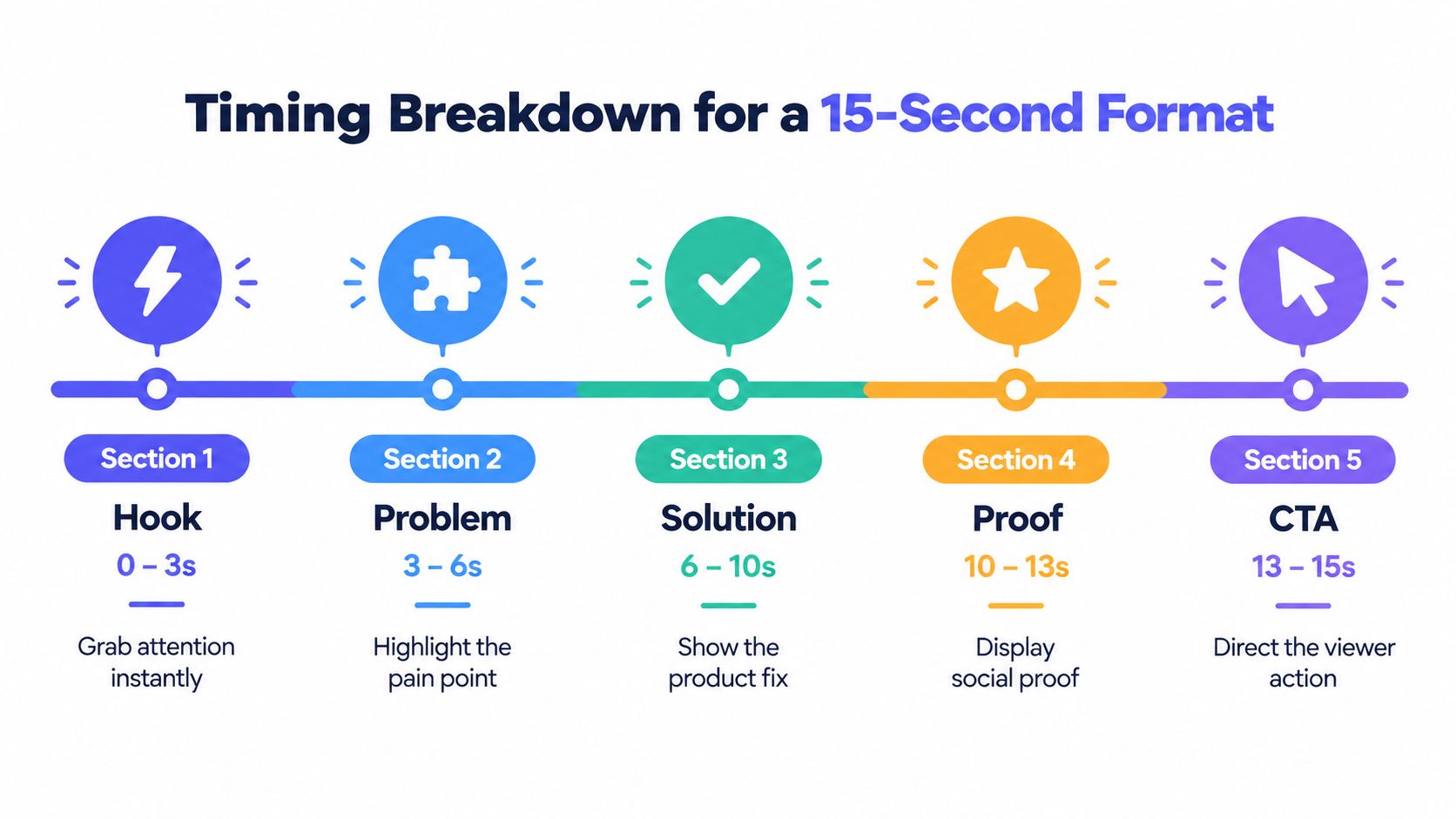
The timeline uses five scenes, hook, problem, solution, proof, and CTA, within the same short runtime. This structure works when the hook and problem move quickly, while the solution receives most of the visual attention. Five scenes do not justify five features. They give one use case enough progression to feel complete, even on a silent feed.
Extract the message from the page
Treat the landing page as the script's single source of truth. Pull each element from the page:
- Headline: Convert it into the primary promise.
- Subheadline: Turn it into the audience problem or context.
- Product visual: Select one screen state that proves the promise.
- CTA: Reuse the action already requested on the page.
- Supporting copy: Include it only when it clarifies the selected workflow.
Suppose the page says, “Turn a product URL into a launch teaser,” followed by copy about short, ready-to-post videos. The script should not claim that the product handles every marketing channel, edits long recordings, or creates customer testimonials. The page supports a narrower message: paste a URL, receive a short teaser, and use the finished asset for a launch.
The SaaS launch video use case applies this approach. Keep the same evidence hierarchy when adapting the script for a second audience segment, changing the framing rather than inventing a new promise.
Make the visual action legible
Every interaction needs a clear beginning and end. If the cursor crosses several menus, viewers see movement without understanding progress. Show the input, show the transformation, and hold the result long enough to register.
Use large text with strong contrast against the background. Keep captions short enough to scan immediately, and place them where interface elements will not cover them. The viewer should understand the problem, product action, and CTA without pausing the clip.
Watch the export with sound unavailable. If you can describe the product, the problem, and the next step without guessing, the script is ready for a muted feed.
Three Full-Length Script Examples
A product demo earns attention by showing one problem, one product action, and one verified outcome. These examples are written for solo builders and SaaS founders creating silent, caption-first launch videos. Each uses five scenes, no stock footage, no voiceover, and no feature tour. Keep every claim aligned with the landing page, which should remain the single source of truth for the demo. For real produced clips, browse these product launch video examples.
Example one for a developer tool
Use case: A developer tool helps a builder turn technical documentation into a clearer setup flow.
0 to 2 seconds, hook
- On-screen text: “Still explaining setup in long threads?”
- Visual action: A dense documentation page appears, followed by confusing message bubbles stacking behind it.
- Purpose: Establish a familiar communication problem without explaining the full product.
2 to 4 seconds, problem
- On-screen text: “New users miss the first step.”
- Visual action: The opening instruction is highlighted while later steps stay blurred in the background.
- Purpose: Focus the pain on onboarding friction.
4 to 10 seconds, solution
- On-screen text: “Turn the workflow into a clear path.”
- Visual action: The product converts the selected setup flow into a structured sequence. One step expands, then the next appears.
- Purpose: Show one meaningful product action instead of listing features.
10 to 13 seconds, proof
- On-screen text: “One guided setup flow.”
- Visual action: The completed flow shows its first action, required input, and final confirmation in one view.
- Purpose: Let the finished interface prove what the product produced.
13 to 15 seconds, CTA
- On-screen text: “Build your setup flow.”
- Visual action: The product URL or landing page CTA appears, with the cursor moving toward it.
- Purpose: Give viewers one clear next step.
The screen sequence carries the argument without narration. Confusion appears first, a guided workflow replaces it, and the final frame points to the action supported by the landing page.
Example two for a workflow automation product
Use case: A workflow automation product helps a solo founder stop copying launch details between forms and project boards.
0 to 2 seconds, hook
- On-screen text: “Copying launch tasks by hand?”
- Visual action: The same task title appears in multiple panels with slight differences.
- Purpose: Make repetitive work instantly recognizable.
2 to 4 seconds, problem
- On-screen text: “Small updates create missed steps.”
- Visual action: The task changes in the source panel while duplicate panels remain unchanged.
- Purpose: Connect manual repetition with an operational consequence.
4 to 10 seconds, solution
- On-screen text: “Connect the workflow once.”
- Visual action: One trigger is selected. A line moves to the destination board, and the task appears automatically.
- Purpose: Keep the product action to one trigger and one result.
10 to 13 seconds, proof
- On-screen text: “The next task is already there.”
- Visual action: The new task appears with its title and due date populated.
- Purpose: Show the completed state. Do not claim time savings unless the landing page provides evidence.
13 to 15 seconds, CTA
- On-screen text: “Automate your next launch.”
- Visual action: The landing page CTA appears as the final card.
- Purpose: Connect the action to the founder's immediate workflow.
The repeated objects make this demo persuasive. Viewers see the same task copied across panels, then see one source create the destination task. A founder should avoid adding unrelated integrations or a broad automation promise here. The landing page supports only the workflow shown.
Example three for a consumer-facing app
Use case: A consumer app helps users organize saved ideas into a usable plan.
0 to 2 seconds, hook
- On-screen text: “Saved ideas aren't a plan.”
- Visual action: A fast collage of saved items fills the screen.
2 to 4 seconds, problem
- On-screen text: “Find the right one when you need it.”
- Visual action: A search gesture moves through the collage while irrelevant items pass by.
4 to 10 seconds, solution
- On-screen text: “Group ideas by what you'll do next.”
- Visual action: Items move into a focused collection with a clear category label.
10 to 13 seconds, proof
- On-screen text: “One focused list.”
- Visual action: The new collection opens, showing the selected items in a clean sequence.
13 to 15 seconds, CTA
- On-screen text: “Start organizing.”
- Visual action: The app's CTA and product mark stay on screen for the closing beat.
This version needs no repeated purpose labels because the sequence already has a clear argument. The collage establishes excess, the search gesture exposes retrieval friction, and the organized collection shows the result. A common founder mistake is adding several categories, filters, and app screens at the solution beat. Show one organizing interaction instead. The viewer should understand the change before the CTA appears.
These examples also show why generic stock footage adds little to a software launch. The product interface supplies the movement, contrast, and proof. ShipTeaser turns a product URL into a 15-second, 1080p, silent motion-graphics teaser in about two minutes, using the same five scenes: hook, problem, solution, proof, and CTA. The output is ready to post in 16:9, 1:1, and 9:16 ratios. It offers a first video free without a credit card, with plans at $99 per month for one video per week, $149 for two per week, and $199 for four per week. Treat those details as product claims that belong only in the final copy when they match the landing page.
Designing for Silent and Caption-First Viewing
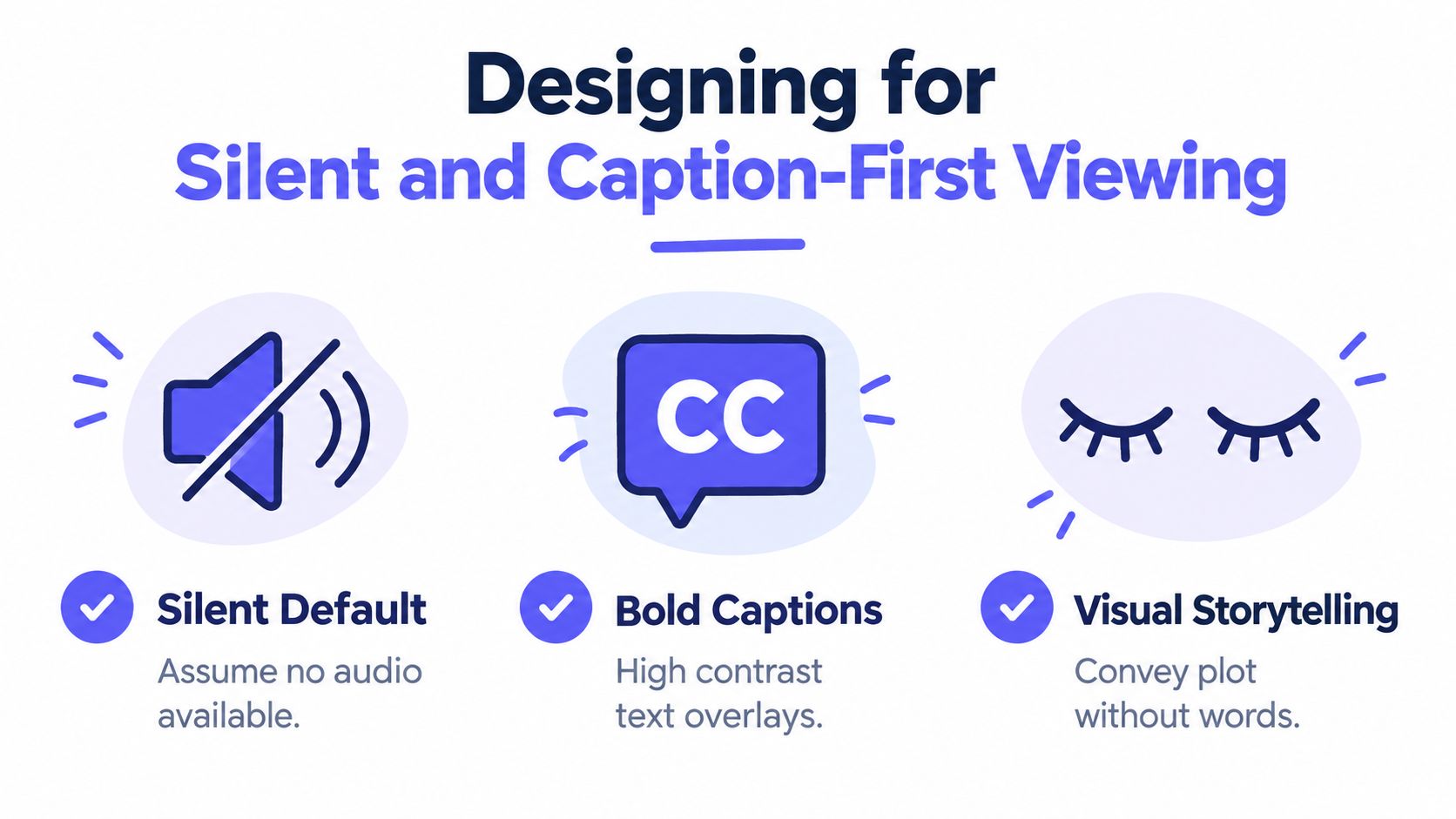
A silent-first video isn't a voiceover with text added afterward. It's a storyboard where the visual action, on-screen copy, and optional music bed support the same message. The viewer should understand the core promise even if the device stays muted.
Accessibility evidence supports this approach. An analysis of 650,000 video assets and nearly 12 million ad deliveries across more than 100 countries found that only 10% of global television advertisements included accessibility features such as captions or audio description. The same accessibility analysis from NewscastStudio reports that more than half of adults, and over 75% of millennials and Generation Z viewers, regularly enable captions, even when watching content in their native language. Captions were also associated with an 8% increase in recall and an 18% increase in brand linkage, according to that source.
The implication is direct. Don't write spoken copy first and hope captions rescue the edit. Write the caption, visual action, and proof state as parallel versions of one sentence.
Use three layers of meaning
A strong silent product demo video script has three coordinated layers:
- Visual layer: Shows the product changing state.
- Text layer: States the problem, action, or outcome in concise language.
- Audio layer: Adds an optional music bed that supports pace but carries no essential claim.
For example, the visual layer can show a URL being pasted and a teaser appearing. The text layer can say, “Paste your product URL,” followed by, “Get a launch teaser.” The optional music can create momentum, but the viewer doesn't need it to understand the sequence.
Keep each text overlay focused. Don't place a paragraph over a moving interface. Use one idea per frame, high contrast, and enough exposure time for a viewer to read without pausing. If a term matters to the product's value, show that term in the interface or in the overlay. Don't hide the meaning in tone of voice.
An audio and video transcription tool can help audit spoken material against on-screen text when you're reviewing longer assets, but a 15-second silent teaser should begin with visual comprehension rather than transcription.
Design for the feed, not the editing room
Muted feeds punish delayed context. Put the problem or outcome in the opening frame, then make the product action obvious. Avoid visual clutter, tiny UI states, and transitions that look impressive but don't explain anything.
Write separate exports from one master message. A horizontal frame can give the interface more room, a square frame can keep the product centered, and a portrait frame can prioritize the main action and CTA. The script stays consistent, but the composition must respect the viewing shape.
Silent viewing also improves discipline. If the script needs a narrator to explain why a screen matters, the screen probably isn't showing enough. Replace the explanation with a clearer state change, a sharper crop, or a more specific caption.
Trust and Disclosure in Automated Demos
Automation creates a production advantage, but it also creates a trust question. Viewers need to know whether a scene shows the actual product, a stylized product representation, or evidence from a real customer. A short video shouldn't bury that distinction under polished motion graphics.
Research across 14 markets found that more than 80% of consumers believe AI-created content, including video, should be clearly labeled, while 62% say transparency would increase their trust in a brand, according to RWS research on AI transparency. Those figures make disclosure a practical part of the script, not a legal afterthought.
Use a brief, plain-language label when automation materially shapes the asset. A small end card can say, “AI-generated product teaser based on published product material.” That statement explains the production method without turning the entire video into a discussion about automation.
Separate facts from demonstrations
A landing page contains several types of language, and your script should treat them differently:
- Verified product fact: The page clearly states what the product does.
- Demonstration: The video shows a real interaction or output state.
- Positioning language: The page uses a persuasive phrase that may need compression.
- Evidence claim: The page attributes a result to customers, research, or measured performance.
Only the first two belong in a short teaser unless the page clearly supports the others. Don't turn “built for fast launches” into “launches products instantly.” Don't turn a polished interface animation into customer evidence. Don't present synthetic imagery as a screenshot from a real user.
A polished visual can demonstrate a workflow. It can't prove a result that the landing page never substantiates.
The safest editing decision is compression, not amplification. If the page says a product helps founders create launch assets, write “Create a launch asset from your product page.” If the page doesn't support a specific performance improvement, don't add one for dramatic effect.
Make the source visible in the process
Keep a copy of the page used to generate the script. Mark the headline, selected UI state, supporting claim, and CTA. Remove any generated line that doesn't map to one of those source elements.
The automated content generation guide is useful background for teams that want repeatable production with a clear source workflow. The operating principle remains yours: automate assembly, but review every claim before publishing.
Disclosure should be brief, accurate, and proportionate. The brand remains authentic when the product claim is grounded in published material and the visual action reflects what the product does.
Launch Video Questions and Answers
A launch video does not fail because it lacks production polish. It fails when the message becomes unreadable in a muted feed or the format hides the product action. Build one source script, then adapt the composition, text scale, and visual priority for each placement. Keep the landing page as the authority for the promise, proof, and CTA.
Google Ads supports 16:9 horizontal, 1:1 square, and 9:16 vertical video assets. Google recommends vertical 9:16 for YouTube Shorts and square assets for App, Demand Gen, and Performance Max campaigns. Its guidance also reports that adding vertical video to a Demand Gen campaign can increase Shorts conversions by more than 35%, while adding vertical video to a Video View campaign with only wide-format assets can increase Shorts view-through rate by more than 40%, as explained in Google Ads video aspect ratio guidance.
Create three outputs from one master script. Use 16:9 when the interface needs horizontal space, 1:1 when the composition needs balanced feed coverage, and 9:16 when the mobile frame should give priority to the product action and CTA. Rewrite the text placement for each frame instead of shrinking a horizontal layout until it becomes difficult to read.
What should a founder measure?
Views do not show whether the script worked. Track three points in the viewer journey:
- Play rate: Did the opening frame persuade people to start or continue watching?
- Completion rate: Did the sequence hold attention through the product action and CTA?
- CTA click-through: Did the final instruction produce a measurable next step?
These measures help separate a weak opening from a confusing demonstration or an unclear offer. If play rate is poor, replace the first frame with a sharper problem statement. If completion drops during the product action, remove secondary interface movement and show one interaction clearly. If completion is healthy but clicks are weak, make the CTA more specific and match it to the landing page wording.
Short-form video continues to receive strong marketing attention. HubSpot's 2025 data reports that 21% of marketers considered short-form video the format delivering the highest return on investment, 29.18% identified it as the most-used content format, and 75% planned to maintain or increase investment in short-form video. HubSpot's short-form video research supports a repeatable testing approach, but the format still needs a clear product story that works without audio.
How often should you publish?
Publish when you have a distinct message, not just because the calendar shows an empty slot. One week can focus on the core use case, another on a different audience problem, and another on a separate workflow. Keep the five-scene structure consistent while changing the landing page promise, proof state, or CTA.
A repeatable system like ShipTeaser's URL-to-teaser workflow keeps each launch video from becoming a custom editing project. Treat the generated output as an assembly starting point, then check every frame against the landing page before publishing. The video should not claim a result, feature, or capability that the page does not support.
A fixed output can help solo builders maintain consistency. Founders who need another way to organize promotional assets can use a ProdSnap ad creative platform. The production choice matters less than script discipline. Every version should preserve one problem, one product action, one proof moment, and one CTA, with all four readable in a silent feed.
What should the CTA say?
Write the CTA in the same language as the landing page. “Try the workflow” is stronger than “Learn more” when viewers can start the workflow. “Get your first teaser free” is specific only when that offer appears on the page. Do not add a calendar booking CTA when the page supports only self-serve signup.
The final frame needs three elements: the product name, the action, and the destination cue. Keep the frame stable long enough to read, and make the text large enough for the narrowest placement. A CTA is the handoff from the demonstration to the next measurable step, so it must tell viewers exactly what to do and what they will find after the click.
FAQ
What is a product demo video script?
A product demo video script is a timed plan for showing how a product solves one specific problem. A strong short script includes on-screen text, visual actions, proof, and one CTA, rather than relying on a voiceover or a feature list.
How long should a 15-second product demo script be?
A 15-second product demo script should contain one primary promise, one visible product interaction, one proof moment, and one next step. If you include narration, clear delivery typically supports about 35 to 45 spoken words, according to Wyzowl's video marketing statistics, but a silent-first script should make the message work without spoken audio.
Should a product demo video use voice-over?
A product demo video doesn't need voice-over when the interface action and on-screen text communicate the problem, solution, proof, and CTA clearly. Voice-over can support a longer explanation, but it shouldn't carry essential meaning in a short social-feed teaser that may autoplay muted.
What should be the source for an automated product demo script?
The landing page should be the primary source for an automated product demo script. Use the headline for the promise, the subheadline for context, one product visual for proof, and the page CTA for the closing action. Remove any generated claim that isn't supported by the published page or visible product behavior.
What ratios should a product launch video include?
A product launch video should include 16:9, 1:1, and 9:16 versions when the same teaser will appear across desktop, square-feed, and portrait mobile placements. Google recommends 9:16 for YouTube Shorts and square assets for App, Demand Gen, and Performance Max campaigns in its video aspect ratio guidance.
Paste your product URL into ShipTeaser to generate a 15-second, 1080p silent motion-graphics teaser with hook, problem, solution, proof, and CTA scenes. Start with the free first video, review every claim against your landing page, and publish the ratio that matches your launch channel.