A launch improvement doesn't always require a bigger campaign. An AliveCor launch experiment found that adding a visible New badge increased conversion rate and revenue per user on desktop and mobile. The useful lesson is that visitors need to understand what's new and why they should act, not admire the production budget.
The strongest new product launch examples pair a specific promise with an asset that makes the promise credible. Dropbox used a demo, Stripe used working code, Slack demonstrated a shared workflow, Superhuman controlled access, Figma reduced trial friction, Linear emphasized speed, Buffer published its progress, and Loom made its output shareable. For a solo software founder, the working pattern is simple: show a useful result, offer a clear next step, and measure what happens after the click.
Copy the mechanism, not the surrounding mythology. A famous launch doesn't prove that an overnight signup surge, an exclusive waitlist, or a public dashboard will work for your product. Choose the tactic that addresses your buyer's biggest hesitation.
1. Dropbox's Demo Video Launch
Dropbox's early demo made an unfamiliar behavior understandable: put a file somewhere, then find the same file where you need it. Drew Houston's demonstration gave prospective users a concrete workflow to evaluate before broad access.
The important promotional asset wasn't a cinematic announcement. It was a demonstration of cause and effect.
File synchronization becomes easier to understand when the result is visible.
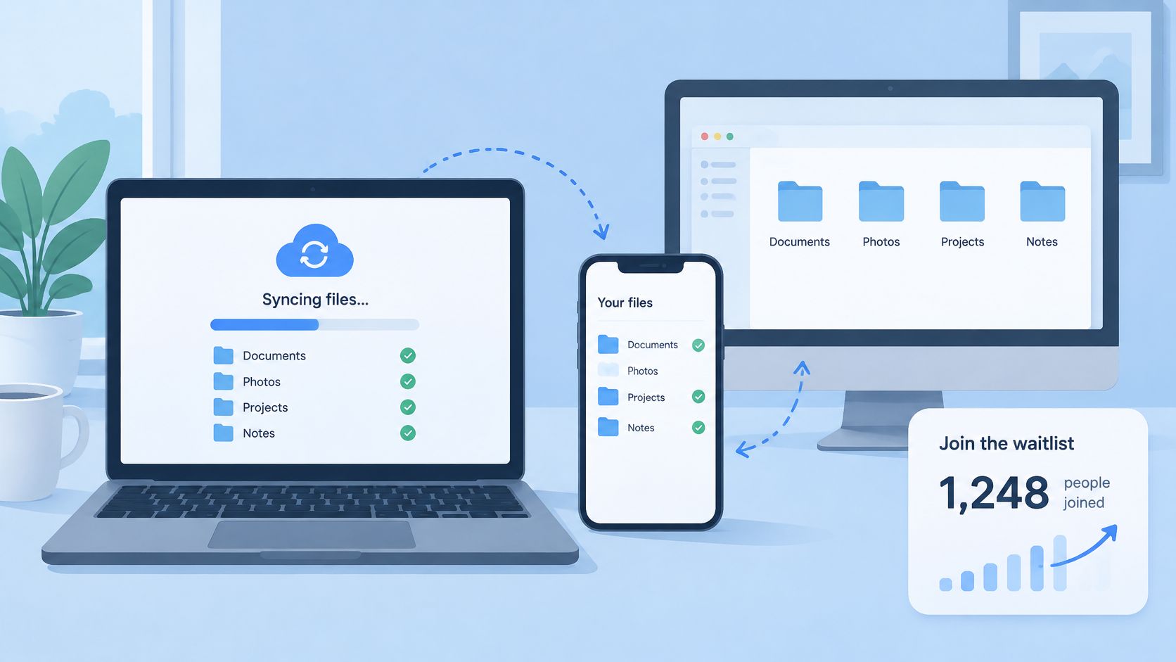
Copy the visible transformation
Say you're launching a developer utility that turns error logs into actionable bug reports. Don't open with your dashboard, settings, or architecture. Start with the messy log, perform the action, and show the finished report.
That sequence answers the question a launch visitor has: What changes when I use this?
- Choose a recognizable input. Use a file, message, or task your audience already handles.
- Show the resulting output. Keep the result readable instead of racing through interface interactions.
- Place the signup beside the proof. Don't make an interested viewer search for access.
A demo should remove doubt about the workflow. A teaser should give the right person a reason to watch that demo.
The distinction between a product demo video and a teaser matters when you're building without a video team. Use your landing page to establish the outcome, then record a separate walkthrough when the interaction itself needs proof.
What still works: showing a real task with a clear result. What to skip: expecting a single community post to reproduce another company's distribution. Measure qualified signups and completed tasks, not just video plays.
2. Stripe's Seven-Line Code Launch
A developer evaluating a payment API wants to see how a transaction works before reading the full documentation. Stripe's early launch made integration feel approachable by putting a compact code example at the center of the pitch.
The tactic is simple: show the shape of the work. Developers can judge a request and its result more easily than a broad promise about how simple an API is.
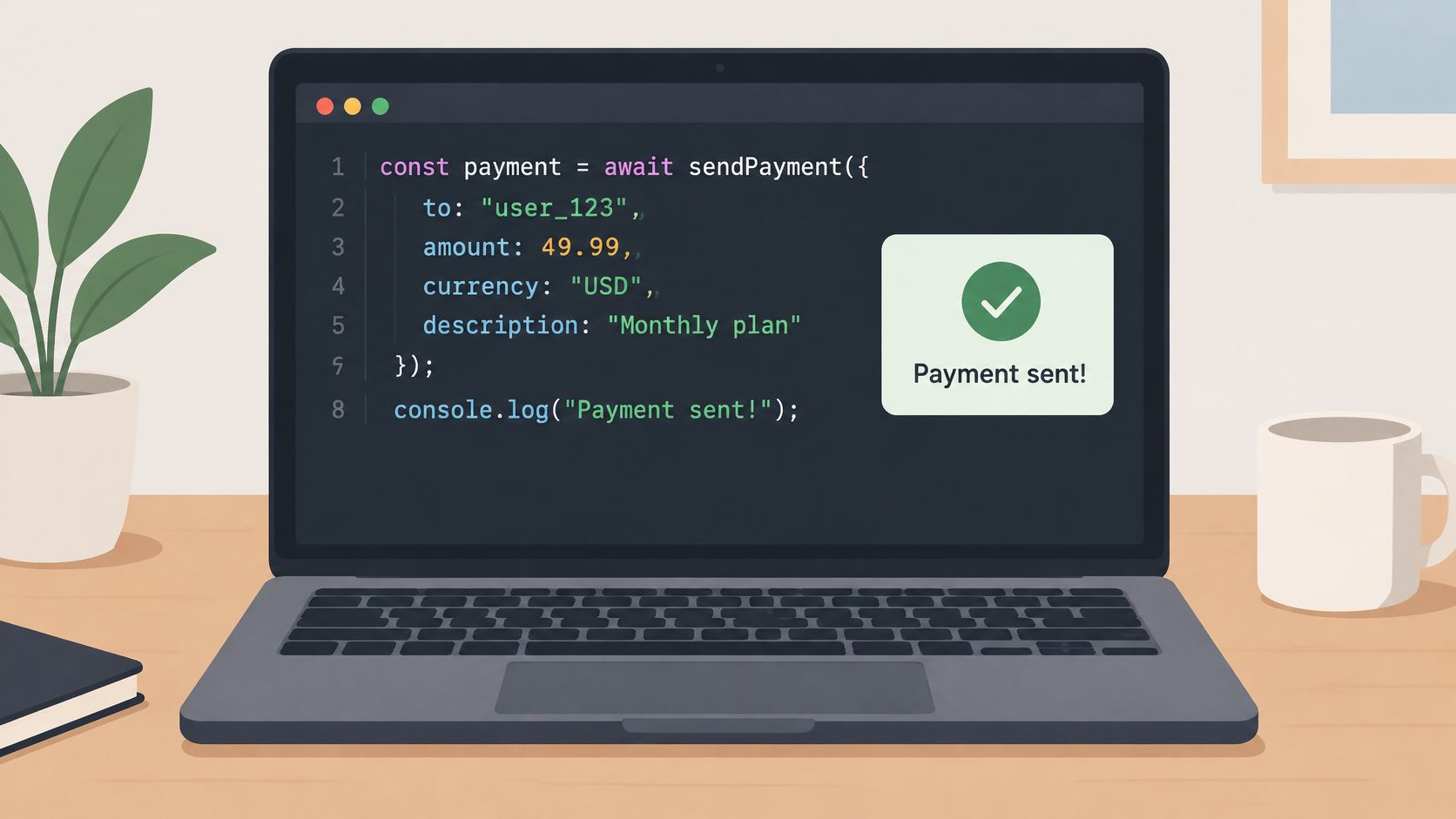
Make the example runnable
A document-parsing API should show a request beside the structured output it returns. Visitors can see what they send, what they receive, and how the result could fit into their application.
Keep the example honest. If authentication, configuration, or deployment takes work, a tiny snippet should not imply those steps disappear.
- Show a complete starting point. Include what a developer needs to reach a real result.
- Make the response visible. Display the output structure, not just the request.
- Provide a safe test path. Link the example to a sandbox or trial with clear limits.
A promotional teaser can show the input, transformation, and result. Leave detailed implementation instructions on the destination page, where developers can copy and inspect the code.
What still works: reducing uncertainty about integration. What to skip: using line count as proof that the full implementation is easy.
Measure how many interested developers make a successful first sandbox call. A snippet copied from the page signals intent; a working request shows that the example helped them take the next step.
3. Slack's Pivot Launch from Glitch
Slack's origin offers a different launch lesson: a useful product may already exist inside another project. Tiny Speck developed internal communication software while building Glitch, then turned that working system into a standalone product.
The replicable tactic isn't the pivot itself. It's testing whether an internal solution solves a problem for outsiders.
The promotional asset is a shared workflow. A prospective customer needs to understand how a team coordinates differently, not merely what an individual user can click.
Prove the team behavior
Consider a solo founder who has built a lightweight release-handoff system for collaborators. Before presenting the system as a broad collaboration platform, invite an external software team to use it for an actual release.
Give the team a specific job: assign the handoff, attach the relevant context, and acknowledge completion. Watch where people return to email or private messages.
- Test outside your own habits. Your internal shortcuts won't necessarily make sense to another team.
- Watch the invitation step. A collaboration product needs a reason for the next participant to join.
- Measure repeat coordination. Account creation doesn't establish that the workflow is useful.
Practical rule: An internal product becomes a credible launch candidate when outsiders can get value without the original team explaining every step.
For the launch asset, show the moment another participant contributes and the shared state changes. A short promotional sequence can establish the benefit, while a separate walkthrough explains the interaction.
If you're changing the audience or positioning of an existing project, treat the transition as a product relaunch, not a cosmetic rename.
What still works: solving a real coordination problem. What to skip: assuming that your team's enthusiasm proves outside demand.
4. Superhuman's Gated Waitlist Launch
Superhuman used a gated rollout to bring people into the product in stages. The tactic worth copying is controlled learning: a team can gather feedback from early users before opening access more widely. The invitation itself becomes the promotional asset, setting expectations about who the product serves and what trying it involves.
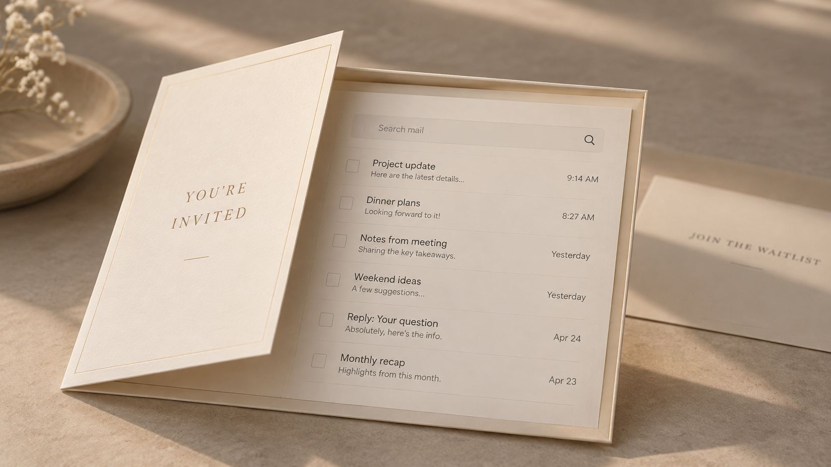
Give waiting a purpose
For an email-triage product aimed at technical founders, ask applicants about their inbox workload and current workaround. Invite people whose needs match the workflow the product can support now. A queue is useful when it helps the team choose relevant early users, not when it makes access look exclusive.
After users complete meaningful work, ask how they would respond if they could no longer use the product. Follow up on their reasons; a single answer is a prompt for conversation, not a verdict.
- Explain the access constraint. Limited onboarding capacity gives applicants a concrete reason to wait.
- Collect useful context. Ask about the job, current workaround, and desired outcome.
- Close the feedback loop. Tell participants what changed in response to their feedback.
A teaser can show the outcome before someone requests access. Keep the invitation aligned with that promise, including eligibility and onboarding requirements. For a solo builder without a video team, ShipTeaser reads a public product page and renders a 30-second launch video from its copy and visuals. Review the result before publishing.
What still works: admitting users at a pace that supports learning. What to skip: a queue with no updates or clear path to access.
Track invitations accepted and whether new users reach meaningful first use. Those signals show whether the waitlist is bringing the right people into the product.
5. Figma's Browser-Based Public Launch
Figma made collaborative design easier to try in a browser, where people could work on the same file together. The replicable tactic is shortening the path to a useful first action. Its promotional asset was the shared workspace itself: visitors could see collaboration as part of the product, not just hear it described.
Every required step should justify the delay it introduces.
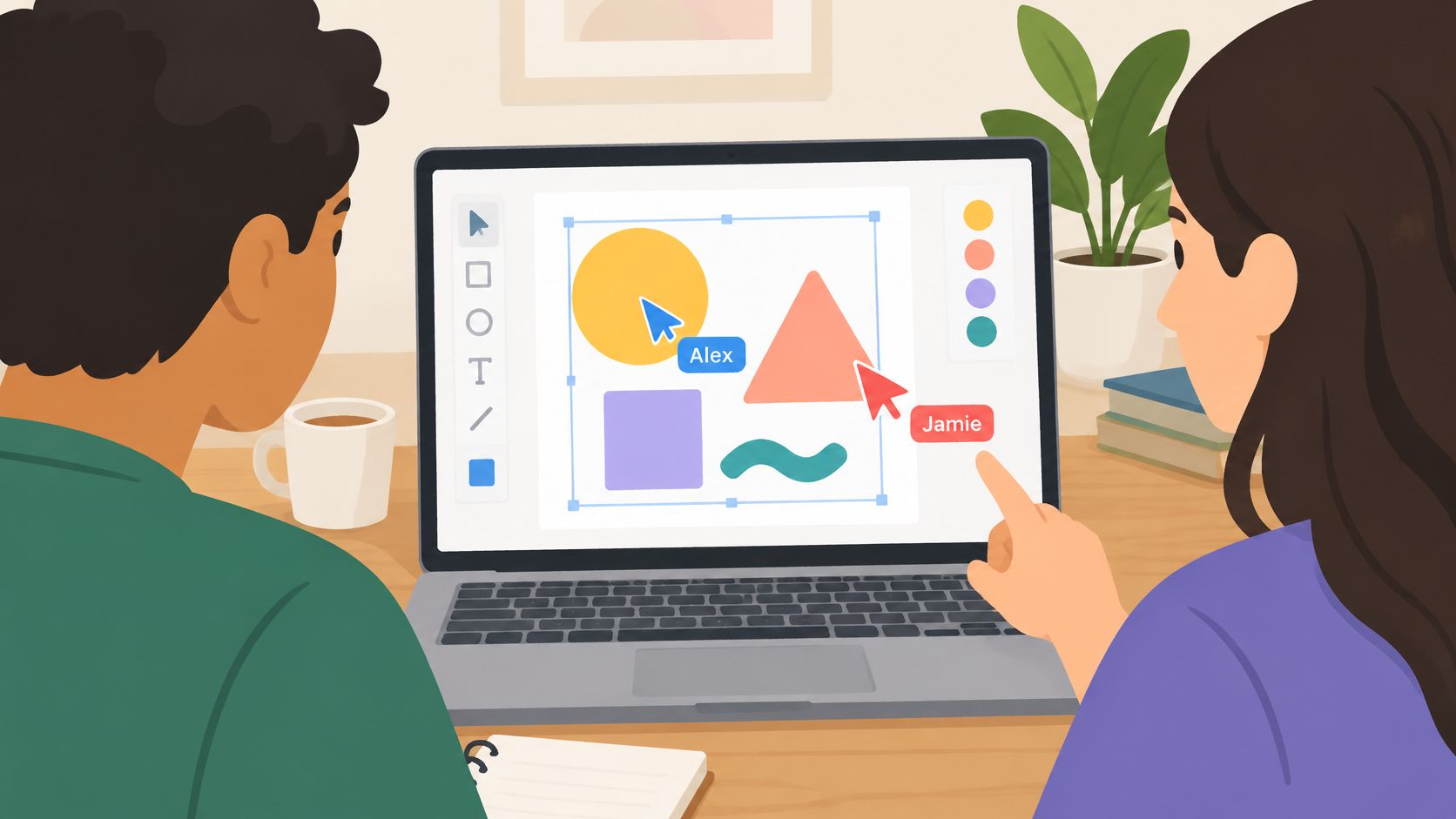
Remove friction without hiding requirements
For a browser-based diagramming app, let visitors open an example and make a useful change before asking them to configure a workspace. Ask for account details when they save, invite collaborators, or take another action that requires an account.
Keep necessary security controls in place, especially if the product handles sensitive information. Reduce setup that delays evaluation, not safeguards users need.
- Separate exploration from commitment. Use sample content when visitors can evaluate the product without importing real data.
- Delay optional setup. Workspace names and profile details rarely prove the product's core value.
- Make collaboration visible. Show a shared change that affects the work, not decorative cursor movement.
The teaser should show a concrete result of participation, such as a resolved comment, an improved diagram, or a captured decision. Then send viewers to an experience where they can try a comparable action.
What still works: making the product easy to evaluate. What to skip: treating a free account as proof that every adoption barrier is gone.
Measure first useful actions and collaborator participation. Free accounts that never reach value offer little evidence that the launch proposition works.
6. Linear's Invite-Only Speed-First Launch
Linear positioned its issue tracker around a focused promise: engineering teams could move through their work quickly with a keyboard-oriented workflow. The launch lesson is to make one product advantage visible, rather than claiming superiority across an entire category.
The promotional asset should show the work itself. Create an issue, assign it, change its state, and continue without detouring through unrelated screens. Each step should make the speed promise easier to judge.
Make the promise observable
For a keyboard-driven planning application, show a user capturing an idea and turning it into an assigned task. Keep the recording at normal speed. If you make a quantitative performance claim, use measurements you can explain and reproduce.
Pick a quality your target user can verify during a trial. Speed, clarity, and reliability each need different proof.
A concise launch video can show the original friction, the alternative workflow, the completed result, and a clear invitation to try the same task. Keep every action legible; rapid cuts can obscure the very behavior you want people to notice.
A beta launch announcement should say who should join, which workflows are ready, and what limitations remain. Offer access at a pace your team can support.
What still works: a specific promise backed by observable product behavior. What to skip: premium visual styling that masks an ordinary workflow.
Measure whether users complete the advertised task and return to it. Positive reactions to a launch announcement alone do not show whether the product feels faster in daily use.
7. Buffer's Transparent Public Launch
Openness can support distribution, and the product still has to solve a problem. Buffer's public reporting shows how regular progress updates can give people a reason to follow a company while helping potential customers judge its work.
For a solo builder, the useful move is to share evidence buyers can act on: a progress update, a pricing explanation, or a report that connects shipped work to a customer outcome. Keep the update focused. A promotional asset can point viewers to the full report without trying to carry every operational detail.
Publish information buyers can use
A deployment-monitoring application can publish which environments it supports, what it recently fixed, and where monitoring remains incomplete. That gives a prospective customer concrete information to evaluate.
A revenue screenshot may interest other founders but leave a buyer unsure whether to trust the alerts. Choose details that help customers make a decision.
- Publish clear pricing. Explain usage limits and what happens as usage grows.
- Include unsuccessful work. Say what did not help and what you plan to change.
- Connect progress to user outcomes. Show which task customers can now complete.
The guide to how to share startup milestones offers ideas for making a genuine update readable. Keep private customer information out of public material.
Turn a customer-relevant change into a short promotional asset, then direct viewers to the full update. Choose your product launch metrics before publishing, so you can judge results by more than attention.
What still works: specific, consistent evidence of progress. What to skip: performing transparency for an audience that will never use the product.
8. Loom's Free Screen Recording Launch
Loom turned the recording itself into a distribution channel. A user shared a useful video, and the recipient encountered the product while watching it.
The tactic to borrow is a shareable output that helps its recipient. For early-stage software in 2026, this still works when the shared result solves a real task. The useful asset is the output, with the product invitation placed where it adds context.
Consider a release-review app that creates a concise deployment summary. Let recipients inspect the changes before asking them to sign up. A relevant invitation can follow the summary, giving people who need the same workflow a reason to learn more.
- Make the output useful on its own. Let recipients inspect a basic shared result without registration.
- Set access controls deliberately. Sensitive work needs permissions or expiry settings.
- Keep attribution unobtrusive. Identify the product without obscuring the content.
The trade-off is practical: easier sharing can expose work to the wrong audience. Teams may need to restrict access before sharing becomes safe.
For a launch, show both the creator's result and the recipient's view. Pair a concise teaser with an example output, so visitors can judge the value directly.
What still works: distribution built into a useful workflow. What to skip: referral prompts or watermarks that make the shared result harder to use.
Track whether recipients become qualified visitors and active users. A count of shared links alone does not show whether the channel is bringing in customers.
How the eight software launches compare on model, asset and fit
The useful comparison is not just what each company launched with. It is whether the tactic still fits early-stage software in 2026, and what a solo builder can ship in its place.
| Launch | Launch model | Asset that carried it | Fit in 2026 and solo-builder version |
|---|---|---|---|
| Dropbox's 2008 Demo Video Launch | Demo-led launch | Screen-recorded file-sync demo | Still works: show a product's value in use. Make a short video from the product page and its real visuals. |
| Stripe's Seven-Line Code Launch | Developer-first launch with a quick path to testing | Short working payment code snippet | Still works: reduce setup uncertainty. Publish a focused, runnable example for one common task. |
| Slack's Pivot Launch from Glitch | Internal tool turned into a public product | Team messaging product validated in-house | Still works: solve a problem your own team understands. Show the workflow and the outcome, not a broad feature list. |
| Superhuman's Gated Waitlist Launch | Invite-only access with feedback-based onboarding | Waitlist and user feedback survey | Use selectively: gating can help manage high-touch onboarding, but it adds friction. Solo builders can invite a small group and ask for specific feedback. |
| Figma's Browser-Based Public Launch | Open, browser-first access with a free tier | Real-time collaborative design experience | Still works: remove installation barriers when the product supports it. Let prospects reach the product in the browser. |
| Linear's Invite-Only Speed-First Launch | Limited early access built around a focused promise | Fast, keyboard-driven issue-tracking experience | Still works for a narrow audience: make one clear product promise. Offer limited access only when it supports focused onboarding. |
| Buffer's Transparent Public Launch | Public, transparent launch with ongoing updates | Open progress, metrics, and pricing | Still works: publish clear product decisions and pricing. Share only information that helps buyers judge fit. |
| Loom's Free Screen Recording Launch | Free-to-start product with built-in sharing | Shareable screen recordings | Still works: make the product useful before asking for a purchase. Show the core task and the result it creates. |
For a video-led version, ShipTeaser reads a public product page and renders a 30-second, 1080p MP4 from its headline, colours, and real screenshots. It uses silent motion graphics, not faces, and needs no editor, prompt, or voice-over. Review the video before publishing; generated copy can misread the product or brand.
Pick One Tactic From These Launches and Ship It This Week
Choose a launch tactic that resolves one specific hesitation. When visitors cannot picture the product, show a task from start to finish. When developers question setup effort, give them a runnable example. When a team product needs collaboration, make the invitation and shared workflow clear.
Then match the tactic to the product's readiness. A waitlist limits access while a team prepares onboarding; a self-serve trial lets qualified users start immediately. Make the next action obvious and keep the promise consistent across the announcement and the product.
Build the asset and the measurement together
Write the promise first: name the user, the task, and the result. Choose evidence that supports it, such as a working example or a clear view of the workflow. Keep the announcement focused on that proof.
A useful measurement chain runs from qualified visits to signup, activation, repeat use, and revenue. The Go-to-Market Alliance survey found that only 41.2% of respondents were measured on revenue growth, so define the commercial outcome before publishing.
Save a baseline and check that key events are tracked. At launch, use tagged destinations and keep the offer consistent. After users try the product, look at whether they complete the promised task, return, and share useful feedback.
ShipTeaser produces a 30-second, 1080p MP4 from a public product page's copy, colors, and real screenshots, using silent motion graphics across five scenes: hook, problem, solution, proof, and call to action. Review each video before publishing. Check that its claims, interface imagery, brand interpretation, and destination accurately represent the product.
Distribute deliberately
Use the multi-platform posting guide for developers to organize distribution, then tailor the message to each audience. Developers need implementation detail; prospective users need a recognizable problem and a credible result.
Make value inspectable, reduce the adoption obstacle that matters, and give interested people a clear next step. The strongest tactic is one a small team can execute now and learn from after the announcement goes live.
FAQ
What makes a new product launch successful?
A successful launch attracts the right users and helps them reach the promised outcome. Track qualified interest, activation, repeat usage, and commercial results separately. Views and signups measure attention, not lasting demand.
Which launch tactic should a solo founder choose?
Start with the biggest obstacle to adoption. Use a demo when the workflow is unfamiliar, a working example when implementation raises doubts, controlled access when onboarding needs close attention, or shareable output when recipients benefit from the result.
Should a software launch use a teaser or a demo?
Use a teaser to introduce the product's value, then direct interested viewers to a demo, working example, or trial that shows how it works.
When does an invite-only waitlist make sense?
Limit access when onboarding capacity, product readiness, or a deliberate learning process calls for it. Explain the reason and keep applicants informed. Avoid artificial scarcity when qualified users can already get value.
ShipTeaser turns a public product page into a silent, 30-second launch video made with the page's copy, colors, and real screenshots. For a solo-builder launch, pair it with a demo, trial, or waitlist. Visit ShipTeaser, enter your product URL, and review the video before publishing.