You've launched a software product, shared the landing page, and then realized the product demo you planned is a five-minute screen recording nobody will finish. Feed viewers need the product's value before the next swipe, and early-stage teams rarely have time for a full production workflow.
A product demo video that works shows one user problem, one product action, one clear outcome, and one next step. For a launch teaser, make that story silent-first and compress it into 15 seconds, using readable on-screen text, visible interface changes, and a single call to action.
What a 15-second Product Demo Video Actually Is
A 15-second product demo video isn't a shortened webinar. It's a silent motion-graphics teaser built for autoplay, muted feeds, launch pages, and quick product discovery. The viewer should understand who the product helps, what changes, and what to do next without needing a narrator.
That constraint suits an early-stage SaaS founder, indie maker, no-code builder, or solo developer launching software. It isn't the right format for explaining complex setup, integrations, security, pricing, or onboarding. Those jobs need a longer walkthrough or documentation. A teaser earns the next interaction.
Silent means visual meaning
Silent doesn't mean no audio at all. It means no voice-over or narration. An optional music bed can support the mood, but the product story must survive with sound turned off.
That makes captions and on-screen text part of the script, not decorative polish. Use a short headline, a visible interface action, and a specific outcome. Don't write a paragraph and expect viewers to read it while the screen changes.
Practical rule: If the viewer needs headphones to understand the product, the teaser isn't finished.
The format isn't designed for ecommerce sellers, realtors, agencies, or professional video editors. It serves founders who need a repeatable product asset without building a timeline, recording a screen, collecting stock footage, or hiring a production crew. If you're comparing this format with a longer explainer, see this comparison of a product demo video and a teaser.
Some products do benefit from a presenter-led format. If a talking avatar is central to your communication strategy, this walkthrough for AI avatar tools covers that separate production path. A 15-second silent teaser makes a different tradeoff. It puts the interface and the outcome first.
Planning the Five Scenes Before You Render
Most weak demos fail before production starts. The script tries to serve several audiences, explain every feature, and end with multiple actions. A 15-second teaser can't carry that load.
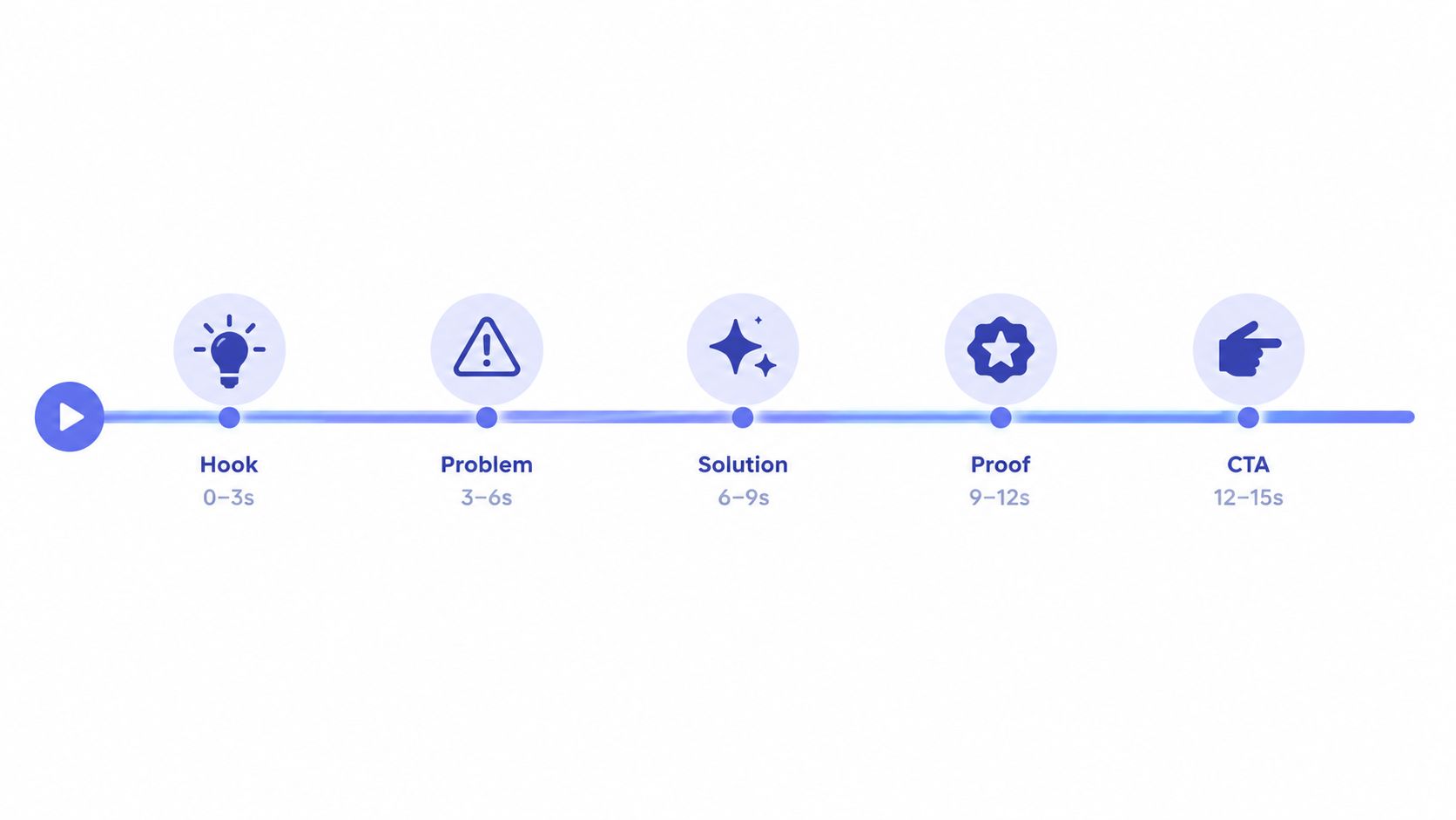
Use five scenes. Each scene has one job and a source on the landing page.
| Time Window | Scene Job | Do This |
|---|---|---|
| 0 to 1 or 2 seconds | Hook | Show the strongest visual proof or name the sharpest user problem |
| 2 to 4 seconds | Problem and audience | Identify who struggles and what slows them down |
| 4 to 10 seconds | Solution | Show one product action and the resulting interface state |
| 10 to 13 seconds | Proof and benefit | Connect the action to one specific outcome |
| 13 to 15 seconds | Call to action | Tell viewers to take one action |
Pull the script from the page
Your landing page already contains the raw material. Use the headline for the hook, the pain-point copy for the problem, the product screenshot for the solution, and the strongest evidence for proof. The signup button or launch action becomes the CTA.
For example, a developer tool might use this sequence:
- “Still checking every deployment manually?”
- “For small engineering teams.”
- Show a deployment moving from pending to verified.
- “Catch release issues before users do.”
- “Try the workflow.”
That example works because every line supports the same idea. It doesn't introduce pricing, integrations, team permissions, and a product tour in the same fifteen seconds.
Give proof one visible job
Proof can be a before-and-after state, a customer mark, a product result, or a specific benefit already supported by your page. Choose one. A crowded proof scene looks like uncertainty.
The same principle applies to the CTA. Use one action, such as “Start free,” “Join the launch,” or “See the workflow.” “Sign up, book a call, read the docs, and follow us” isn't a CTA. It's a menu.
For broader production planning, this guide on how to plan your video production steps is useful when a teaser sits inside a larger launch campaign. For the teaser itself, keep the pre-production sheet small enough to review in one pass.
Why Silent-First Changes Every Other Decision
A viewer may encounter your product demo in a public place with the sound off. A survey of 5,616 US consumers found that 69% watched video with sound off in public places, while 25% did so in private settings. It also reported that 80% were more likely to watch an entire video when captions were available. Those figures describe viewing behavior, not a performance guarantee, but they justify a firm production rule: build the teaser to work in silence first. The survey findings on muted social viewing and captions
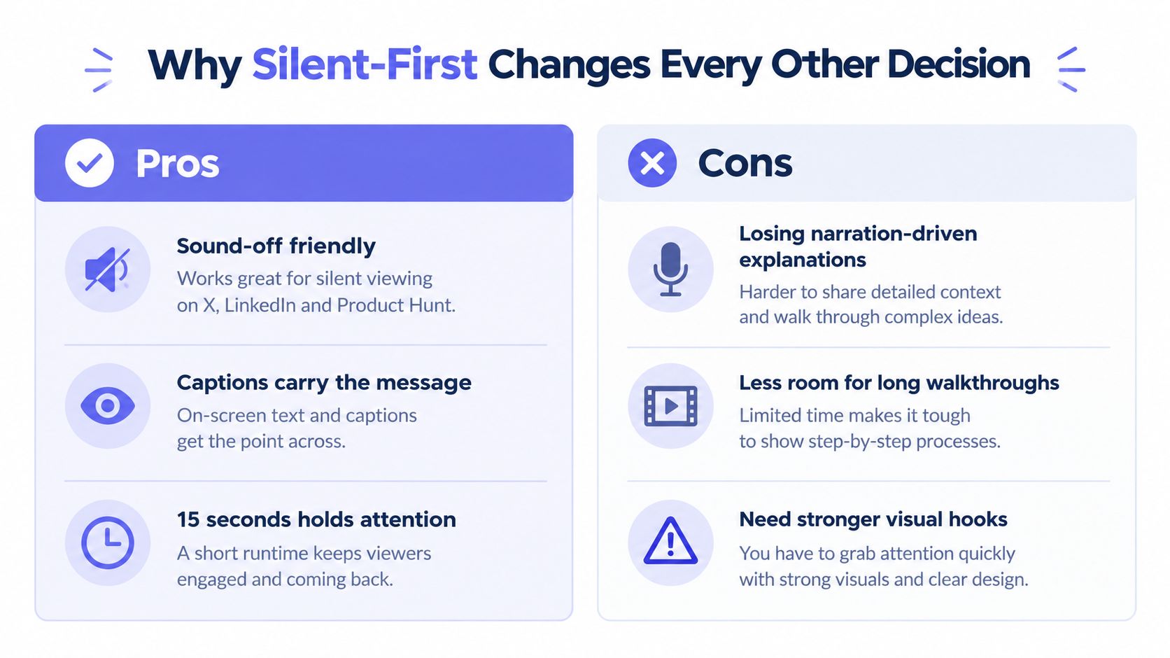
Build the screen as the narrator
A silent-first demo needs three things:
- Readable wording: Keep each text beat short enough to scan while the interface moves.
- Visible state changes: Show the input, transformation, and result. Cursor movement without a changed state proves nothing.
- Strong contrast: Match the landing page's visual identity, but prioritize legibility over exact brand styling.
Captions also support accessibility. Translators USA video subtitles explains why timed text matters when viewers cannot rely on audio. Review every caption manually. A feature name rendered incorrectly can damage trust faster than a plain visual design.
Give the 15-second teaser one job: earn attention and direct viewers to the next useful action.
A longer format can carry setup, integrations, security, or pricing, while the teaser must communicate one sharp product moment. Keep those details out of the silent unit.
An industry analysis of video engagement found that engagement held steady for videos lasting one to five minutes and dropped sharply beyond five minutes. It also reported 74% engagement for instructional videos lasting three to five minutes, compared with a 43% average for all videos in that duration range. Wistia's State of Video report supports matching length to purpose. It does not establish 15 seconds as the right length for every format, but it reinforces the need to decide what the video must accomplish before adding scenes.
Use this three-second hook framework to sharpen the opening. The first frame should show a problem, result, or meaningful change. A logo animation spends the teaser's limited attention without proving what the product does.
Generating the Teaser From Your Landing Page URL
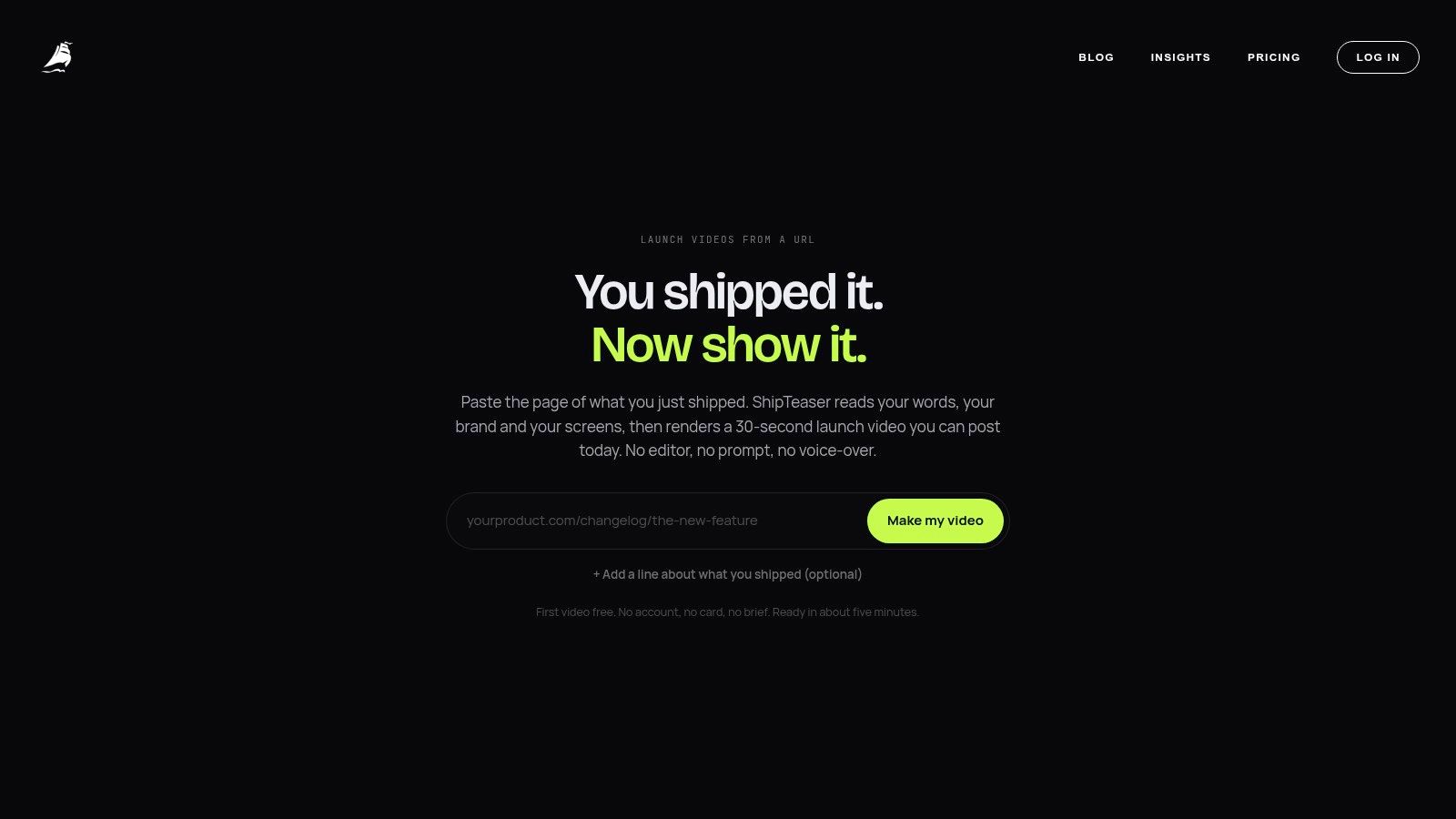
The fastest workflow starts with the page you already maintain. Submit the product URL, and the generation process uses the page's headline, pain-point copy, screenshots, visible colors, typography cues, and product positioning as source material.
Use the URL as a source of truth
Before submitting the page, check that the headline says what the product does and that the screenshots show a meaningful result. A vague landing page produces a vague teaser. Fix the page before blaming the video.
The workflow is straightforward:
- Paste the public product URL.
- Let the system extract the page's message and visual cues.
- Review the generated hook and scene sequence.
- Check the interface crop and on-screen wording on a phone.
- Download the result and post the suitable ratio.
- Re-run with a different hook if the first opening doesn't earn attention.
The output is a 15-second, 1080p MP4 with five scenes: hook, problem, solution, proof, and CTA. The result is ready to download and post in roughly two minutes. The process doesn't require a video editor, timeline, screen recorder, stock footage library, or manual clip trimming.
Review the output like a founder
Don't judge the first render by visual polish alone. Ask four practical questions:
- Can a stranger identify the intended user?
- Does the product action visibly change the screen?
- Does the benefit connect to that action?
- Is the final CTA readable and singular?
If the answer to the first question is no, change the hook. If the interface doesn't change state, choose a stronger screenshot or interaction. If the CTA disappears into the background, fix contrast before posting.
ShipTeaser is one URL-to-video option for founders who want this fixed teaser format. ShipTeaser produces the asset from the submitted product page. ShipTeaser isn't a general-purpose editor, and ShipTeaser doesn't offer avatars, narration, screen recording, stock footage, dubbing, translation, subtitles as a separate editing layer, or timeline control.
Choosing the Right Aspect Ratio for Each Platform
A 15-second silent teaser needs a canvas chosen before you render it. The wrong frame can hide the product action, waste screen space, or make a readable CTA too small to notice.
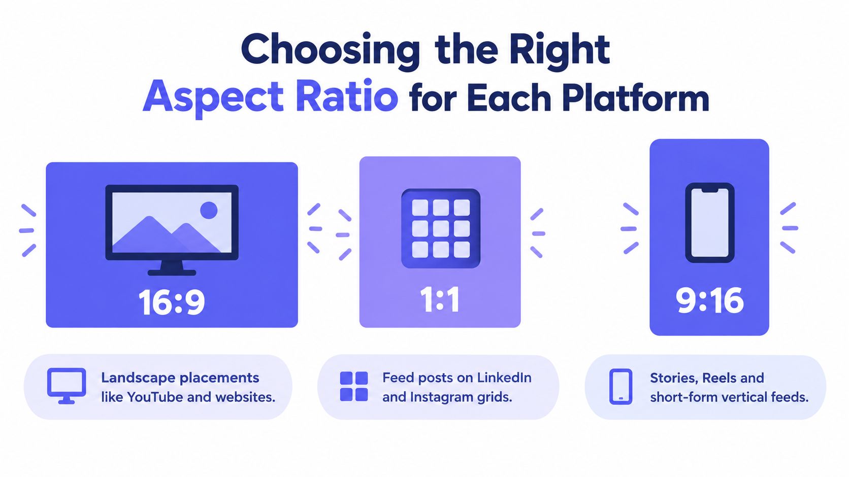
Stories, Status, Reels, and other short-form placements require 9:16 vertical video, while feed posts can support square and horizontal formats. Meta's format guidance for Stories, Status, and Reels supports exporting separate versions rather than repeatedly cropping one file.
Match the canvas to the placement
- 16:9: Choose the wide version for websites, desktop viewing, and in-stream placements.
- 1:1: Choose square for feed posts where a compact, balanced frame gives the video more presence.
- 9:16: Choose vertical for Stories, Reels, and short-form mobile feeds.
Keep the message and five-scene sequence consistent, then recompose each canvas around the product action. A vertical version may need a tighter interface crop, while a wide version can show more surrounding context. Do not treat resizing as a production step. Treat it as a composition decision.
Test the safe area on a phone
Keep the primary interface action near the central safe area. Placement controls, usernames, captions, and buttons can cover the edges, so check the actual preview before publishing. Put critical wording at the top or center only when it remains clear at phone size.
Shrink the preview until it resembles a real feed view. If the product name, interface state, or single CTA becomes difficult to read, revise that scene instead of trusting the desktop preview.
Use the launch video specs checklist before publishing. The safe-area preview is the gate. A ratio can look correct in a desktop browser and still conceal the interface detail that proves the product works.
Mistakes That Make Generated Teasers Invisible
A generated teaser can look polished and still disappear in a muted feed. The first 15 seconds must prove one useful idea quickly, with every cut earning its place.
Remove the obvious waste
Logo animation first: A decorative logo screen delays the product story. Open with the user's frustration or the strongest product state, then introduce the brand through the action.
Narration assumptions: Spoken explanation vanishes when sound is off. Put the meaning on screen, and use music only to support pace.
Stock footage padding: Generic office footage does not prove software works. Show a real interface crop, an input state, or the visible result.
Tiny interface detail: A full-page screenshot may impress on desktop while failing on a phone. Crop tightly around the product action, enlarge the relevant state, and raise contrast.
Multiple CTAs: Requests to sign up, read documentation, and book a call compete for attention. Choose one next step that matches the teaser's purpose.
Decorative transitions: A wipe or zoom that changes nothing wastes screen time. Use each transition to show movement from input to transformation to result.
Cut anything that does not clarify the product, the problem, or the next action.
Measure the cuts, not your taste
A 2025 industry survey of video marketing found broad business adoption and generally positive reported returns. That makes watchability the differentiator. A demo earns attention through a clear opening, visible proof, and a reason to continue.
Track the first three seconds, midpoint retention, completion, CTA click-through, and downstream signup conversion separately. Compare versions before changing colors, music, or transitions. If viewers leave immediately, rewrite the opening. If they finish but do not click, the sequence may explain the product without giving them a reason to act.
Review each metric against the scene responsible for it. A weak first scene needs a stronger hook. A sharp drop during the interface reveal usually signals a poor crop, unreadable text, or proof that arrives too late. A strong completion rate with weak signup conversion points to the CTA or the landing-page handoff, not necessarily the edit.
Putting Teasers on a Weekly Cadence
A 15-second teaser should be a recurring unit of work, not a leftover task after the main video. Tie each release to a real product change, customer question, or audience concern. A landing page update can provide a new hook, interface state, proof point, or angle.
ShipTeaser's paid plans set the publishing rhythm: one, two, or four videos per week at $99, $149, and $199 per month. The first video is free with no credit card, and exports are available in 16:9, 1:1, and 9:16.
Match the cadence to your product activity. One weekly teaser supports a steady launch narrative. Two create room to test a problem-led hook against a feature-led hook. Four support several audience angles, but only if each video communicates one clear idea. A higher publishing frequency does not excuse weak positioning.
Keep the experiment controlled
Change one meaningful variable at a time. Keep the product action and audience constant, then test different openings. A problem-led hook should name the friction the viewer recognizes. A feature-led hook should show the capability that resolves it. Compare retention and CTA activity by channel, then keep the version that makes the product easier to understand.
Use the next release to test a specific question, such as whether proof belongs earlier or whether the CTA needs a clearer benefit. Record the result and carry the winning choice into the next test.
A 15-second teaser cannot teach an entire product. Its job is to create a repeatable bridge from discovery to the page where deeper proof lives. That is enough.
FAQ
How long does it take to make a ShipTeaser product demo?
ShipTeaser generates a 15-second teaser from a submitted product URL in about two minutes. The output is a downloadable 1080p MP4 with hook, problem, solution, proof, and CTA scenes.
Does ShipTeaser include voice-over?
ShipTeaser doesn't include voice-over or narration. “Silent” means the teaser communicates through motion graphics and burned-in on-screen text, with an optional music bed available.
Can I edit the video myself?
ShipTeaser doesn't include a video editor or timeline. You can review the output and re-run the generation with a different hook, but ShipTeaser doesn't provide manual clip trimming or screen-recording controls.
Are captions included?
ShipTeaser includes burned-in on-screen text in the generated output. Review the wording and readability on a small phone display before publishing.
Is a 15-second teaser enough for a complex product?
A 15-second teaser is enough to introduce one promise and prompt further exploration. Complex setup, integrations, security, pricing, and onboarding belong in a separate walkthrough or documentation flow.
ShipTeaser turns your product landing page into a 15-second, silent teaser with the hook, proof, and CTA already structured for launch distribution. Start with your product URL, claim the first video free with no credit card, and visit ShipTeaser to create the next demo your feed needs.