You're launching with the clock already screaming. The page is live, the slot is booked, and nobody has time for a beautiful edit timeline that drifts into next week.
An app launch video should be a shipping artifact, not a creative side quest. The right move is a 15-second, silent motion-graphics teaser built from the landing page, shipped fast, and posted in the formats your launch needs, not the formats a perfectionist wants to polish forever. If you need a practical template for how teams use short video to explain a product and drive action, this ecommerce video guide that boosts sales is useful context, even though the use case is different.
The Fifteen-Second Teaser Reality Check
Launch morning is not the time to invent a film. The URL is live, the Product Hunt slot is in a few hours, and the only honest question is whether the teaser gets made and posted before the window closes. A two-week edit that never ships is worthless.
ShipTeaser exists for that moment. Paste a product URL, get a 15-second, 1080p, silent motion-graphics teaser in about 2 minutes, then post it as a launch asset. The first video is free, there's no credit card, and that matters because founders should test the message before they commit to a paid cadence.
The broader reason this works is simple. Video is now mainstream marketing, not a niche stunt. Wyzowl's survey of 266 business respondents found that 91% of businesses use video as a marketing tool, and 82% of marketers report that video delivers a good return on investment. The same research says video improves understanding, brand awareness, web traffic, lead generation, sales, and time on site, which is why a short teaser has real job-to-be-done value, not just visual polish. Wyzowl's video marketing statistics
Practical rule: if the teaser can't be made from the landing page fast, the landing page is probably too messy for launch anyway.
The rest of this comes down to four things, in order. Write the script, clean the URL, export the right ratios, and test hooks against real downstream action. If you get those four right, the video ships on time and pulls its weight.
A Five-Scene Script You Can Write in Twenty Minutes
Write the script before you open any generator. A launch teaser has five jobs and no room for filler. Every line needs to move the viewer to the next one.
Use one line per scene
Use a fixed sequence: hook, problem, solution, proof, CTA. Keep it tight. Mobile viewers drop fast, and the MMA mobile benchmark found that about 30% of viewers remained through the midpoint of short ads, while skippable completion rates ranged from 9% to 14%. MMA video benchmarking study
A clean five-line script for a meeting-notes app looks like this:
- Hook, 0 to 2 seconds: “Still losing decisions after the call?”
- Problem, 2 to 5 seconds: “Notes live in three places, and nobody trusts the summary.”
- Solution, 5 to 10 seconds: “Turn one meeting into a clean, shareable recap.”
- Proof, 10 to 13 seconds: “One dashboard. One source of truth.”
- CTA, 13 to 15 seconds: “Try the workflow.”
“The hook is a filter, not an introduction.”
The opening has to earn attention immediately. Feed video gets judged before the viewer has context. Facebook's research, as cited in Wistia's video length guidance, found that 65% of people who watch the first three seconds of a feed video go on to watch at least ten.
For a fuller walkthrough of scene-by-scene scripting, see the product video script guide.
The proof scene does not need a customer montage. Use one screenshot line, a product state, or a single claim tied to the product. Keep the CTA specific. “Learn more” is weak. “Try the workflow” gives the viewer an action. Write all five lines before you open any tool, because the script is the only part you should hand-craft.
Preparing the URL So ShipTeaser Reads It Cleanly
Start with the page you want the teaser to read. If that page is messy, the output will be messy too. A clean input gives you a tighter launch asset.
Strip clutter before you generate
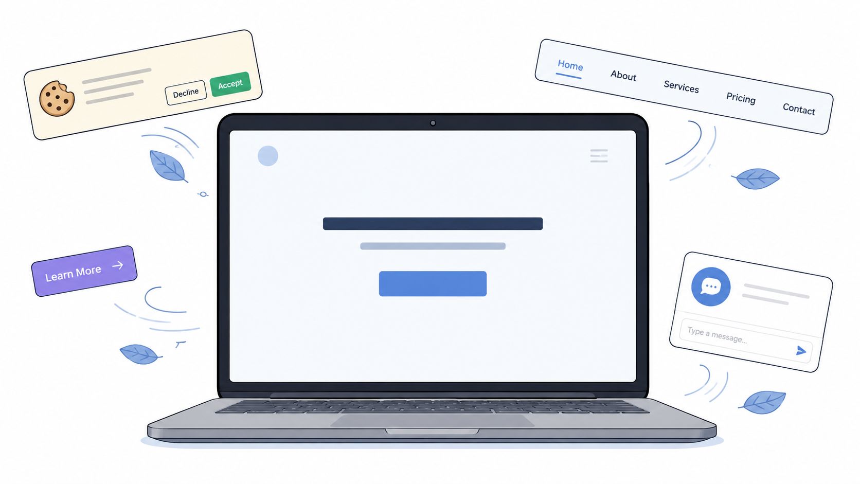
Open the landing page in a clean preview. Cut the noise that does not help the teaser. Cookie banners, nav links, extra CTAs, chat widgets, and long footer clutter all distract from the main promise.
Then check only three things. One clear promise in the hero. One proof point in the social proof area. One direct CTA on the final scene. That is enough for a short launch asset. More than that, and the render starts trying to summarize the whole site instead of the product.
Clean the page once and it can serve both the teaser generator and any launch listing that reads the same URL. That is the point. One source page. One message. Less drift.
A long sales page is a bad input. A focused landing page, or a tighter use-case page, gives the generator fewer choices and a better result. Keep the page honest. If the page tries to sell five things, the teaser will blur them together.
Use the same discipline with ShipTeaser's URL-first workflow. Paste the clean page, let the system read the copy, screenshots, and visible brand cues, then get out of the way. The ShipTeaser URL-to-video page shows that input-first workflow in practice.
Exporting and Posting the Three Aspect Ratios
One render is not enough. Launch distribution needs the right crop for the place where people see the video. That means 16:9, 1:1, and 9:16, not one master file forced into every feed.
Match format to placement
Use the format that fits the surface. 9:16 is the mobile-first vertical layout, and Google Ads specifies 1080 by 1920 pixels with a recommended length of 15 seconds for that orientation. 16:9 is the horizontal layout, and 1:1 is the square layout. Google also lists these three as the core orientations for advertisers. Google Ads video asset guidance Google video asset guidance
ShipTeaser's exports follow that structure. Use 9:16 for vertical social surfaces, 1:1 for compact feed placements, and 16:9 for standard horizontal surfaces. The job is simple. Ship one launch concept in the right shapes, then keep the edit consistent across them.
For exact pixel dimensions and bitrate settings per ratio, see the launch video specs reference.
A quick publishing checklist keeps the handoff clean:
- Write the caption first. The post should explain the product in one sentence.
- Put the link where the platform expects it. Don't make people hunt.
- Watch comments early. The first wave tells you whether the message landed or confused people.
The worst mistake is re-editing per platform until launch day becomes post-launch day.
If you want a deeper look at how framing changes across placements, the best aspect ratios for social clips article is a useful companion read. The rule stays the same. Render once, post three times, and keep every placement tied to the same master file so a hook fix updates the whole set in one pass.
Testing Three Hooks Before You Pick a Winner
Launch day rewards discipline. Pick one video shape, then test three hooks against the same cut. The hook is the variable that matters first. For a tighter breakdown of why the first few seconds decide whether people keep watching, see the three-second hook breakdown.
Change one thing and keep the rest fixed
Write three opening lines, then leave everything else alone. Use one bold claim, one specific question, and one outcome-led line. Run all three in the same window, with the same caption, the same thumbnail if you use one, and the same audience.
Track what happens after the opening, not just what gets viewed. Measure qualified-view rate, average percentage viewed, landing-page click-through rate, and signup or install conversion. Completion rate can flatter a weak asset, especially when autoplay or forced views inflate it.
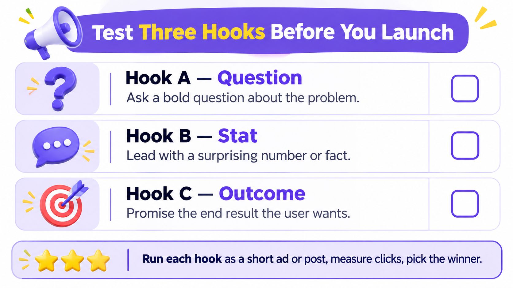
Keep the hook that wins on downstream action. Ignore the prettier impression count if it does not turn into clicks and signups. A version with fewer casual views but stronger conversion is the one to ship.
ShipTeaser's free first video makes this test cheap enough to run. Use it. The hook carries the signal, and weak hooks burn launch week before the market even understands the offer.
Why the Right Promise Matters After Install
A launch video doesn't stop at the click. It sets an expectation, and that expectation either matches the product or it doesn't. If the promise is fuzzy, the wrong people sign up and disappear.
Build a promise-to-event map
Write four things before you post anything. The video claim, the first-session action, the activation event, and the retention metric you care about later. If the teaser promises speed, the product should deliver speed immediately. If the teaser promises clarity, the first screen should make that obvious.
That discipline matters because challenge-oriented creative tends to attract better users than hype-first creative. In 2025 app-marketing analysis, challenge-oriented creative produced 2.2 times higher Day 7 retention on ad networks and 2.5 times higher on social and search than excitement-oriented creative. AppsFlyer creative optimization report
So stop writing teasers that only sell enthusiasm. A founder should prefer a problem-led opening over a vague “exciting launch” line, because the wrong promise drags in the wrong install. That creates churn, extra support, and a launch that looks busy while producing weak users.
Practical rule: if the teaser promise can't be tied to one obvious first action inside the product, the video is too broad.
The fixed five-scene structure pays off again. The hook can frame a problem, the middle can show the answer, and the proof frame can reinforce the exact behavior the product makes easier. That keeps the teaser honest and makes the post-install experience cleaner.
Your First Launch Week and the Mistakes to Dodge
Launch week needs a schedule. A fixed deliverable. A fixed turnaround. A fixed test plan.
Keep the week tight
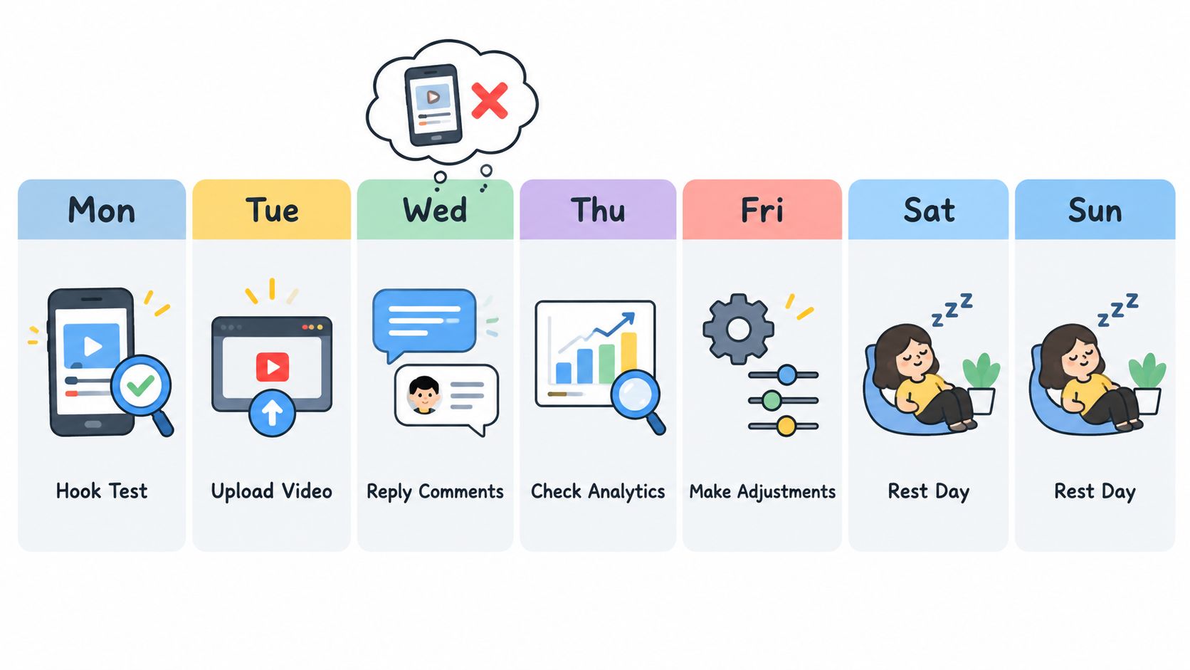
Monday, tighten the landing page. Tuesday, produce the first teaser from a weekly plan, so the launch cadence stays repeatable. Wednesday, run the three-hook test. Thursday, post the winner across all three ratios. Friday, check comments and measure whether viewers who clicked completed the first-session action the teaser promised.
That is enough for a lean launch week. Anything bigger usually turns into delay. Shipping on time beats polishing forever.
By Friday, the only question that matters is simple. How many viewers who clicked finished the first-session action you promised? That checkpoint tells you whether the teaser and the product are aligned, or whether you sold the wrong thing.
Watch for three mistakes:
- Posting before the page is tight. The URL is the input, so a messy page creates a messy result.
- Regenerating the same hook over and over. That is not testing. That is wasting time and budget.
- Treating completion as the only metric. A high completion rate can still hide weak downstream action.
Keep the launch week simple and repeatable. One URL. One teaser. Three hooks. Three ratios. One decision. That is how a founder ships without turning launch day into production hell.